
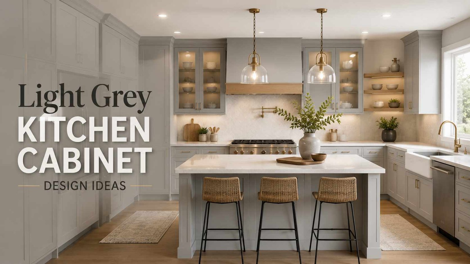
I’ll be honest, the first grey kitchen I ever helped redo didn’t go smoothly. We picked a shade that looked flawless on the little paint chip at the store, and once it went up on every single cabinet in the room, it read almost lilac under the kitchen’s fluorescent lights.
We ended up repainting the whole thing a few weeks later with a warmer, more muted grey, and it taught me something that no showroom display ever could: grey only looks the way you expect once it’s actually in your room, under your lighting, next to your floors and your countertops.
That lesson has stuck with me through every kitchen since. Grey is forgiving in some ways and unforgiving in others. It’s forgiving because it goes with almost any style, any wood tone, any metal finish.
It’s unforgiving because the smallest shift in undertone, sheen, or lighting can completely change how it reads.
So rather than just telling you “grey is trendy, go for it,” I wanted to put together something more complete — not just 21 ideas, but the costs, the color names, the mistakes, and the questions people actually ask me once they’ve decided to go this route.
Here are 21 ideas I keep coming back to, drawn from kitchens I’ve actually seen come together, followed by everything else you’d want to know before you commit.
1. Pair It With Warm Wood Open Shelving
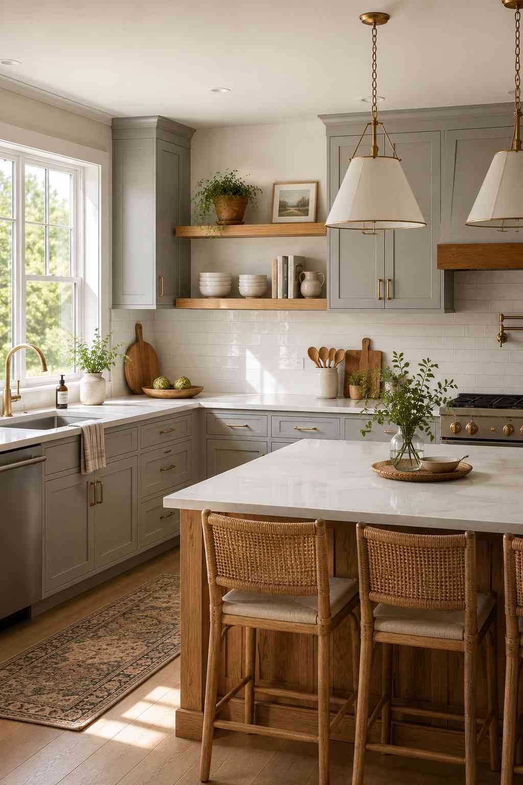
One of the easiest ways to keep light grey cabinets from feeling cold is to break them up with a section of open wood shelving. I’ve seen this done with reclaimed pine, walnut, and even plain builder-grade oak stained a honey tone, and it works every time. The wood softens the grey and gives your eye somewhere warm to land. It also forces you to keep your everyday dishes a little more organized, since open shelves show everything.
A good spot to try this is above a stretch of counter that doesn’t get much upper cabinet use anyway, like next to a window or above a coffee station. You don’t need to redo your whole upper cabinet run to get the effect. Even two or three floating shelves, spaced with a bit of breathing room between them, can do the job. I usually suggest keeping the shelf styling simple — a stack of plain white bowls, a couple of plants, maybe one cookbook standing upright — because the whole point is contrast with the grey, not competing for attention with it.
Best for: farmhouse kitchens, Scandinavian-style kitchens, small kitchens that need a lighter visual touch.
2. Go Two-Tone With a Darker Island
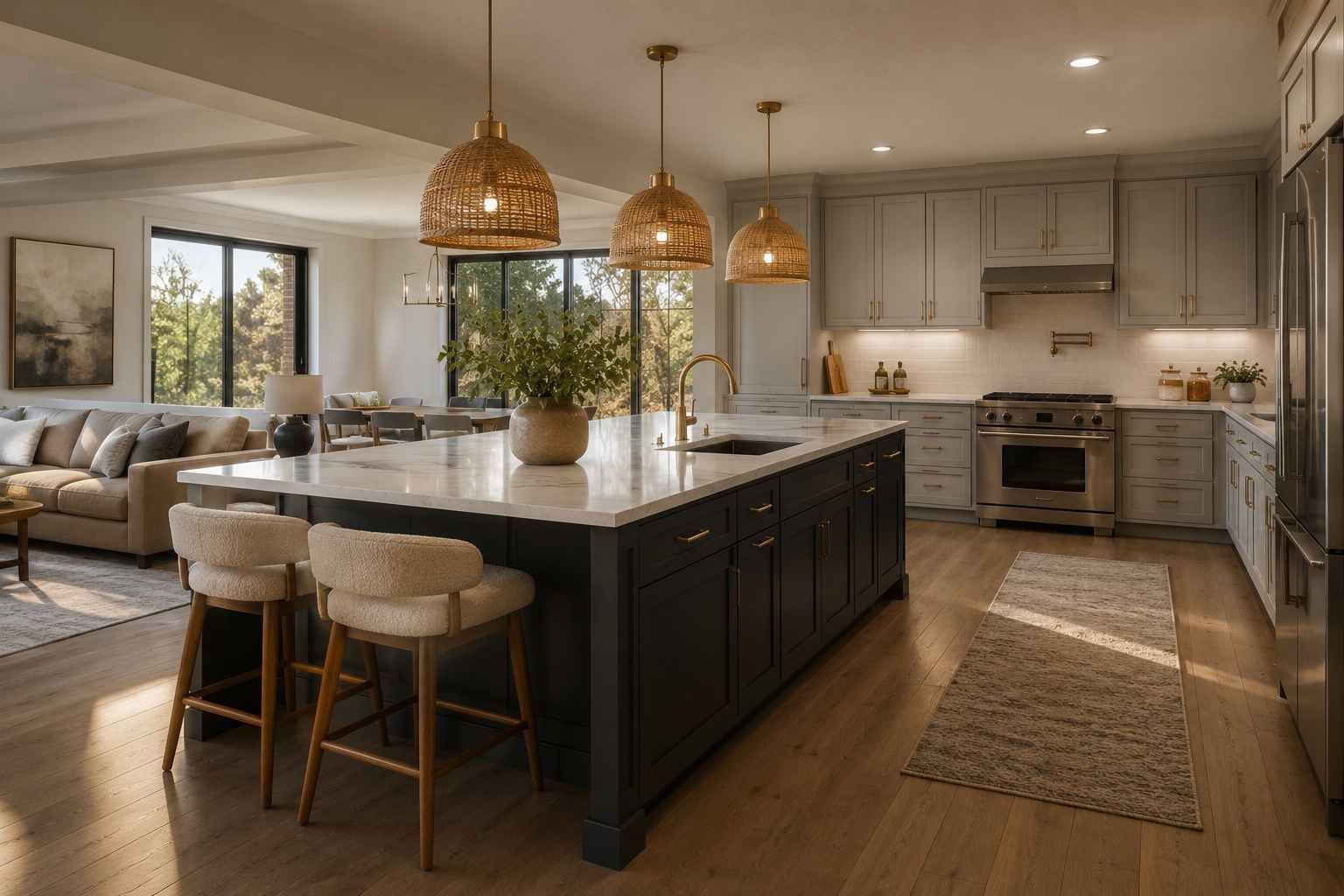
Light grey uppers with a charcoal or deep slate island is one of my favorite combinations to recommend, especially in kitchens that feel a bit too uniform. The island becomes an anchor for the whole room instead of just another cabinet run. If you’re nervous about committing to a dark island permanently, try it first with a peel-and-stick wrap or a temporary paint test on just one cabinet door to see how you feel about it before repainting everything.
What surprises people most is how much smaller a room can feel visually organized once the island stands apart from the rest of the cabinetry. Instead of one long, continuous block of color wrapping around the whole kitchen, your eye gets a clear “here’s the workspace, here’s the storage” separation. I’ve noticed this works especially well in open-concept homes where the kitchen flows directly into a living space, because the darker island also helps define where the kitchen actually ends without needing a wall to do it.
Typical cost: Repainting just an island, rather than the full kitchen, usually runs $300–$800 depending on size and the number of coats needed to get solid coverage over a dark color. It’s one of the cheapest ways to test this look before going further.
3. Brushed Brass Hardware for Softness

Grey has a way of making brushed brass look more elegant than it might on white or navy cabinets. I think it’s because brass has warmth built into it, and light grey doesn’t fight that warmth the way brighter whites sometimes do. Even a small detail like swapping standard nickel knobs for unlacquered brass pulls can change the entire feel of a kitchen without touching a single cabinet door.
One thing worth knowing before you buy: unlacquered brass isn’t sealed, so it will develop a natural patina over the first two or three years of everyday use — fingerprints, faint darkening, small variations across the pulls. Some people love this aged look and choose unlacquered brass specifically for it. Others find it frustrating and prefer a lacquered or PVD brass finish that stays shiny and consistent indefinitely. Polished, shiny brass tends to read as slightly more formal and can occasionally look a touch too glossy against a soft, matte grey, so if you want that warm brass look without the upkeep, a satin or brushed finish usually blends in more naturally than a high-polish one.
4. Marble or Marble-Look Countertops
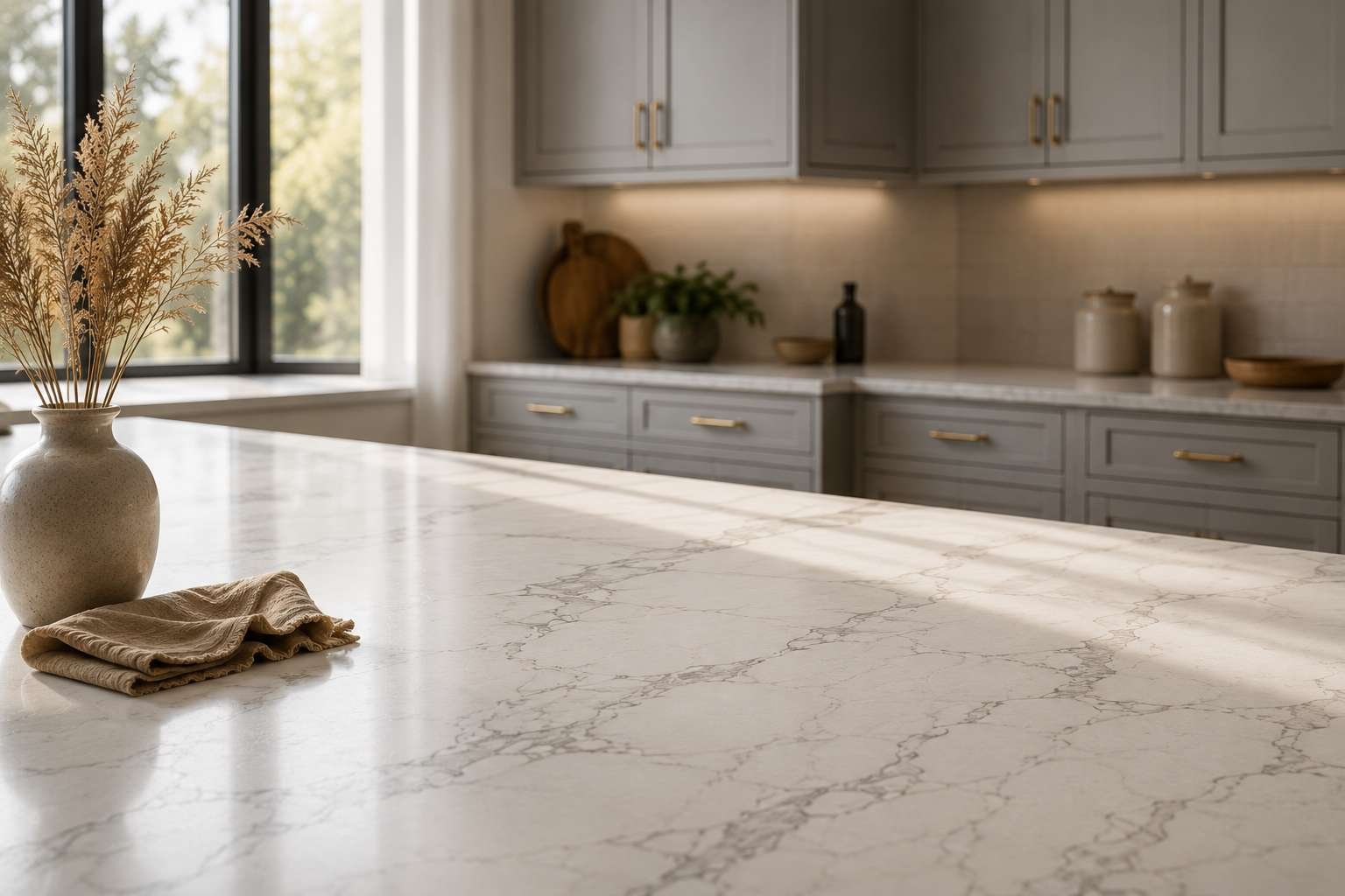
There’s a reason marble and light grey cabinets show up together so often — the soft veining in most marbles (or good quartz alternatives) tends to pick up the same undertones already in the cabinet paint. If your cabinets lean slightly blue-grey, look for a countertop with cool grey veining. If they lean warmer, toward greige, a countertop with beige or taupe veining will tie the whole space together instead of fighting it.
Typical cost: Quartz countertops with marble-look veining generally run $60–$120 per square foot installed, while genuine Carrara or Calacatta marble tends to sit higher, often $100–$200 per square foot once you factor in sealing and more careful installation. Prices vary a lot by region and slab availability, so treat these as rough starting points rather than a quote.
5. Matte Finish Instead of Gloss

I used to assume gloss finishes were the safer, more modern choice, until I actually lived with a matte grey kitchen for a while. Matte hides fingerprints and water spots far better, which matters more than people expect once real cooking and real kids get involved. It also gives the color a chalkier, more sophisticated look rather than a plastic-y shine, especially under warm LED lighting.
The trade-off worth knowing: in households with young kids or heavy daily cooking, matte cabinet paint usually hides fingerprints and small smudges better than a shinier finish, but grease splashes right around the stove can actually be slightly harder to wipe clean on true matte than on a satin sheen, since satin has a bit more surface slip. If you’re set on matte for the visual look, a satin or eggshell finish specifically on the cabinets flanking the range is a reasonable compromise that a few of my clients have gone with after living with all-matte for a year and getting frustrated near the hob.
Also Check – Modern Kitchen Flooring Ideas
6. Add a Bold Backsplash Instead of Playing It Safe
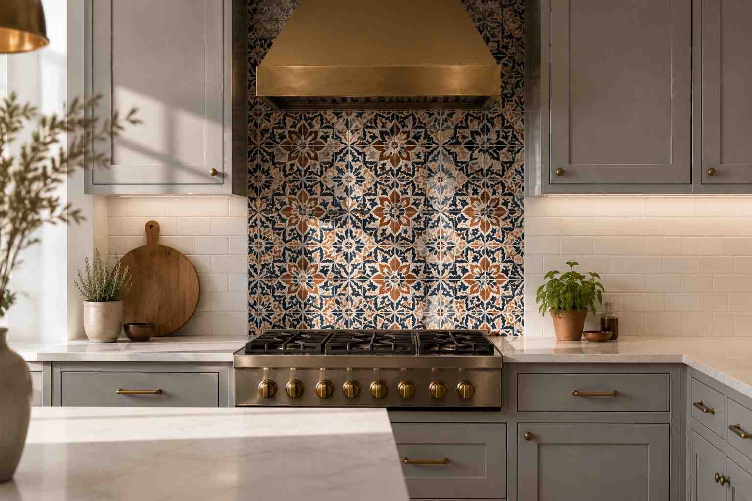
A lot of people pair light grey cabinets with a plain white subway tile and call it done, and it looks fine, but it’s a missed opportunity. I’ve seen kitchens completely transformed by a patterned tile backsplash — Moroccan-style, herringbone, even a bold geometric print — because the grey cabinets are neutral enough to handle it. The backsplash becomes the personality of the room while the cabinets stay as the quiet backdrop.
If a full patterned wall feels like too much of a leap, start smaller. A patterned tile just behind the stove, framed by plain tile everywhere else, gives you that same personality without covering every wall in a busy print. It also happens to be one of the more affordable upgrades in a kitchen remodel, since you’re usually only tiling a few square feet behind the range rather than the entire perimeter.
If you’re saving ideas for later, this is a good one to pin — the stove-wall version especially tends to get lost if you don’t bookmark it.
7. Shaker Style for a Timeless Look
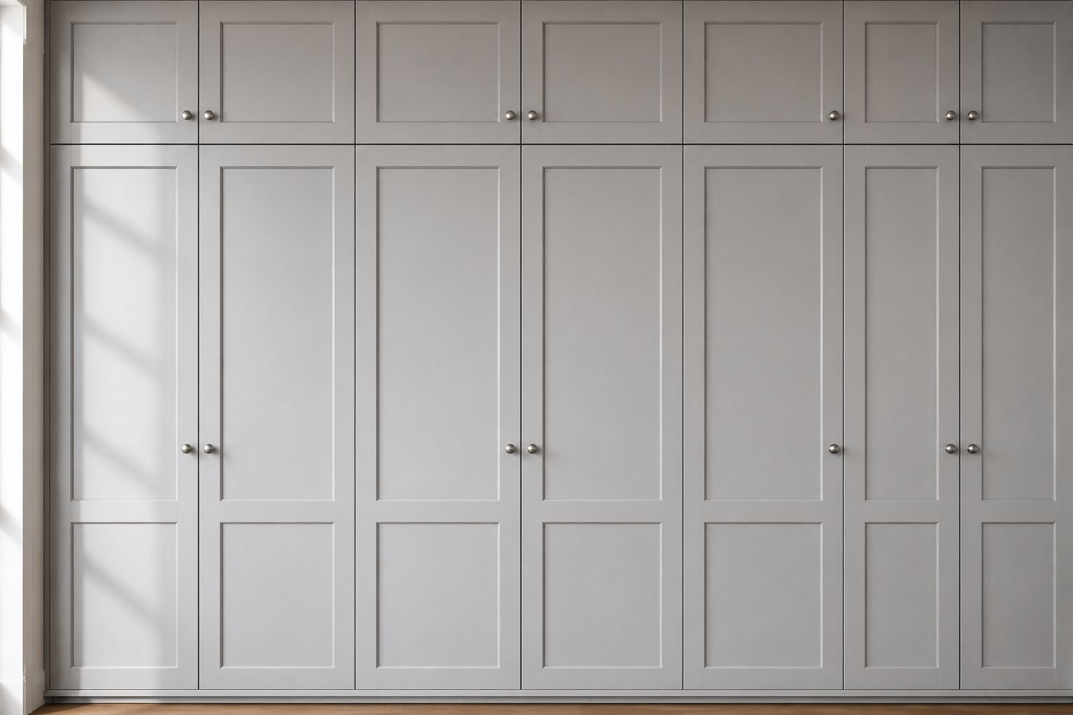
If you’re not sure which door style to choose, shaker cabinets in light grey are about as close to a safe bet as you’ll find. The simple recessed panel doesn’t compete with the color, so the grey gets to do the talking. I’ve repainted more kitchens back to shaker-style grey than any other combination when homeowners were trying to sell their homes, because buyers consistently respond well to it.
Typical cost: Painting existing shaker cabinets professionally usually falls between $250 and $700 for a small to mid-size kitchen if the boxes are in good shape and only need a color change, not structural repair. Replacing cabinet fronts entirely while keeping the boxes runs closer to $800–$2,000, and a full custom cabinet replacement can easily start at $6,000 and climb well beyond that depending on size and materials.
Best for: resale-focused renovations, traditional and transitional homes, anyone who wants a look that won’t feel dated in five years.
8. Flat-Panel Doors for a Modern Edge
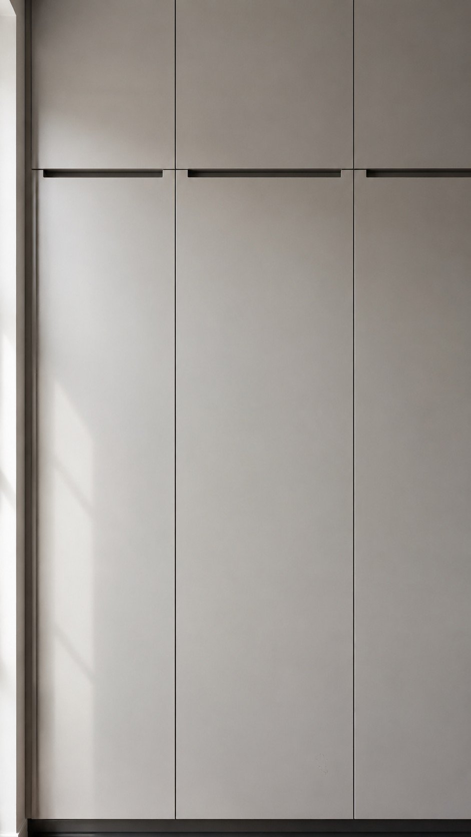
On the flip side, if your home leans more contemporary, flat-panel or slab-style doors in light grey give a cleaner, more architectural feel. This works especially well with handleless or integrated-pull hardware. I’d only caution that flat panels show scratches and dents a bit more obviously than shaker doors, since there’s no raised edge to distract the eye, so it’s worth spending a little more on a durable finish.
Best for: modern and minimalist kitchens, small urban apartments, Japandi-style interiors.
9. Mix Grey Uppers With White Lowers
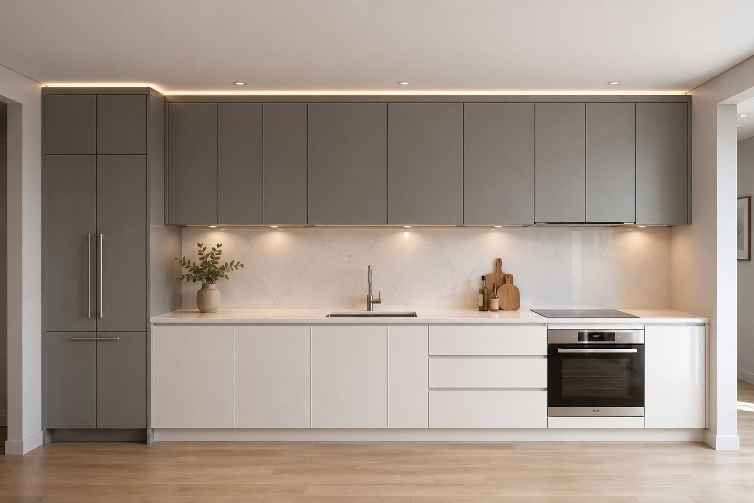
This is a subtle trick that a lot of people overlook. Putting the lighter color, white, on the lower cabinets and the slightly darker light grey up top does something interesting visually — it grounds the room instead of making it feel like it’s floating. Most kitchens do the opposite instinctively, but I’ve found this reversed version often photographs and feels more balanced, especially in kitchens with lower ceilings.
I tried this exact swap in a kitchen with an eight-foot ceiling that always felt slightly boxy no matter what we did with paint or lighting. Once we reversed the usual pattern, dark-ish grey up top and clean white below, the ceiling suddenly felt higher and the whole room felt more deliberate rather than accidental. It was a small change on paper, but it was the one adjustment that made the client stop second-guessing the rest of the design.
10. Black Hardware for Contrast Without Going Dark

If a dark island feels like too much commitment, black hardware is a gentler way to add contrast. Matte black knobs and pulls against light grey doors create definition without darkening the whole room. It’s one of the cheapest updates you can make to an existing grey kitchen, and I’ve seen it single-handedly modernize kitchens that were otherwise stuck in a builder-grade rut.
Typical cost: A full hardware swap for an average kitchen, roughly 25–35 knobs and pulls, generally costs $150–$400 for mid-range matte black hardware, plus an afternoon of your own time or a small labor fee if you’d rather not drill new holes yourself.
11. Butcher Block Countertops for Warmth
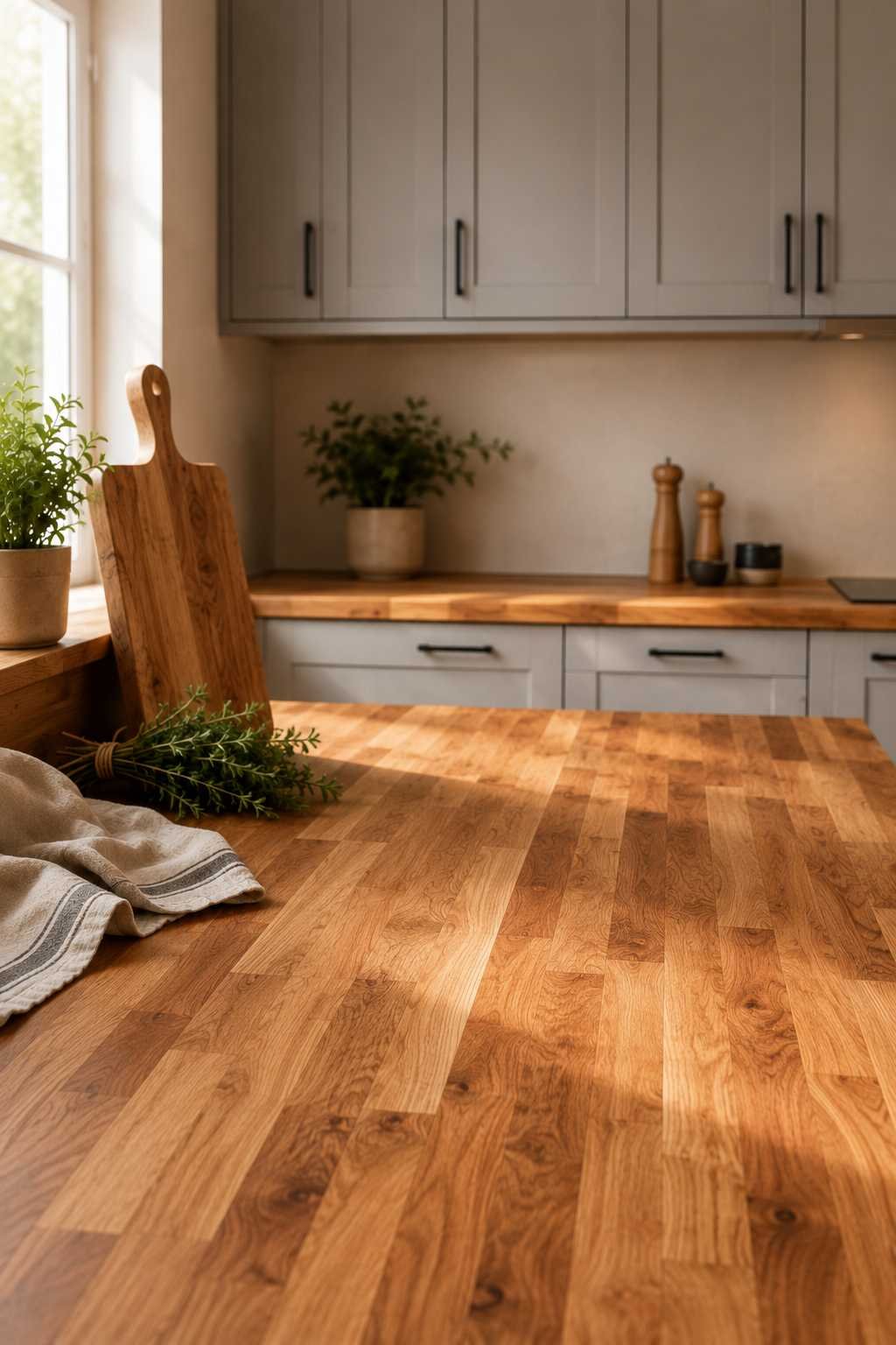
Butcher block isn’t just for farmhouse kitchens anymore. A light grey cabinet base with a butcher block countertop brings in a natural, almost Scandinavian warmth that stone countertops can’t replicate. It also happens to be one of the more budget-friendly countertop options, which matters if you’re already spending most of your renovation budget on cabinetry.
Typical cost: Butcher block generally runs $40–$100 per square foot installed depending on the wood species, which is noticeably lower than most natural stone. The trade-off is maintenance — it needs periodic oiling and isn’t as forgiving around the sink if water sits on it, so it suits a kitchen where you’re willing to do a little upkeep in exchange for the warmth and lower upfront cost.
12. Glass-Front Upper Cabinets
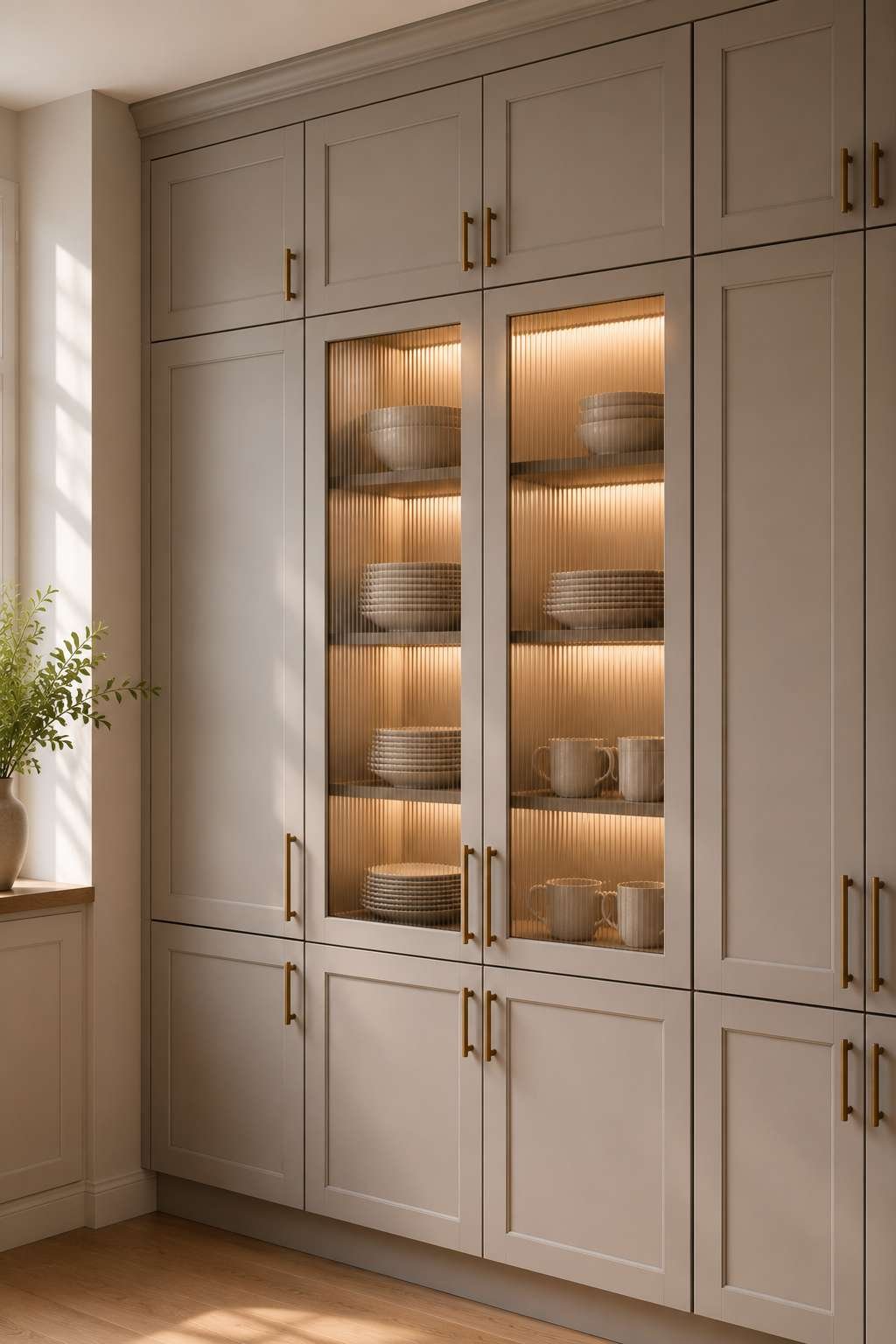
Swapping a couple of upper cabinet doors for glass fronts breaks up a long run of solid grey and gives the eye a place to rest. It also works as gentle, forced organization — nobody wants their mismatched Tupperware on display, so glass fronts tend to encourage people to store their nicer dishware where it can be seen. Frosted or ribbed glass is a good compromise if you want the visual break without fully showing off what’s inside.
Best for: dining-adjacent kitchens, kitchens where the cabinetry runs long and needs visual breaks, anyone with dishware worth showing off.
13. Two-Tone Grey Shades on the Same Wall

Instead of pairing grey with a totally different color, try two different shades of grey — a lighter one on top, a slightly deeper one on the bottom. It’s a quieter version of contrast that still adds depth. This works particularly well in smaller kitchens where a single strong contrasting color might feel too busy, but flat, single-tone cabinetry would feel a little boring.
Save this one if you’re renovating a smaller kitchen — it’s easy to forget as an option when everyone defaults to a single flat color.
14. Warm Toned Light Grey for North-Facing Kitchens
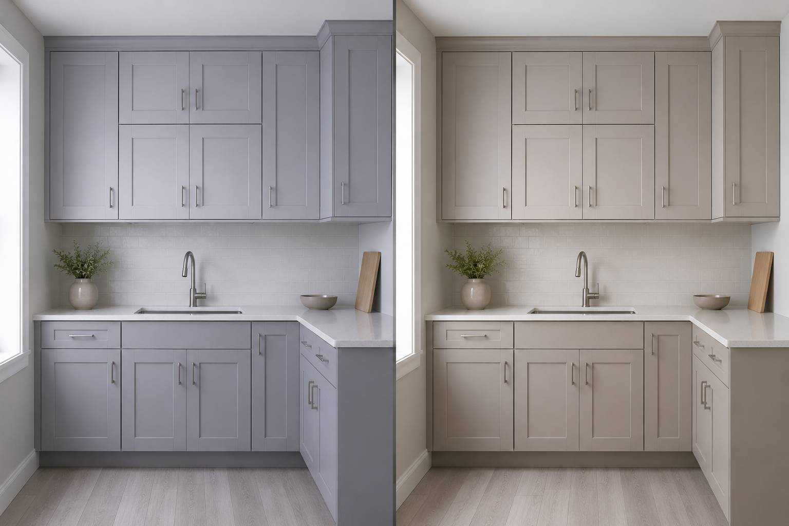
If your kitchen doesn’t get much direct sun, avoid the coolest, blue-leaning greys. I learned this one the hard way on an early project — a beautiful cool grey that looked perfect in the showroom turned almost lavender-grey in the actual kitchen because of the lack of warm daylight. A greige or warm-undertone grey holds up far better in rooms with limited natural light.
The easiest way to check this before committing is to paint a large sample board, not just a tiny swatch, and move it around your kitchen at different times of day. Hold it near the window, near the sink, and under your main overhead light. If it starts to look purplish, greenish, or oddly blue in any of those spots, that’s usually a sign the undertone is fighting your room’s natural light rather than working with it.
15. Cool Toned Light Grey for South-Facing, Sun-Filled Kitchens
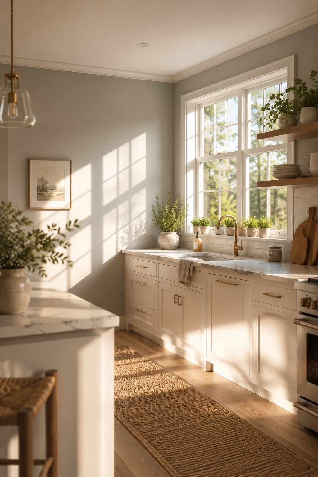
On the other hand, if your kitchen gets a lot of warm afternoon sun, a cooler grey can actually balance out that warmth rather than clash with it. Warm sunlight has a way of pulling out yellow undertones in paint, so a grey that looks slightly cool on the swatch often ends up looking perfectly neutral once it’s on the wall in a bright room.
Also Check – Kitchen Design Ideas That Actually Work With Dark Wood Floors
16. Statement Pendant Lighting Over the Island

Grey cabinets are the ideal backdrop for statement lighting because they won’t compete with a bold fixture the way a patterned or brightly colored cabinet might. Oversized rattan pendants, brass domes, or even colorful glass pendants all read beautifully against light grey. This is usually the cheapest, lowest-commitment way to add personality to an otherwise neutral kitchen.
Typical cost: A pair of statement pendants generally runs anywhere from $80 for simple fixtures to $400–$600 each for designer pieces, plus electrician time if you’re not working with an existing junction box.
17. Textured Cabinet Fronts
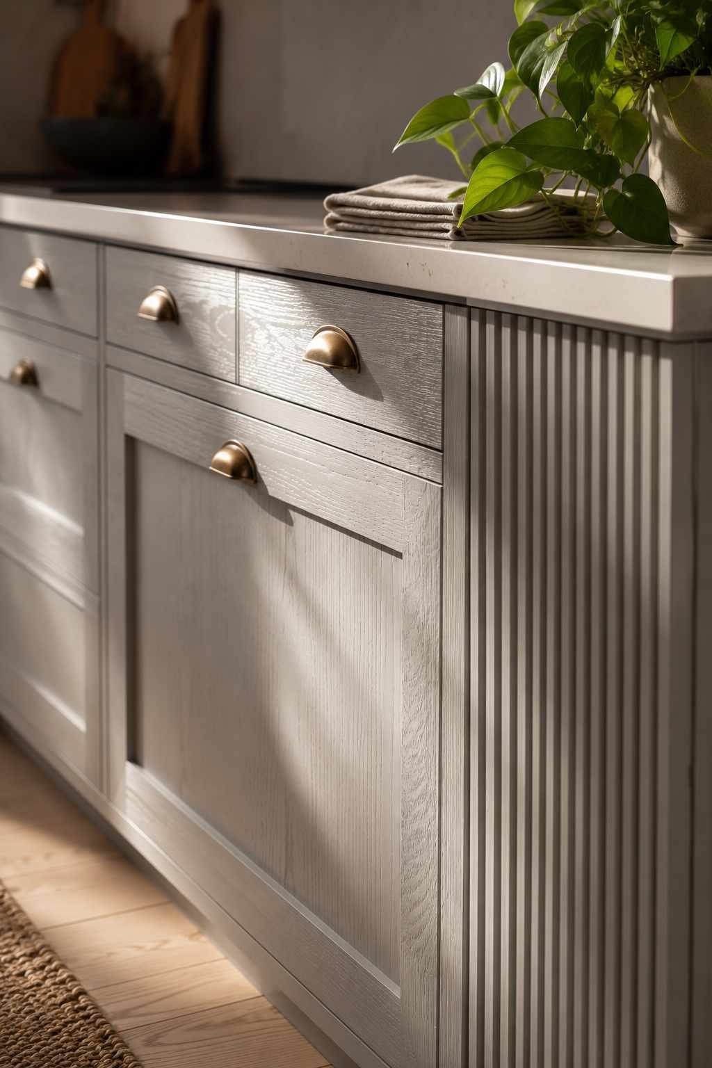
Not every grey kitchen needs to be smooth and flat. Textured finishes — a subtle wood grain showing through the paint, or a slightly ribbed cabinet front — add dimension that photographs flat colors sometimes lack in person. I’ve used this approach in a few kitchens where the homeowner wanted something a little more tactile and less “showroom perfect.”
18. Grey Cabinets With a Wood-Toned Range Hood
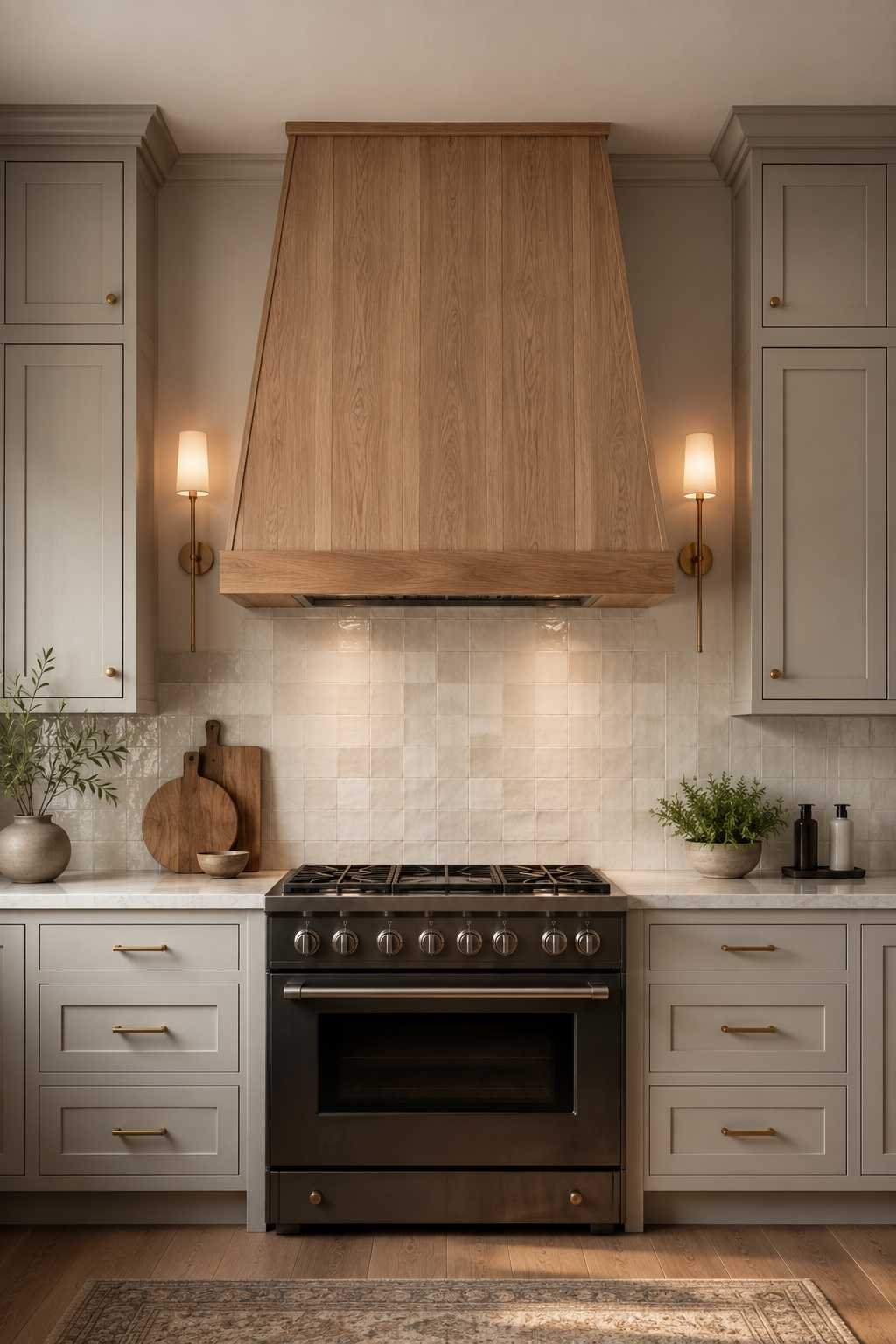
A wood-clad range hood surrounded by light grey cabinetry is one of those details that looks custom and expensive, even when it isn’t particularly hard to do. It draws the eye upward and gives the kitchen a natural focal point beyond just the countertops. This pairing tends to work in almost any style of home, from modern farmhouse to more transitional designs.
Best for: kitchens with a strong central sightline, homes where the range wall is the first thing you see walking in.
19. Soft Blue-Grey for a Coastal Feel
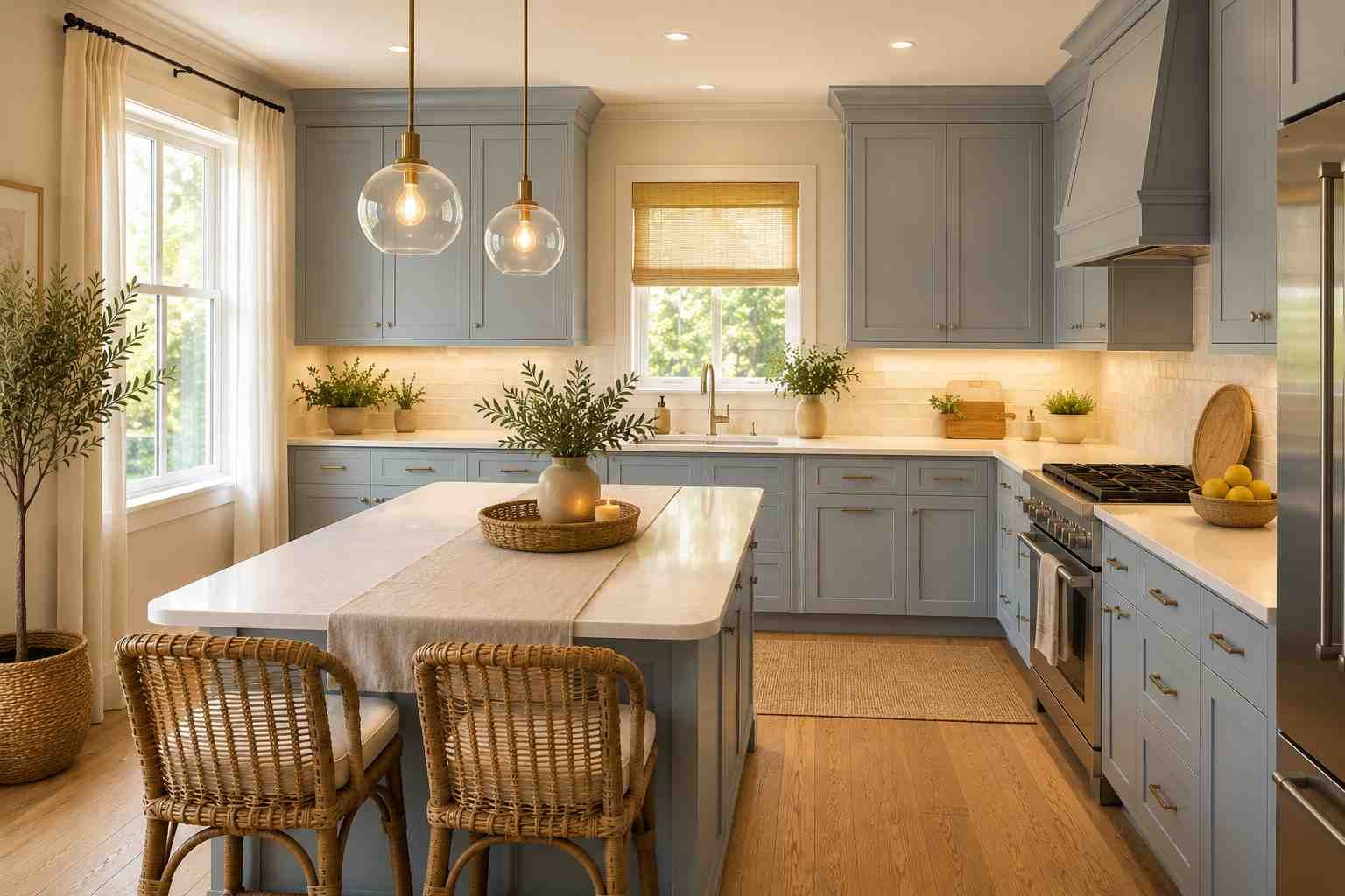
If you want your grey to lean toward a specific mood rather than staying perfectly neutral, a soft blue-grey brings in a relaxed, coastal feeling without going full-on nautical theme. Paired with white countertops and natural rattan or woven bar stools, it creates a light, breezy kitchen that still feels grounded and practical rather than overly themed.
I did have one project where a client fell in love with a blue-grey specifically because of a Pinterest photo, and we almost went with it before realizing her kitchen was north-facing with fairly small windows. We swapped to a warmer, greige-leaning version of the same general “soft coastal” mood instead, and it still gave her the feeling she wanted without the room turning dim and slightly cold the way the original shade would have.
20. Stainless Steel Appliances as the Safe, Versatile Choice
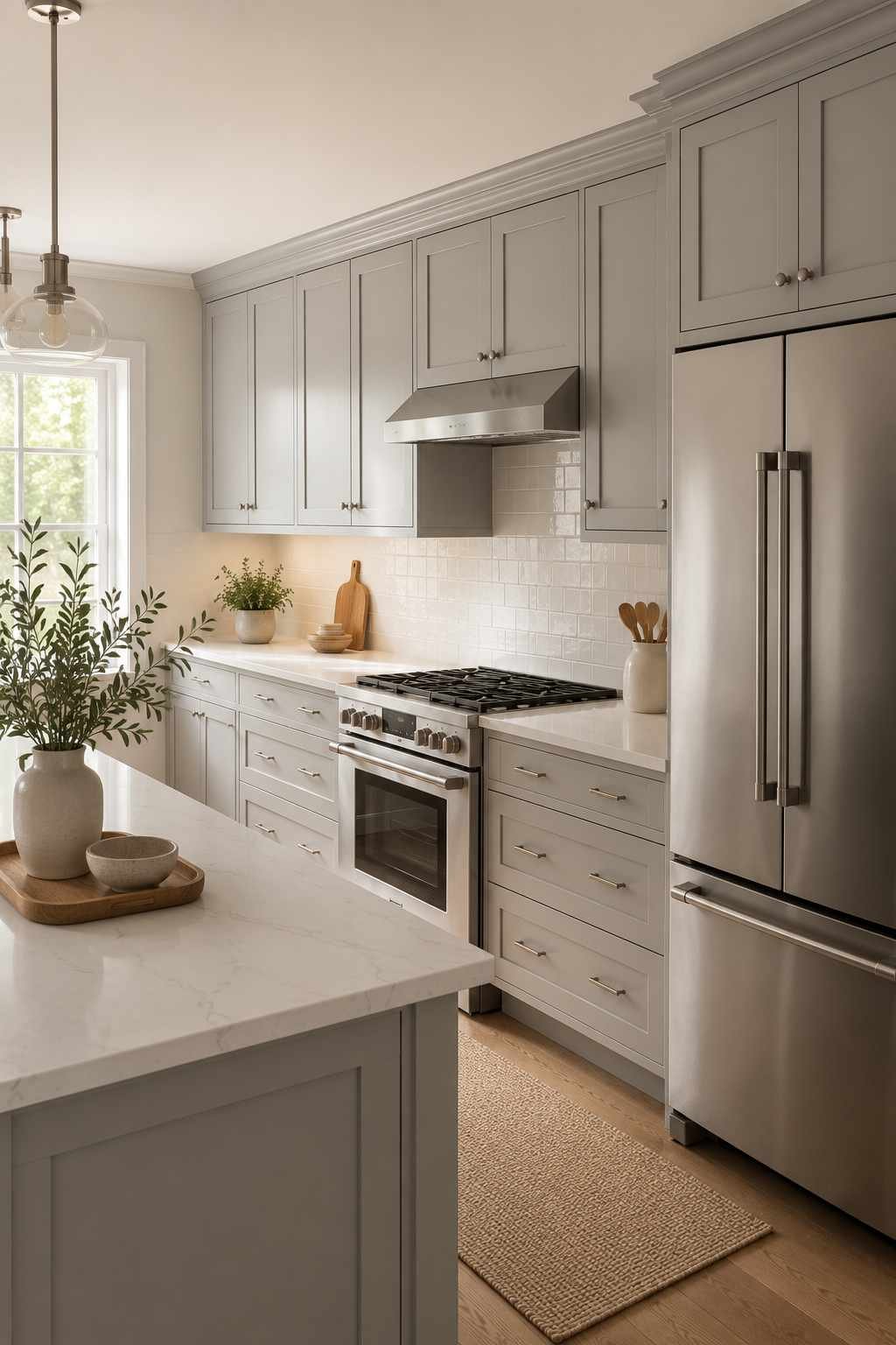
I know stainless steel gets called boring sometimes, but there’s a reason it remains the top recommendation for grey kitchens — it simply doesn’t clash with anything. Whether your grey leans warm or cool, stainless steel appliances sit quietly in the background and let the cabinetry and countertops do the visual work. If you want to elevate it slightly, panel-ready appliances that match your cabinet color take this even further by disappearing into the cabinetry entirely.
21. A Single Bold Accent Wall or Pantry Door
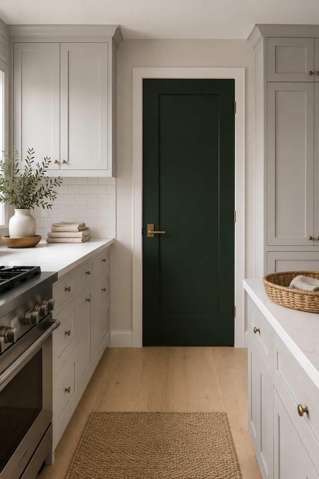
Sometimes the best way to keep a light grey kitchen from feeling too muted is to give it one deliberate pop of color somewhere unexpected — a pantry door in deep green, a small accent wall behind open shelving, or even a colorful runner rug near the sink. The trick is committing to just one bold element rather than scattering color throughout the room, so the grey cabinetry still reads as the calm, cohesive base it’s meant to be.
What Light Grey Paint to Actually Buy
People ask me this constantly, so here are a handful of specific shades I’ve either used myself or seen used well, along with where each tends to work best.
| Paint | Undertone | Works Best In |
|---|---|---|
| Sherwin-Williams Agreeable Gray | Warm greige | North-facing kitchens, rooms with limited natural light |
| Sherwin-Williams Repose Gray | Balanced, slightly cool | Most lighting conditions; a safe all-rounder |
| Benjamin Moore Classic Gray | Very light, warm | Small kitchens where you want brightness without stark white |
| Benjamin Moore Balboa Mist | Warm, slightly greige | Traditional and transitional kitchens with wood floors |
| Farrow & Ball Ammonite | Cool, soft | South-facing kitchens with strong natural light |
Paint always looks different once it’s on your actual walls and cabinets, under your actual bulbs, so treat this list as a shortlist to sample, not a final decision to make from a screen.
Common Mistakes With Light Grey Cabinets
A few things I see go wrong over and over, in case any of these save you a repaint down the line:
- Choosing the undertone in isolation. A grey that looks neutral on its own can look distinctly blue, purple, or green once it’s next to your specific floor and countertop.
- Ignoring your natural light before choosing. North-facing and south-facing kitchens genuinely need different grey undertones, not just different amounts of the same color.
- Mixing a cool grey with warm, orange-toned flooring. This is one of the most common regrets I hear about, usually from kitchens where the floor was staying and only the cabinets changed.
- Going all-grey with nothing to break it up. Cabinets, walls, and countertops all in similar grey tones can flatten a room and make it feel more like a display than a home.
- Choosing bulbs without thinking about color temperature. A gorgeous warm grey can look sickly under a cool 5000K bulb, and a cool grey can look muddy under a very warm 2700K one.
- Going cheap on the paint itself. Budget cabinet paint often needs more coats to get solid, even coverage over an existing dark color, and tends to chip sooner near handles and hinges.
How Lighting Changes Your Grey, Room by Room
This deserves more attention than most articles give it, because lighting is genuinely the single biggest variable in how your grey will actually look day to day.
Morning light tends to be cooler and bluer, especially in east-facing kitchens, which can make an already-cool grey look almost icy for the first hour or two of the day. Afternoon and evening light, especially in west-facing kitchens, warms up considerably and can pull hidden yellow or beige undertones out of a grey that looked perfectly neutral that morning.
North-facing kitchens get soft, indirect, cooler light all day, which is why warmer greys and greiges tend to hold up so much better in them. South-facing kitchens get strong, warm, direct sun, which is exactly why a slightly cooler grey often balances out better there than it would elsewhere.
Bulb temperature matters just as much as the sun. 2700K bulbs read as warm and cozy, similar to old incandescent bulbs, and tend to push greys toward a warmer, slightly beige feeling. 3000K is a middle ground, still warm but a touch crisper, and is what I recommend most often for kitchens trying to stay neutral. 4000K and above reads as cool, almost clinical light, and can make even a warm grey look flatter and greyer than intended. If you’re set on a specific paint color, it’s worth buying one bulb at each temperature and testing them in your actual fixtures before installing a whole kitchen’s worth.
Countertop Guide for Light Grey Cabinets
- White quartz — Consistent color, low maintenance, resists staining. Slightly less “natural” looking than real stone, and can occasionally read as a bit sterile without added texture elsewhere.
- Carrara marble — Beautiful natural veining, timeless look. Porous and needs regular sealing; can etch or stain if acidic spills sit too long.
- Butcher block — Warm, budget-friendly, easy to sand and refinish. Needs periodic oiling and isn’t ideal directly around a sink.
- Soapstone — Naturally heat and stain resistant, develops a nice patina over time. Limited color range and can be harder to find installers experienced with it.
- Concrete — Highly customizable in color and shape, very modern look. Can develop hairline cracks over time and needs sealing to resist staining.
- Granite — Durable, heat resistant, wide range of natural patterns. Some patterns can feel busier than the calm look most grey kitchens are going for, so it’s worth choosing a quieter slab.
Material Pairings at a Glance
| Cabinet Tone | Pairs Especially Well With |
|---|---|
| Warm grey | White oak flooring or cabinetry accents |
| Greige | Walnut wood tones |
| Cool grey | White quartz countertops |
| Soft, muted grey | Carrara or Calacatta marble |
| Any light grey | Black or matte hardware for contrast |
Light Grey vs. Other Popular Cabinet Colors
| Comparison | Quick Take |
|---|---|
| Light grey vs. white | Grey hides daily wear better and feels slightly warmer; white feels brighter and more resale-neutral. |
| Light grey vs. greige | Greige leans warmer and pairs more easily with wood tones; light grey is more flexible with metals and stone. |
| Light grey vs. navy | Navy is bolder and more of a statement; light grey stays quieter and dates more slowly. |
| Light grey vs. sage green | Sage feels more trend-forward and organic; light grey feels more timeless and easier to resell. |
| Light grey vs. beige | Beige feels more traditional and cozy; light grey feels a bit more current without being trendy. |
Before You Choose: A Quick Checklist
- Test your paint sample in morning, afternoon, and evening light
- Test it again under your actual kitchen bulbs at night
- Hold the sample next to your existing or planned flooring
- Choose your hardware finish before finalizing the exact grey
- Compare at least two countertop samples against the same paint chip
- Decide on matte, satin, or gloss before ordering, not after
- Live with the sample for a few days before committing to a full order
Frequently Asked Questions
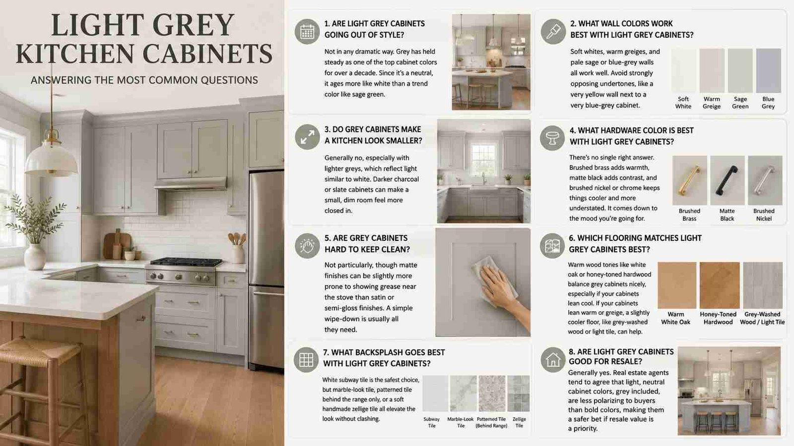
Are light grey cabinets going out of style?
Not in any dramatic way. Grey has held steady as one of the top cabinet colors for over a decade now, and because it’s a neutral rather than a bold trend color, it tends to age more like white than like something more of-the-moment such as sage green.
What wall colors work best with light grey cabinets?
Soft whites, warm greiges, and pale sage or blue-grey walls all tend to work well. The main thing to avoid is a wall color with a strongly opposing undertone, like a very yellow-warm wall next to a very blue-cool cabinet grey.
Do grey cabinets make a kitchen look smaller?
Generally no, especially with lighter greys, which reflect light in a similar way to white. Darker charcoal or slate cabinets can make a small, dim room feel more closed in, which is part of why so many small-kitchen versions of this look stick to the lighter end of the grey spectrum.
What hardware color is best with light grey cabinets?
There’s no single right answer. Brushed brass adds warmth, matte black adds contrast, and brushed nickel or chrome keeps things cooler and more understated. It comes down to the overall mood you’re going for more than any strict rule.
Are grey cabinets hard to keep clean?
Not particularly, though matte finishes can be slightly more prone to showing grease near the stove than satin or semi-gloss finishes, as mentioned earlier. A simple wipe-down with a gentle cleaner is usually all they need.
Which flooring matches light grey cabinets best?
Warm wood tones like white oak or honey-toned hardwood tend to balance grey cabinets nicely, especially if your cabinets lean cool. If your cabinets already lean warm or greige, a slightly cooler floor, like a grey-washed wood or light tile, can help keep the room from feeling too monochromatic.
What backsplash goes best with light grey cabinets?
White subway tile is the safest choice, but marble-look tile, patterned tile behind the range only, or a soft handmade zellige tile all tend to elevate the look without clashing.
Are light grey cabinets good for resale?
Generally yes. Real estate agents I’ve spoken with tend to agree that light, neutral cabinet colors, grey included, are less polarizing to potential buyers than bold or highly saturated colors, which makes them a safer bet if resale value is a priority.
Best Combinations at a Glance
- Best overall: Light grey cabinets, white quartz countertops, brushed brass hardware
- Most budget-friendly: Repainting existing cabinets plus a matte black hardware swap
- Most luxurious: Light grey cabinets, Carrara marble, walnut accents
- Best for small kitchens: Light grey cabinets with a plain white backsplash and warm 3000K lighting
Bringing It All Together
Every kitchen I’ve worked on has taught me something new about how this color behaves, and honestly, that’s part of what makes it such a satisfying choice to work with.
It rewards patience and attention to the small stuff — the undertone, the finish, the hardware, the light — rather than demanding a big dramatic gesture to look good.
If you’re planning a remodel, start by testing two or three paint samples directly on your existing cabinet doors before you choose countertops or hardware.
Seeing each shade in your own lighting, at different times of day, is the single step most likely to prevent an expensive mistake, and it’s the one thing that makes every decision after it, from countertops to backsplash to hardware, noticeably easier to get right the first time.
 Sumit Banerjee