
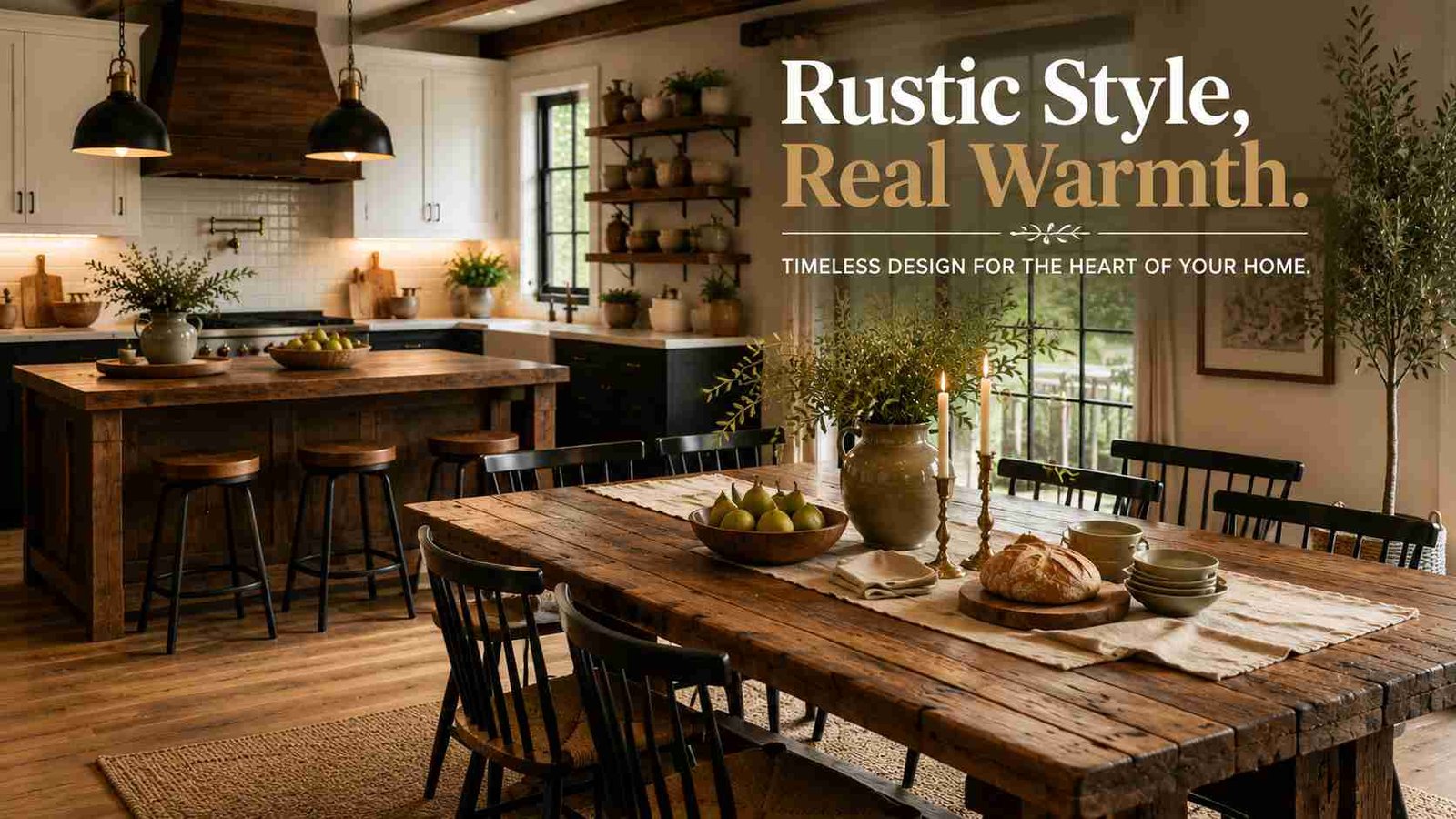
I’m not an interior designer. I don’t have a certificate on my wall or a portfolio of client homes. What I have is a kitchen I redid over almost two years, one paycheck and one Saturday at a time, and a lot of mistakes I made so you don’t have to.
When I started, I typed “rustic modern black and white kitchen” into every search engine I could find, and most of what came back was the same ten stock photos recycled across fifty websites with zero actual advice on how to get there.
So this is the article I wish I’d found. It’s not going to tell you to “consult a professional” every other paragraph. It’s going to tell you what actually worked, what I’d do differently, and what nobody warns you about before you start knocking down a wall.
A quick note on where this advice comes from: my kitchen is a fairly standard mid-size galley-to-open-plan layout (roughly 11×14 feet), north-facing with moderate natural light, and the full renovation took just under two years done in phases as money allowed.
That context matters, because some of the advice below (like how dark to go with black cabinets) depends a lot on light and layout — I’ll flag it where it does.
Why Rustic Modern Black And White Actually Works (And Isn’t Just A Trend)
Before the list, a quick word on why this combination holds up. Black and white on its own can feel like a showroom — sterile, cold, a little unlived-in. Rustic on its own can feel dated fast, especially if it leans too hard into “farmhouse chic” territory that every third house on your street already has.
Put them together and something interesting happens. The black and white gives you a clean, confident structure — it photographs well, it doesn’t date the way trendy colors do, and it makes small kitchens feel bigger because of the contrast.
The rustic elements (real wood, stone, aged metal, imperfect textures) stop it from feeling like a hospital or an Apple Store. You get warmth without clutter, and boldness without chaos.
That’s the balance every idea below is trying to strike.
Is This Style Right For Your Kitchen?
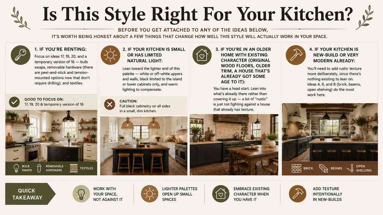
Before you get attached to any of the ideas below, it’s worth being honest about a few things that change how well this style will actually work in your space:
If you’re renting: focus on ideas 17, 19, 20, and a temporary version of 16 — bulb swaps, removable hardware (there are peel-and-stick and tension-mounted options now that don’t require drilling), and textiles. Skip anything involving paint or tile unless your landlord has explicitly signed off.
If your kitchen is small or has limited natural light: lean toward the lighter end of this palette — white or off-white uppers and walls, black limited to the island or lower cabinets only, and warm lighting to compensate. Full black cabinetry on all sides in a small, dim kitchen is the one combination I’d genuinely caution against.
If you’re in an older home with existing character (original wood floors, older trim, a house that’s already got some age to it): you have a head start. Lean into what’s already there rather than covering it up — a lot of “rustic” is just not fighting against a house that already has texture.
If your kitchen is new-build or very modern already: you’ll need to add rustic texture more deliberately, since there’s nothing existing to lean on. Ideas 4, 6, and 8 (brick, beams, open shelving) do the most work here.
Getting The Foundation Right Before You Touch Paint Or Fixtures
1. Start With Your Cabinet Split, Not Your Wall Color
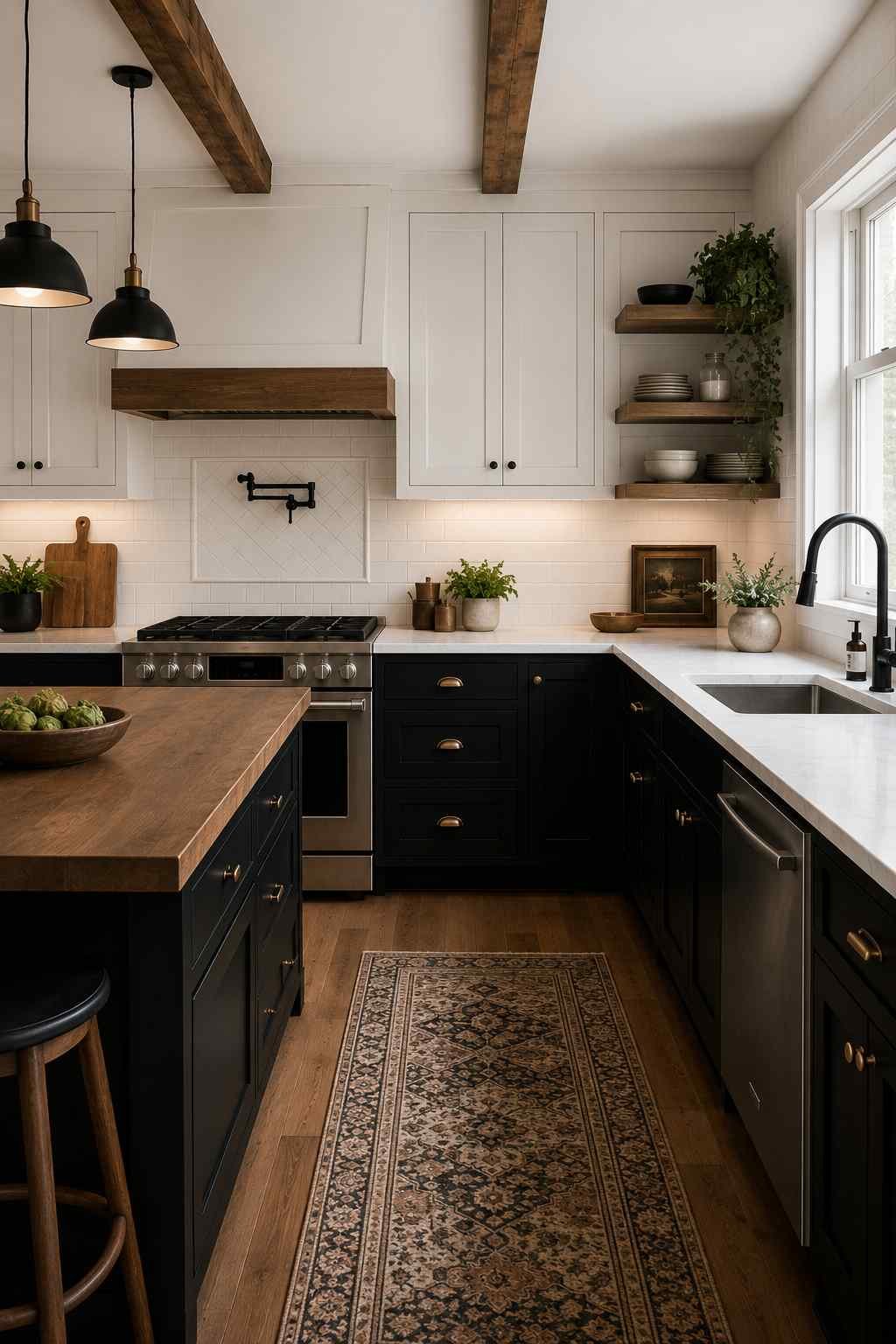
The biggest mistake I made early on was picking a wall color first. Wrong order. In a rustic modern black and white kitchen, your cabinets do most of the visual work, so decide that split first.The most common approach that actually looks intentional rather than random is black lower cabinets with white or off-white uppers — it grounds the room and keeps the top half feeling light and airy. I went the opposite way for a while (white bottoms, black top) and it made my ceiling feel lower than it is. Lesson learned the hard way.
2. Choose One Wood Tone And Commit To It Everywhere
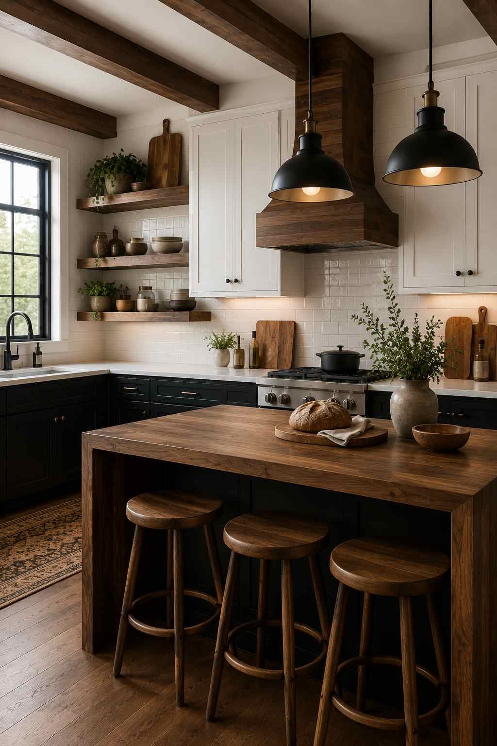
This is the single biggest “amateur mistake” I see in kitchens like this, including my first attempt. People mix three or four different wood tones — one for open shelves, another for the island, another for a butcher block counter — and it ends up looking chaotic instead of rustic. Pick one wood family (warm honey oak, weathered gray-brown, or deep walnut) and repeat it on every wooden surface in the room. Consistency is what makes rustic read as “designed” instead of “leftover materials.”
3. Use Real Materials Where Your Hands Actually Touch
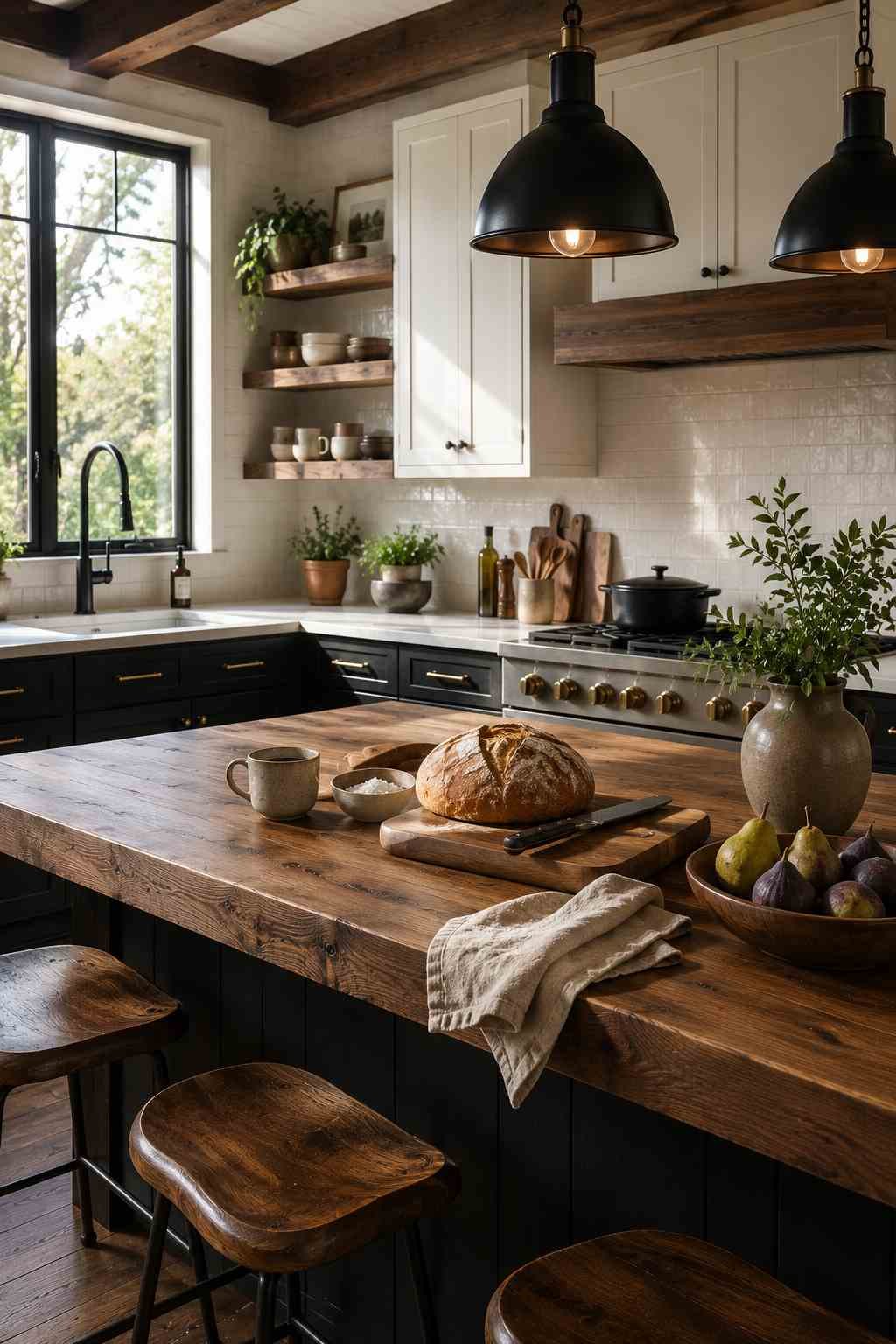
You don’t need real reclaimed barn wood on every surface, but I’d strongly suggest spending the extra money on real material anywhere you touch daily — countertops, handles, the island edge. Laminate that mimics wood grain looks fine in photos but gives itself away the second you run your hand across it. I compromised on real wood only for the island top and used quality laminate elsewhere, and honestly nobody has ever noticed the difference except me.
Wall And Ceiling Ideas
4. Exposed Brick Or A Brick-Look Accent Wall
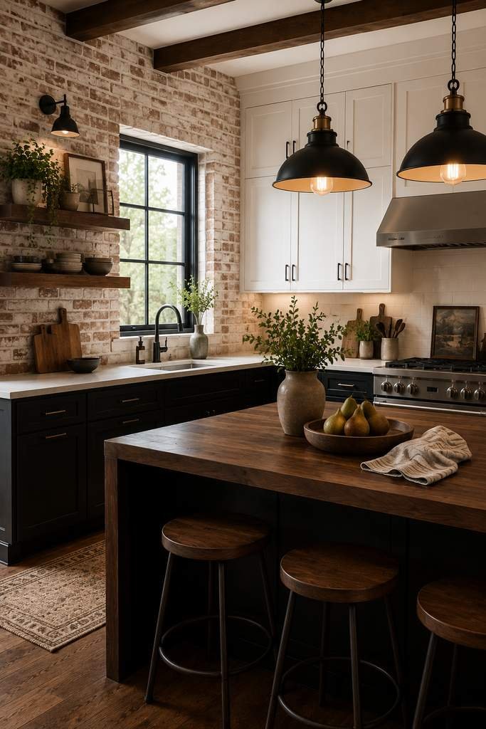
One wall of exposed or faux brick, left in its natural red-brown or painted a soft white, adds instant rustic texture without touching your black and white color scheme. If your house doesn’t have real brick to expose (mine didn’t — I checked, disappointingly), thin brick veneer panels are a realistic and much cheaper alternative than most people assume.
5. Shiplap, But Only On One Wall
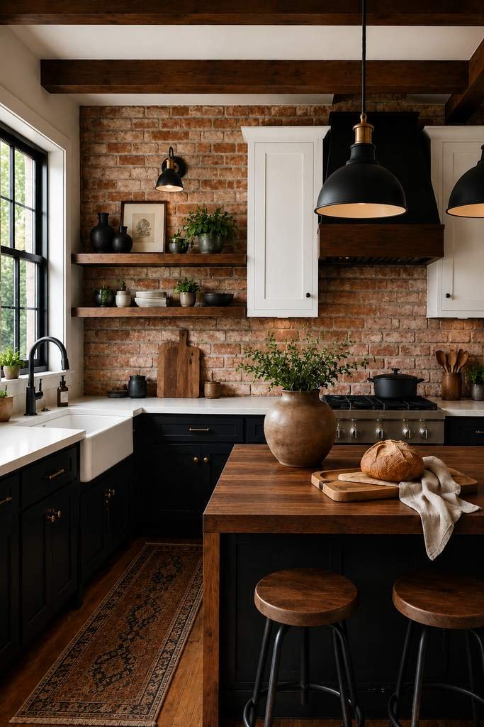
Shiplap had its viral moment and burned out fast, but it still works in small doses. Use it as a single accent wall behind open shelving or around a range hood, painted matte white. Skip it on every wall — that’s what makes a kitchen look like it’s chasing a trend instead of built around one.
6. Exposed Wooden Ceiling Beams
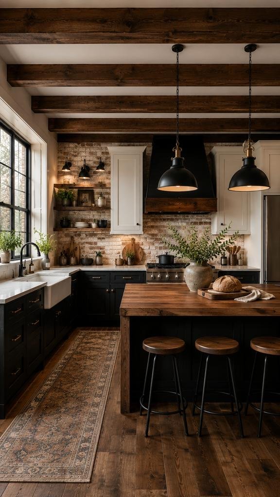
If your ceiling height allows it, exposed or faux wooden beams running across a white ceiling is one of the fastest ways to inject rustic character into an otherwise sleek black and white room. Even hollow, lightweight faux beams (which are far easier and cheaper to install than real structural beams) make a real visual difference. As a rough sizing guide, beams in the 6×6 to 8×8 inch range spaced about 24 to 36 inches apart tend to read as intentional architecture rather than an afterthought — anything thinner or too tightly spaced starts to look more like trim than a beam. One practical note: if your ceilings are under 8 feet, be cautious here, since even faux beams can make a low ceiling feel noticeably lower.
7. A Dark, Moody Accent Wall Instead Of An All-White Room
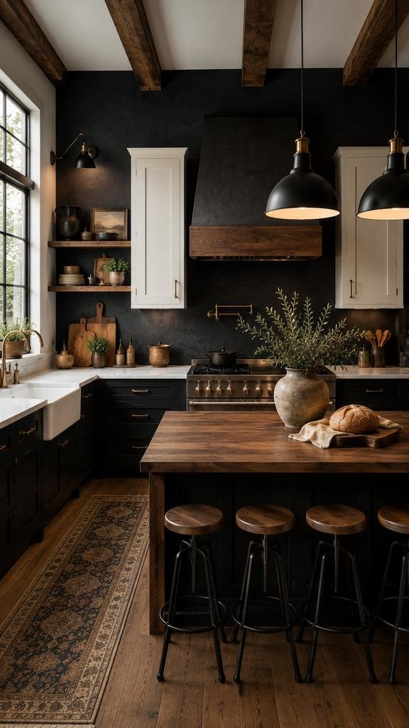
Going full white on every wall can feel flat. Try one wall in matte black or deep charcoal, ideally the wall behind your range or sink, so it acts as a natural focal point. Matte finish matters here — glossy black paint on a full wall reflects too much light and starts to look more “nightclub” than “kitchen.”
Also Check – Sage Green Kitchen Deisgns
Cabinet And Storage Ideas
8. Open Shelving In Raw Or Reclaimed Wood
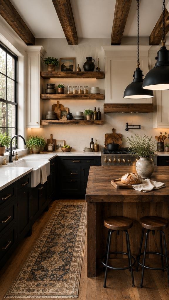
Swap a set of upper cabinets for open wooden shelves. It’s cheaper than full cabinetry, it breaks up a heavy black-and-white cabinet run, and it gives you a spot to actually show off some texture — ceramics, woven baskets, whatever you’ve got. A comfortable working depth is around 10 to 12 inches, with roughly 14 to 16 inches of vertical space between shelves so mugs and mid-size dishware actually fit without stacking oddly. Fair warning from experience: open shelves collect dust and grease faster than closed cabinets, especially near the stove. Keep them away from your cooktop unless you enjoy wiping them down weekly.
9. Black Cabinet Frames With Glass Fronts
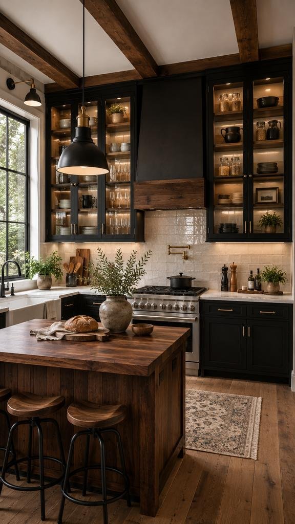
If full black cabinets feel too heavy for your space, try black-framed cabinets with glass panel doors. You get the boldness of black without the visual weight of solid doors, and it gives you a chance to style the inside — which, yes, means you have to actually keep your dishware organized, but it’s worth it.
10. Two-Tone Kitchen Island
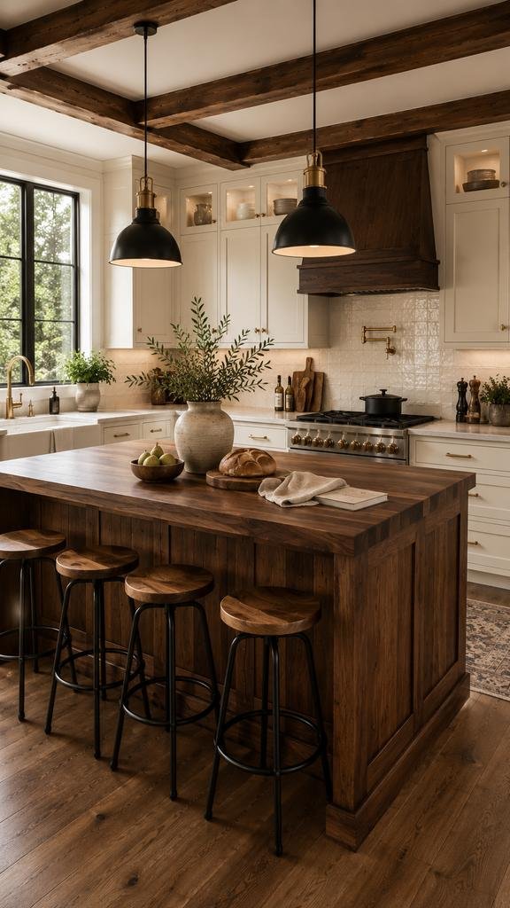
Make the island a different tone from your main cabinetry — often black when the rest of the kitchen leans white, or a raw wood tone when everything else is black and white. This turns the island into a natural centerpiece rather than just extra counter space.
11. Metal And Wood Open Shelving Brackets
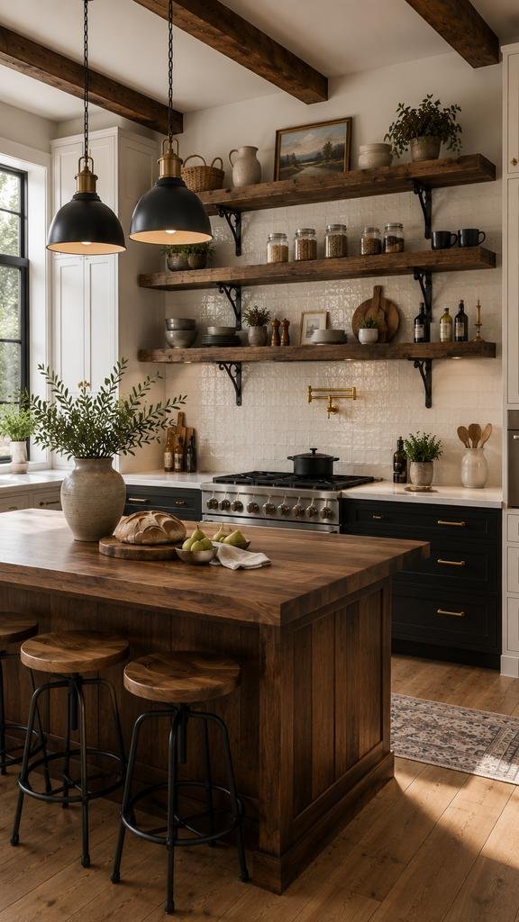
Small detail, big impact. Swap standard shelf brackets for black wrought iron or aged metal brackets under wooden shelves. It’s a rustic-industrial touch that costs very little but photographs really well and adds visual interest to what would otherwise be a plain shelf.
Countertop And Backsplash Ideas
12. Honed (Not Polished) Black Or White Stone
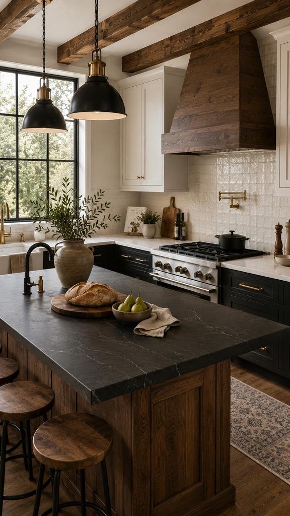
Polished granite or marble countertops read as very “2010s modern,” in my opinion. A honed (matte) finish on black soapstone or white quartz feels more rustic and organic while still keeping the color scheme intact. It also hides water spots and fingerprints far better than a glossy surface, which matters more than you’d think once you’re actually cooking in the space daily.
13. Handmade-Look Subway Tile Backsplash
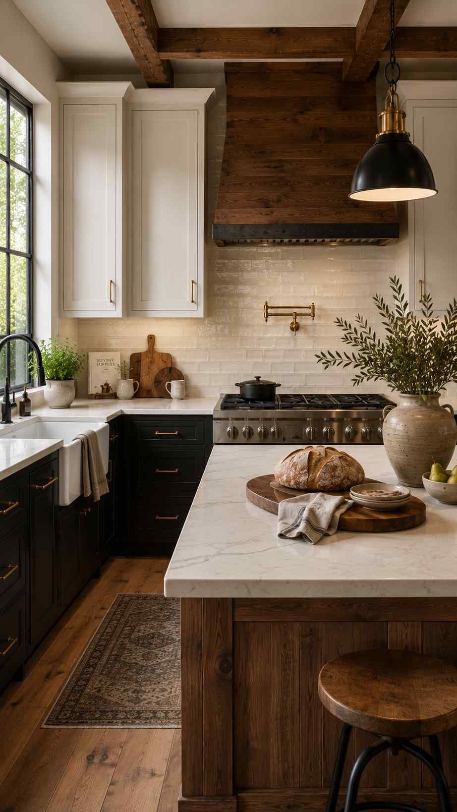
Skip perfectly uniform subway tile. Look for handmade or “artisan” style tile with slightly irregular edges and a subtle glaze variation. Standard subway tile runs 3×6 inches, but handmade versions are often closer to 3×8 or 4×8, which also means fewer grout lines across your backsplash — a small detail that makes the whole wall feel calmer. It gives you the clean lines of classic subway tile with enough imperfection to feel rustic rather than mass-produced.
14. Thick Butcher Block Countertop Section
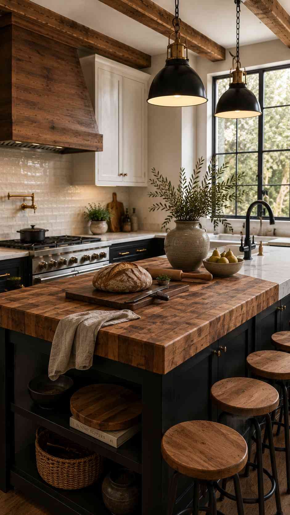
Even if most of your counter is stone, consider one section — often on the island — in a thick butcher block. It’s genuinely useful for food prep (real wood is kinder to knives than stone) and it’s the easiest single upgrade to bring warmth into an otherwise cool-toned kitchen.
15. Dark Grout With Light Tile (Or Vice Versa)
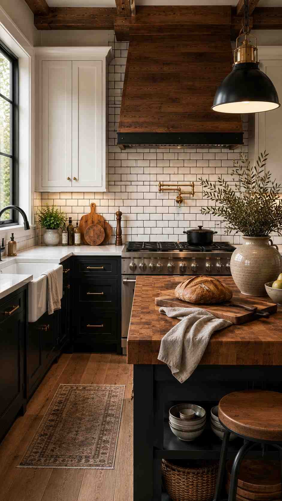
A small but effective trick: use contrasting grout color with your backsplash tile. Light tile with charcoal grout, or dark tile with white grout, adds a graphic, almost hand-drawn quality to the backsplash that fits the rustic modern look far better than matched grout does.
Lighting Ideas
16. Black Metal Pendant Lights Over The Island
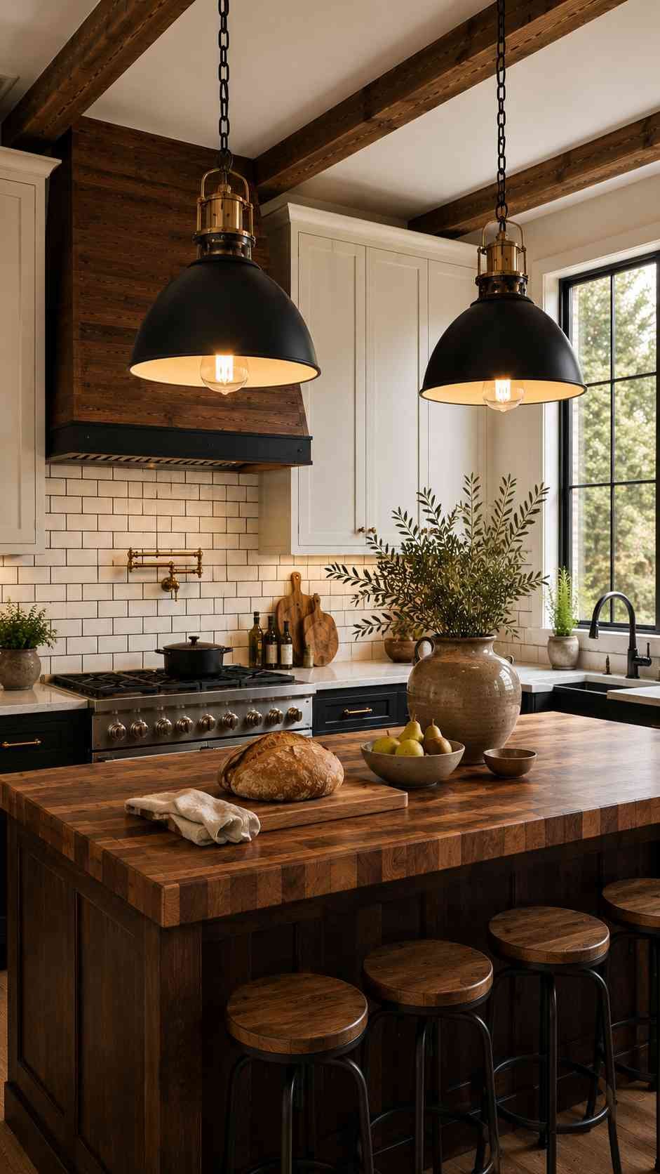
This is close to a non-negotiable in this style. Black metal pendants, ideally with an exposed bulb or a matte black shade, over your island or sink area. They’re widely available, relatively inexpensive, and instantly signal “rustic industrial” better than almost any other single fixture.
Also Check – L Shaped Kitchen Designs
17. Warm Bulb Temperature, Not Cool White
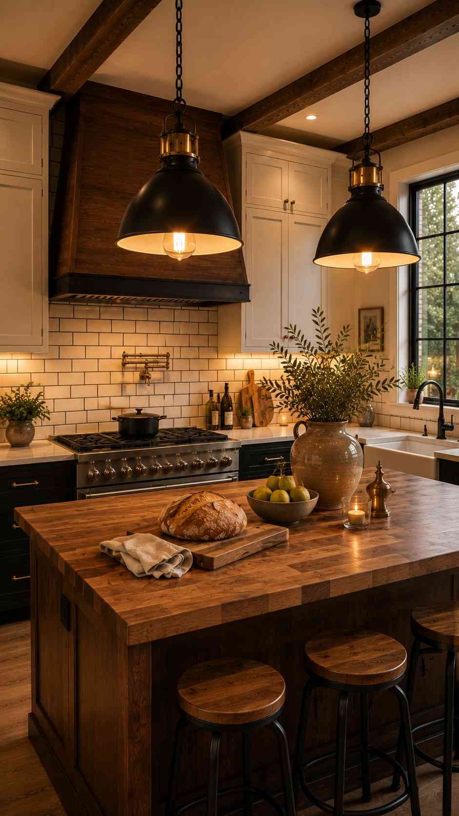
I made this mistake initially and it genuinely changed how the whole kitchen felt. Cool white LED bulbs make black and white kitchens feel clinical and sterile. Switch to warm white (around 2700K–3000K) and the exact same room suddenly feels inviting instead of like an operating theater.
18. Under-Cabinet Lighting To Highlight Texture
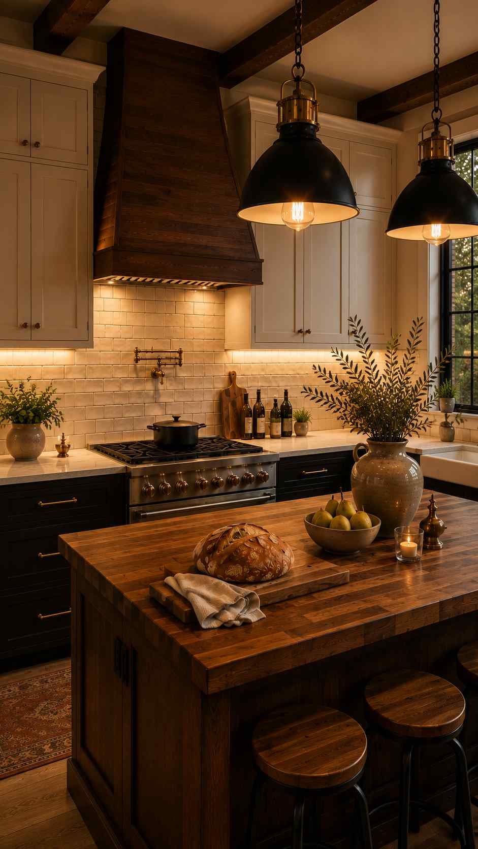
If you’ve invested in a nice backsplash or stone countertop, under-cabinet LED strips will actually show it off in the evening instead of leaving it in shadow. It’s a small add-on during a renovation but a genuine pain to retrofit later, so if you’re already opening up cabinets, do this now.
Hardware, Fixtures, And Finishing Touches
19. Matte Black Faucet And Hardware
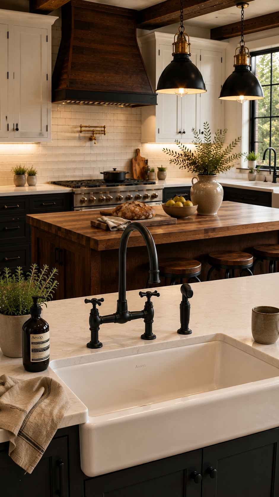
Matte black (not glossy, not chrome) faucets, cabinet handles, and hinges tie the whole room together and reinforce the color scheme without needing more paint or tile. It’s one of the cheapest updates in this entire list relative to the visual impact it has.
20. Woven Or Natural Fiber Textures
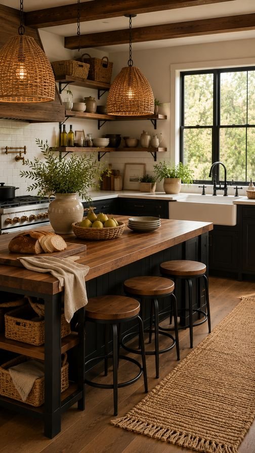
Rattan pendant shades, a jute rug near the sink, woven baskets on open shelves — these small natural-fiber touches are what actually make a kitchen feel “rustic” rather than just “black and white with wood accents.” Don’t skip this layer; it’s easy to forget and it’s doing more work than people give it credit for.
21. A Reclaimed Or Distressed Wood Dining Table Nearby
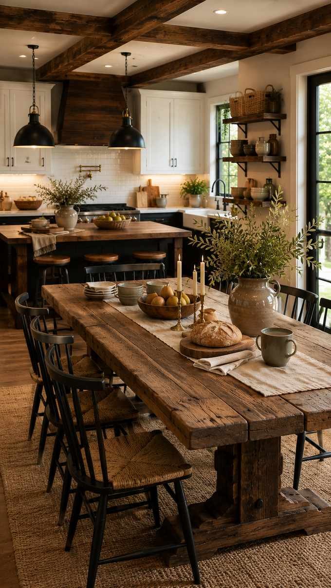
If your kitchen opens into a dining nook or breakfast area, a reclaimed or intentionally distressed wood table ties the whole space together. It doesn’t need to match your island wood exactly, but it should sit in the same general tone family — this is where rule #2 (one wood tone, everywhere) really pays off.
A Few Honest Things Nobody Tells You
A few things I learned that don’t fit neatly into a numbered list but matter just as much:
Black shows everything, in both directions. Matte black cabinets hide fingerprints better than glossy ones, but they show water spots and dust in direct sunlight more than you’d expect. If your kitchen gets a lot of afternoon sun, matte black surfaces near the window will need more frequent wiping down than you’re picturing right now.
White grout is a lie you tell yourself once. I used white grout on my backsplash and within eight months it had picked up a faint yellow tinge near the stove, no matter how often I cleaned it. If I were doing it again, I’d go with a light gray instead of pure white in any grout that lives near heat or oil splatter.
Sample boards matter more than paint chips. Get actual sample pieces of your wood tone, your countertop material, and your cabinet color, and look at them together in your actual kitchen lighting at different times of day. What looked perfectly matched under store lighting looked noticeably different under my kitchen’s mix of morning sun and evening warm bulbs.
Budget for hardware last, but don’t skip it. It’s tempting to spend your whole budget on cabinets and counters and grab whatever handles are cheapest. Don’t. Hardware is one of the most touched, most visible details in the whole room, and cheap hardware looks cheap even against expensive cabinetry.
Quick-Reference: All 21 Ideas By Cost And Effort
If you’re trying to plan rather than just browse, here’s how I’d rank these by rough cost and how disruptive they are to install. “Low” effort generally means a weekend DIY job; “High” effort usually means hired labor and some mess.
| # | Idea | Rough Cost | Effort | Best For |
|---|---|---|---|---|
| 1 | Black lower / white upper cabinet split | $$–$$$ | High | Any kitchen doing a full repaint or reface |
| 2 | Single consistent wood tone | $ | Low | Anyone mixing materials from scratch |
| 3 | Real wood on touchpoints only | $$ | Medium | Budget-conscious full renovations |
| 4 | Brick or brick-look accent wall | $$ | Medium | Open-plan or dining-adjacent kitchens |
| 5 | Shiplap accent wall | $ | Low–Medium | Smaller kitchens needing one focal wall |
| 6 | Exposed/faux ceiling beams | $$$ | High | Kitchens with 8ft+ ceilings |
| 7 | Dark matte accent wall | $ | Low | Kitchens that feel too flat or all-white |
| 8 | Open wood shelving | $ | Low–Medium | Kitchens with upper cabinets away from the stove |
| 9 | Black-framed glass cabinets | $$$ | High | Dining-facing or statement cabinet runs |
| 10 | Two-tone island | $$–$$$ | High | Kitchens with a dedicated island |
| 11 | Metal shelf brackets | $ | Low | Any kitchen with open shelving |
| 12 | Honed black or white stone counters | $$$ | High | Full countertop replacements |
| 13 | Handmade-look subway tile | $$ | Medium | Any full backsplash redo |
| 14 | Butcher block accent counter | $$ | Medium | Islands or single-section upgrades |
| 15 | Contrast grout | $ | Low | Anyone already retiling |
| 16 | Black metal pendant lighting | $$ | Low–Medium | Islands, sinks, breakfast bars |
| 17 | Warm bulb temperature swap | $ | Low | Every kitchen, honestly — start here |
| 18 | Under-cabinet lighting | $$ | Medium | Kitchens mid-renovation with cabinets open |
| 19 | Matte black hardware and faucet | $ | Low | Every budget tier, highest impact-per-dollar |
| 20 | Natural fiber textures (rattan, jute) | $ | Low | Finishing touches on any budget |
| 21 | Reclaimed wood dining table | $$–$$$ | Low (just buying) | Open-plan kitchens with adjacent dining |
($ = budget-friendly, $$ = moderate, $$$ = significant investment — these are relative to each other, not fixed prices, since costs vary a lot by region and material grade.)
How Much Does This Style Actually Cost?
People rarely talk numbers in these articles, so I will, roughly, based on my own project and prices I’ve seen friends pay in similar mid-sized kitchens.
If you’re doing a full renovation — new cabinets, countertops, backsplash, lighting, and hardware — you’re realistically looking at a wide range depending on whether you go custom or semi-custom cabinetry, and whether you hire out labor or do some of it yourself.
Cabinets alone are usually the biggest line item, often taking up a third to half of the total budget. Countertops come next, with butcher block being noticeably cheaper than stone, and honed quartz sitting in the middle between budget laminate and high-end natural stone.
The good news with this particular style is that a lot of the “rustic” character comes from cheaper elements, not expensive ones. Open shelving costs less than upper cabinets.
Faux wood beams cost a fraction of structural ones. Matte black hardware and fixtures are often priced the same as chrome or brushed nickel, just less common in stock at big box stores, so you may need to order online.
If your budget is tight, I’d prioritize cabinets and countertops first, then hardware and lighting, and treat open shelving, brick accents, and beams as the “nice to have” layer you add once the bones are done.
Doing It In Phases If You Can’t Do It All At Once
I didn’t renovate my kitchen in one go, and honestly, I don’t think most people do. Here’s roughly the order I’d recommend if you’re spreading the project out, based on what actually made a visible difference at each stage versus what sat half-finished for months:
Phase one — paint and hardware. Repainting cabinets (even just the lower ones black) and swapping hardware is the cheapest way to see the biggest visible shift, and you can do it in a weekend without touching plumbing or electrical.
Phase two — lighting and backsplash. Pendant lights and a tile backsplash change the mood of the room dramatically and don’t require structural changes.
Phase three — countertops and any structural changes like open shelving or exposed beams. Save these for when you have a clearer budget, since they’re harder to undo once installed.
I did it in almost exactly this order, mostly by accident rather than planning, and looking back it was the right sequence. Doing countertops first would have meant living with an unfinished-looking kitchen for over a year while I saved up for the rest.
Common Mistakes To Avoid
Beyond the ones I already mentioned above, a few more that I either made myself or watched friends make in their own rustic modern kitchens:
Going too dark on a small kitchen. Black cabinets on both top and bottom in a small, low-light kitchen can make the room feel like a cave. If your kitchen is small or doesn’t get much natural light, keep black to the lower half only, or use it as an accent on just the island.
Mixing metal finishes without a plan. Black faucet, brass cabinet handles, and chrome appliance trim in the same room reads as unplanned rather than eclectic. Pick one or two metal finishes maximum and repeat them throughout.
Forgetting ventilation when adding open shelving near the stove. Open shelves look great in photos taken the day they’re installed. A year later, if they’re near your cooktop, they’re often coated in a thin film of grease that’s a pain to clean off unsealed wood. Either seal the wood properly or keep open shelving away from your main cooking zone.
Choosing trend-driven tile that will look dated in five years. Certain tile patterns can date a kitchen fast. Classic subway tile, herringbone, or simple large-format tile tend to hold up better over time than anything too pattern-heavy.
Frequently Asked Questions
Does a black and white kitchen make a small space feel smaller?
Not necessarily. High contrast between black and white can actually make a small kitchen feel more dynamic, as long as you’re strategic about where the black goes. Keeping black to lower cabinets or a single accent wall, while keeping ceilings and upper walls white, tends to work better in smaller spaces than an all-black scheme.
Is rustic modern the same as farmhouse style?
They overlap but aren’t identical. Farmhouse style usually leans heavily on specific motifs — apron sinks, shiplap everywhere, distressed white cabinetry. Rustic modern is broader and less tied to one specific look; it’s really about combining natural, textured materials with a clean, contemporary layout and color palette, which is why it tends to age better than a strict farmhouse theme.
What’s the most budget-friendly way to start?
Paint and hardware, hands down. If you can only do one thing from this whole article, repainting your lower cabinets black (or your uppers white, depending on your starting point) and swapping to matte black hardware will get you further toward this look than almost any other single change, and it’s a project most people can do themselves in a weekend.
Do I need real wood, or can I use wood-look laminate?
For large surfaces like flooring or cabinet fronts, good laminate can look convincing in photos and holds up fine day to day. For anything you touch directly and often — an island top, open shelves, handles — real wood tends to be worth the extra cost, since laminate gives itself away through touch and wear much faster than it does through sight.
How do I keep a black and white kitchen from feeling cold?
Warm lighting, natural wood tones, and texture — that’s really the whole answer. A black and white kitchen with cool white bulbs, all-laminate surfaces, and no natural materials will feel sterile no matter how nice the layout is. Add warm bulbs, real wood somewhere prominent, and at least one or two natural fiber textures (a rug, woven baskets, a rattan light shade), and the same color palette suddenly feels warm instead of clinical.
Final Thoughts
A rustic modern black and white kitchen isn’t about following a strict formula — it’s really about balancing two moods that don’t naturally sit together: the clean confidence of black and white, and the warmth and imperfection of rustic materials. The ideas above worked for me because I kept coming back to that balance every time I had to make a decision, whether it was a paint color or a cabinet handle.
You don’t need all 21 ideas in one kitchen — honestly, that would probably be too much. Pick the ones that fit your space, your budget, and how you actually use your kitchen, and build outward from there. That’s really the only advice that mattered in my whole renovation, and it’s the one thing I wish someone had told me on day one instead of just showing me another photo gallery.
 Sumit Banerjee
[…] Check – Rustic Modern Black And White Kitchen Design Ideas […]
[…] Also Check – Rustic Modern Black And White Kitchen Design Ideas […]