
Black countertops are one of those choices that either make a kitchen or completely overwhelm it, and the difference almost always comes down to what’s happening around them — especially the tile.
I’ve walked through more kitchen renovations than I can count over the years, and I’ve watched homeowners get the countertop right and then freeze up when it’s time to pick tile, because black is unforgiving.
It shows off good choices and bad ones with equal honesty.
What I want to do here is walk you through nineteen tile directions that genuinely pair well with black countertops, based on what I’ve actually seen hold up in real kitchens — not just in a showroom under perfect lighting.
Some of these are safe and classic, some are a little bolder, and a couple are for people who want their kitchen to feel like nobody else’s.
Pick whichever one fits how you actually live, not just how you want the photos to look.
1. Crisp White Subway Tile
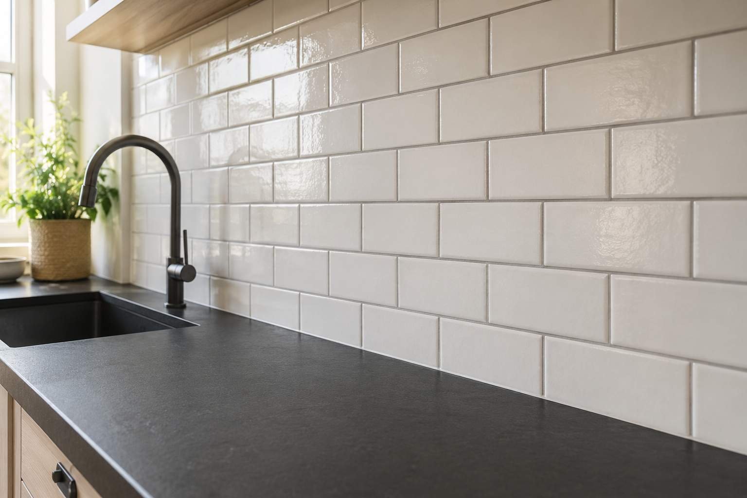
This is the pairing most people land on first, and there’s a reason it never really goes out of style. White subway tile against a black countertop gives you that clean, high-contrast look that photographs well and, more importantly, lives well day to day. The trick is in the grout. Bright white grout will show grease splatters near the stove within a few months, so I usually steer people toward a light grey grout instead — it hides the small stuff without dulling the crispness of the tile.
2. Handmade Zellige Tile in Off-White
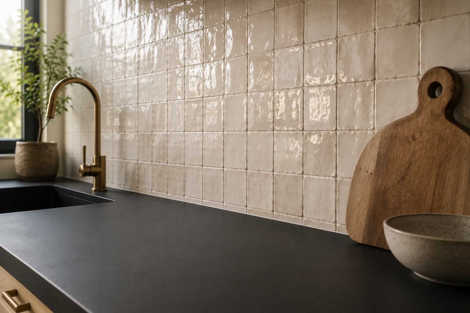
If subway tile feels too plain for your taste, zellige is the upgrade. These are the slightly irregular, hand-glazed tiles from Morocco, and every single one has a bit of a wobble to it, no two tiles reflect light the exact same way. Against a flat black countertop, that texture does a lot of work. It stops the kitchen from feeling too sharp or clinical. It’s pricier than machine-made tile and takes a more patient installer, but the depth it adds is hard to replicate any other way.
3. Black-and-White Checkerboard Floor
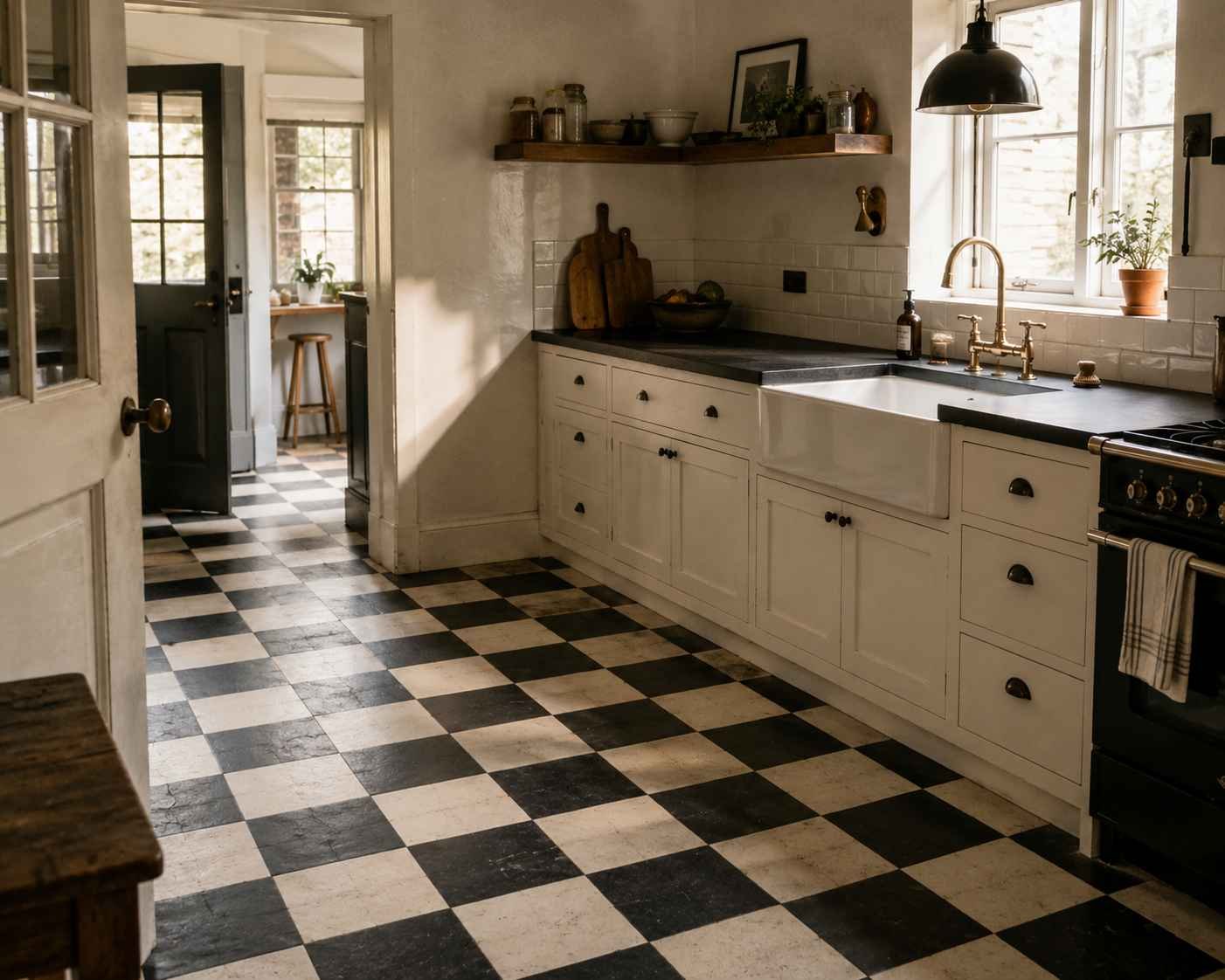
Most people think about wall tile first and forget the floor can carry just as much weight. A checkerboard floor, especially in a slightly worn or matte finish, gives a black countertop something to talk to. This works particularly well in older homes or anywhere you’re going for a diner-meets-farmhouse feel. Keep the walls simple if you go this route — plain white or a soft plaster tone — because the floor is already doing the loud work.
4. Deep Green Ceramic Tile
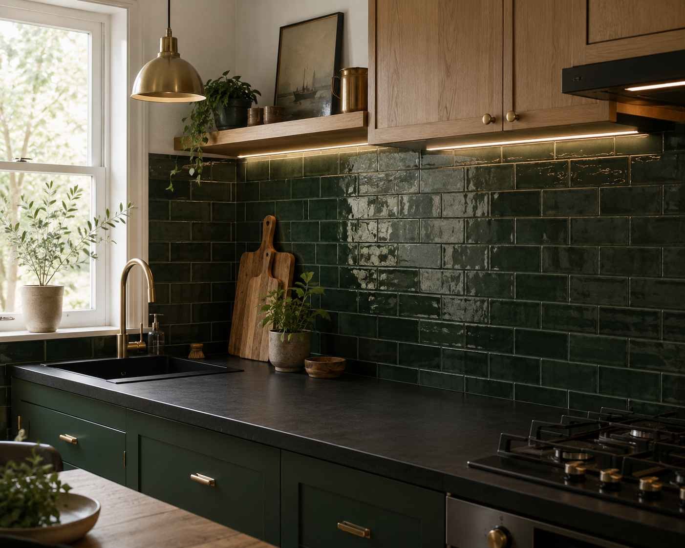
Green and black together read as moody in the best way. A deep bottle green or hunter green tile on the backsplash pulls warmth out of a black countertop that might otherwise feel a little cold or industrial. I’ve done this in a few smaller kitchens and it never once felt claustrophobic, which surprises people. Dark colors next to each other don’t automatically shrink a room — it’s usually the lighting and the finish that matter more than the color itself.
5. Warm Terracotta Tile

Terracotta brings the opposite energy of glossy white subway tile — it’s earthy, a little rustic, and it softens a black countertop instead of sharpening it. This pairing tends to suit kitchens with wood cabinetry or open shelving, where you want everything to feel lived-in rather than showroom-perfect. Go for a matte or lightly glazed terracotta rather than a high-shine version; the whole appeal here is that grounded, sun-baked look.
6. Glossy Glass Subway Tile
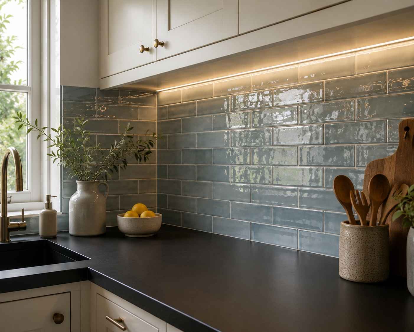
Glass tile reflects light in a way ceramic just can’t, and next to a black countertop that reflection becomes almost jewel-like, especially under warm undercabinet lighting. A soft blue-grey or seafoam glass tile keeps things airy without fighting the darkness of the counter. One thing worth knowing before you commit — glass tile shows water spots more than ceramic, so if you’re not someone who wipes down the backsplash daily, this might not be your best long-term match.
7. Large-Format Marble-Look Porcelain
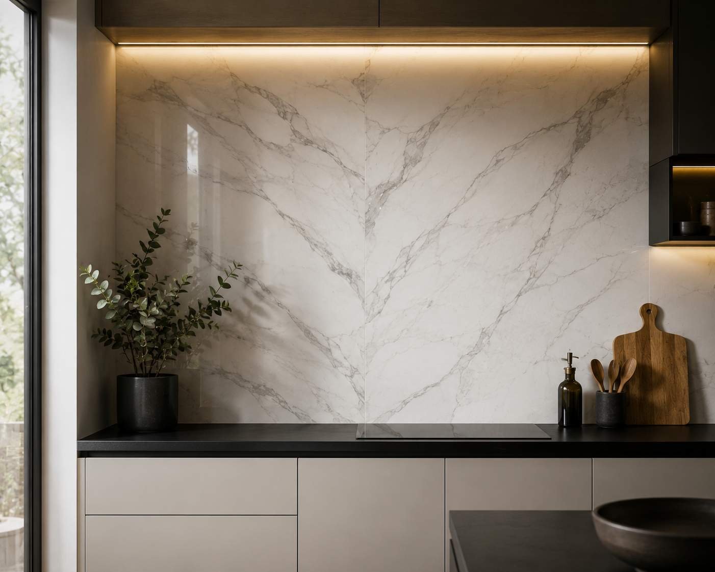
If you love the look of marble but not the maintenance headache, marble-look porcelain has come a long way. Large slabs of it running up the wall behind a black countertop give you that quiet, high-end feel without the sealing and staining worries real marble brings. I’d recommend going as large-format as your installer is comfortable with — fewer grout lines mean the veining reads more like a continuous natural stone surface instead of a repeated tile pattern.
8. Herringbone Pattern in Neutral Tone
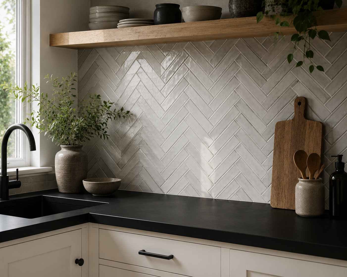
Pattern doesn’t have to mean color. A herringbone layout in a soft grey or warm white gives the eye something to follow without introducing a new palette into the room. It’s a great option for people who are drawn to texture and movement but nervous about anything too bold sitting next to black. Herringbone also happens to be a good disguise for slightly uneven walls, which is more common in older houses than people expect.
9. Matte Black Tile Backsplash

Sometimes the boldest move is doubling down. A matte black tile backsplash paired with a black countertop creates a monochrome look that feels intentional and calm rather than heavy — as long as you break it up somewhere. This usually means light cabinetry, a pale floor, or strong natural light coming into the room. Without one of those relief points, an all-black kitchen can start to feel like a cave, so plan the rest of the room with that balance in mind.
10. Blue and White Delft-Style Tile
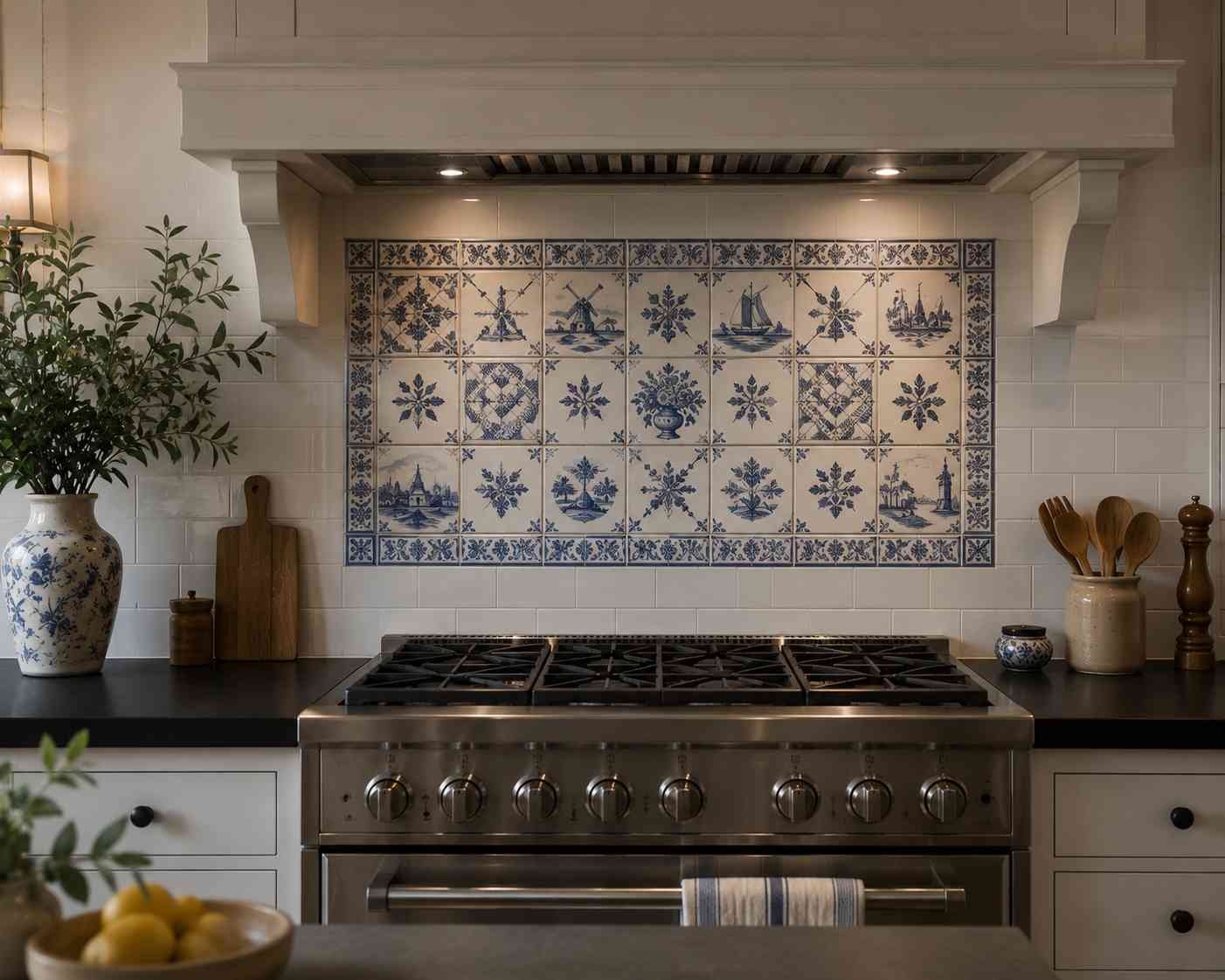
This is a favorite for kitchens that want a bit of personality and storytelling built into the walls. Delft-style tile, with its hand-painted blue florals and scenes on white, adds detail that a plain backsplash never could. Against black, the blue reads richer and the white pops harder than it would against a lighter counter. It’s a strong choice, so I usually suggest using it as an accent strip or behind the range rather than covering an entire wall — a little goes a long way.
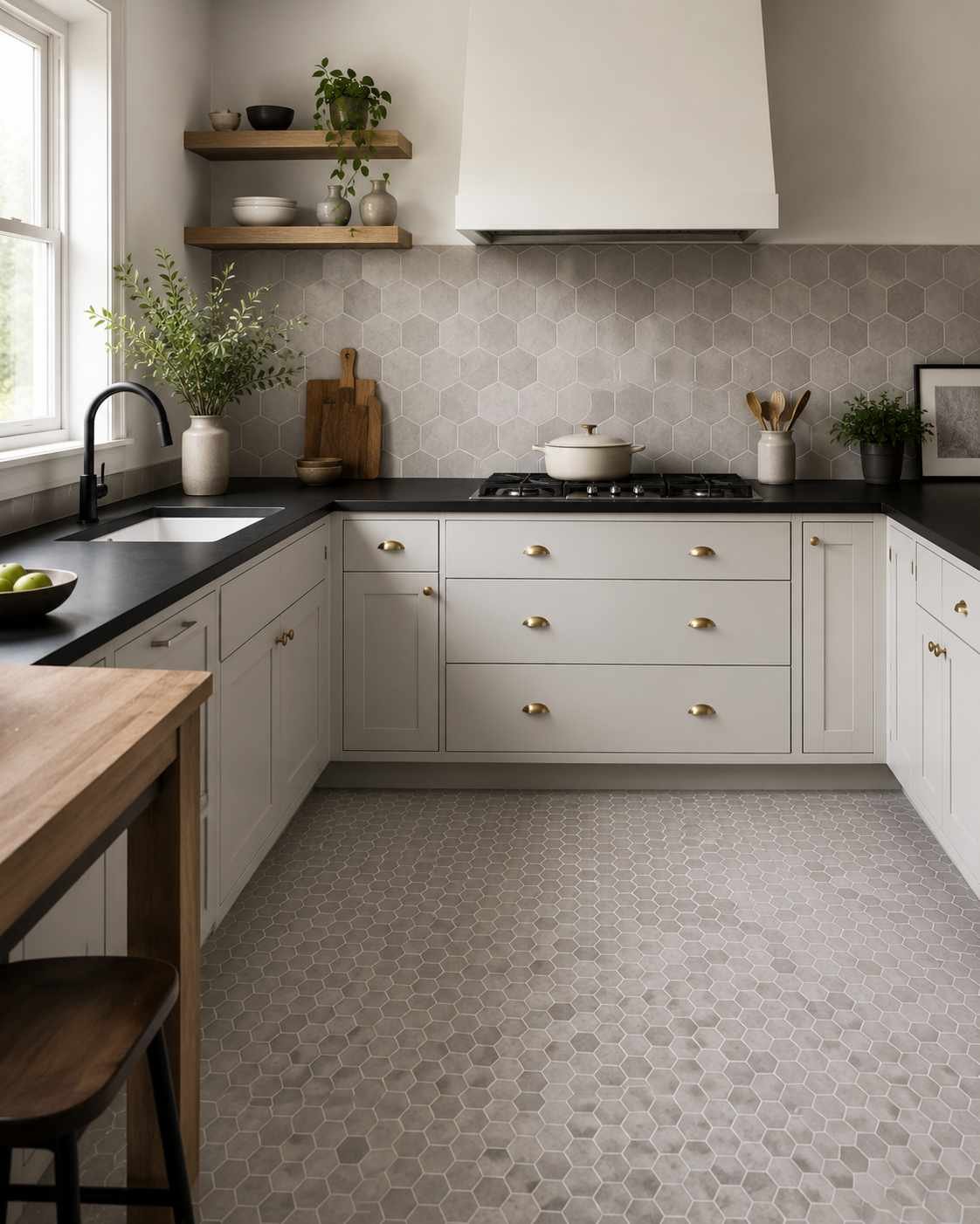
11. Hexagon Tile in Soft Grey
Hexagon tile has a playful geometry to it without being loud, and a soft grey tone keeps things from tipping into “trendy for five years and then dated.” It’s a solid middle-ground choice for anyone who wants texture and shape but doesn’t want the backsplash to become the main event in the room. Smaller hexagon tiles also work beautifully on a kitchen floor if you want to carry the shape through the whole space.
12. Warm Beige Travertine
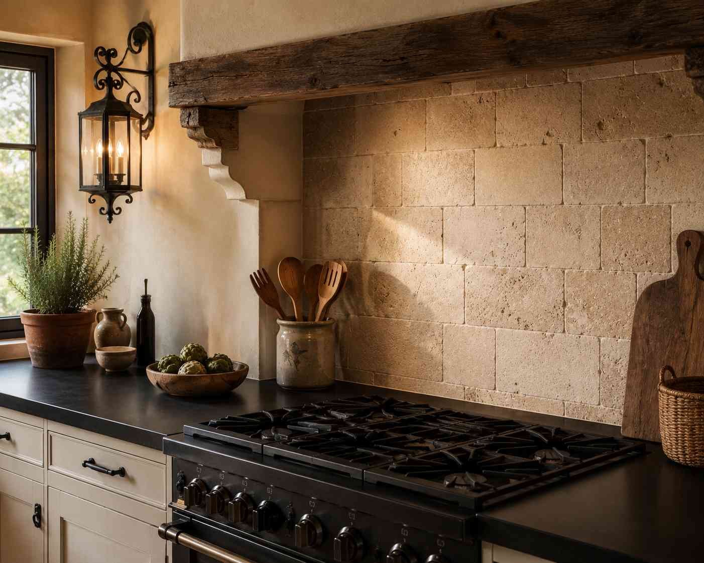
Travertine has natural pitting and warmth that a lot of manufactured tiles try to imitate and rarely nail. Against a black countertop, a warm beige or ivory travertine backsplash softens the whole kitchen and keeps it from feeling too stark or modern. This is a great pick for kitchens that lean Mediterranean or old-world in style, especially when paired with wood beams or wrought iron fixtures elsewhere in the room.
13. Bold Encaustic Pattern Tile
Encaustic tiles carry their pattern all the way through the material rather than just glazed on the surface, and the patterns themselves tend to be intricate — think Moroccan or Spanish-inspired geometrics in multiple colors. Used as flooring or a statement wall behind open shelving, they give a black countertop kitchen a focal point that doesn’t rely on color contrast alone. Keep the rest of the kitchen quiet if you go this route; these tiles don’t need competition.
14. Brick-Look Tile in Red or Rust
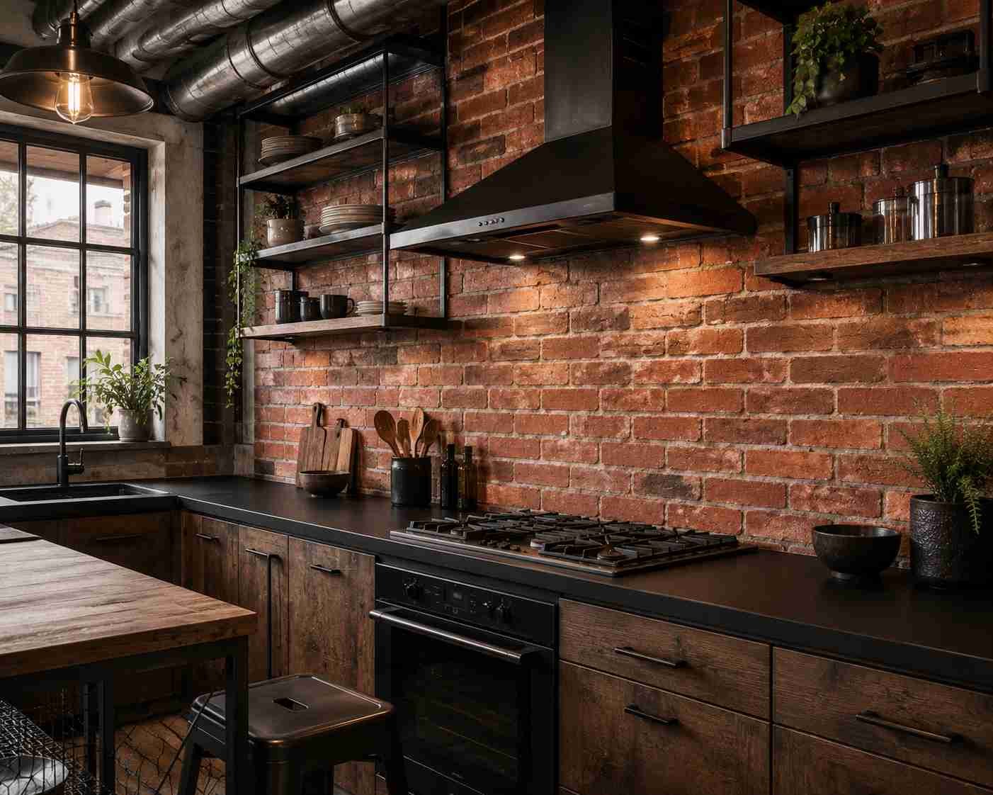
There’s something about a red-brick backsplash next to a black countertop that feels almost industrial-loft in the best sense. It works especially well in kitchens with exposed elements — open ductwork, metal shelving, that kind of thing. The rust and red tones warm up what could otherwise be a very cool, hard-edged palette, and the slightly rough texture of brick-look tile adds a tactile quality that flat tile just doesn’t have.
15. Soft Pink Zellige or Ceramic
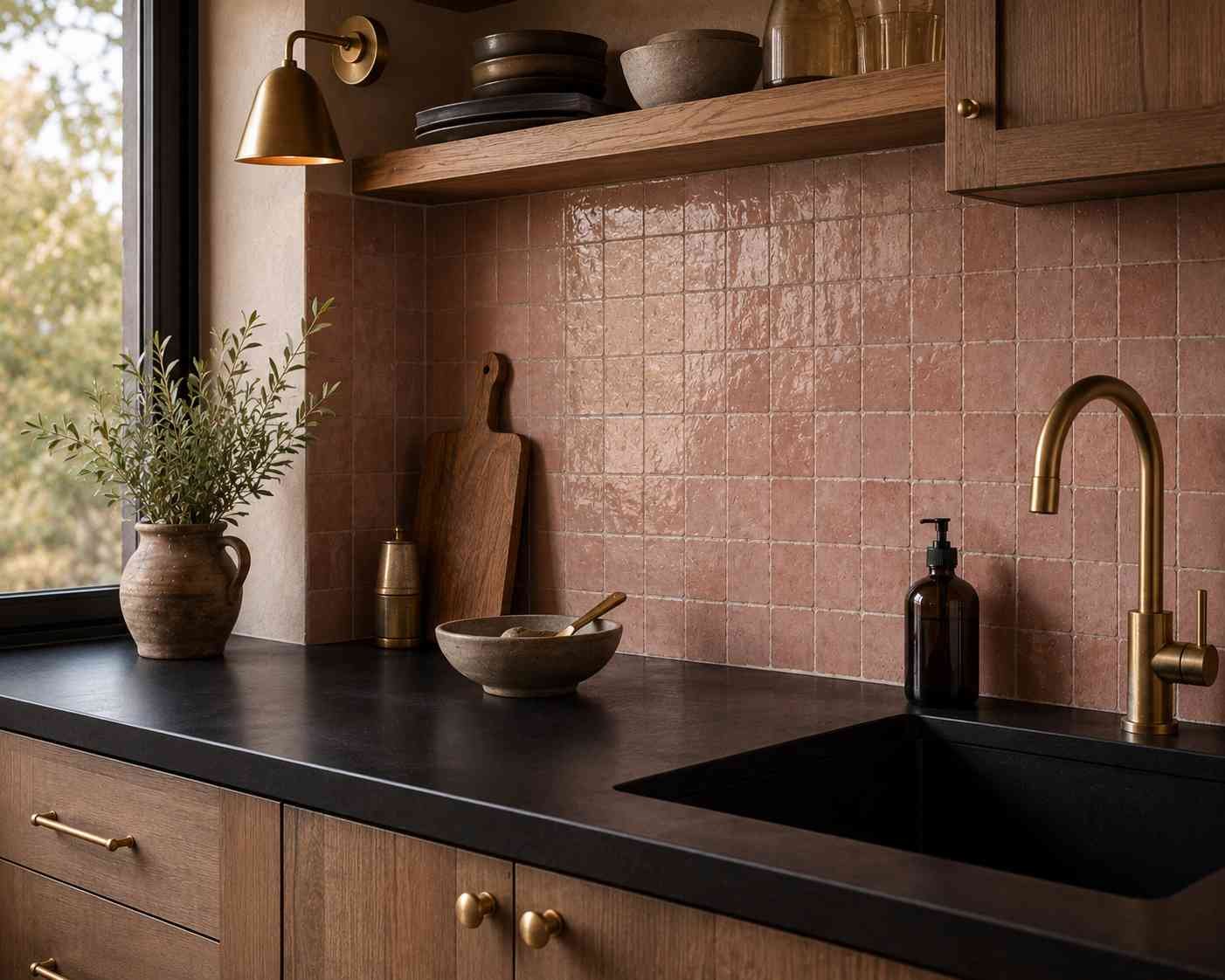
This one surprises people, but a muted, dusty pink tile against black is a lot more sophisticated than it sounds on paper. It’s not bubblegum pink — think more like a faded clay or blush tone. Against a matte black countertop, it reads warm and a little romantic without pushing the kitchen into overly feminine territory. This pairing tends to work best in kitchens that already lean toward brass hardware and warm wood tones.
16. Charcoal Grey Textured Tile
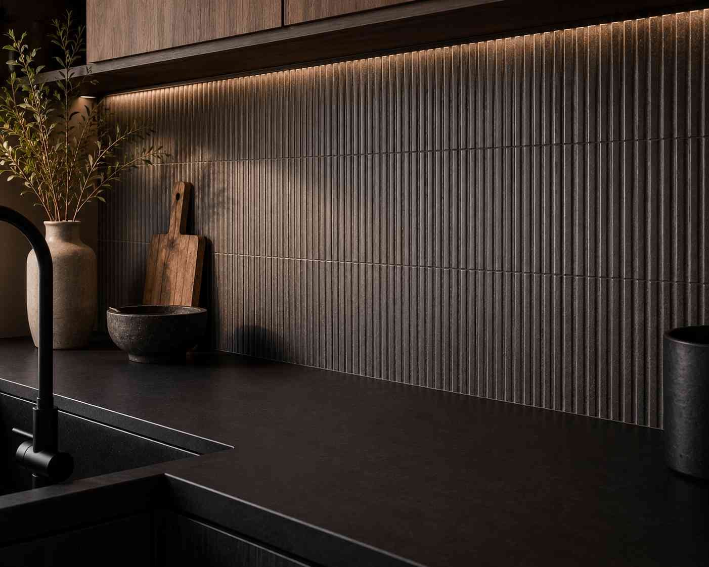
If pure black feels like too much but you still want that dark, grounded look, charcoal grey textured tile is the compromise. It’s close enough to the countertop tone to feel cohesive but has just enough separation to avoid looking like an accident. Textured or ribbed grey tile also catches light in an interesting way, which helps prevent the wall from looking flat or one-note next to a matte black counter.
17. Vintage-Style Floral Tile
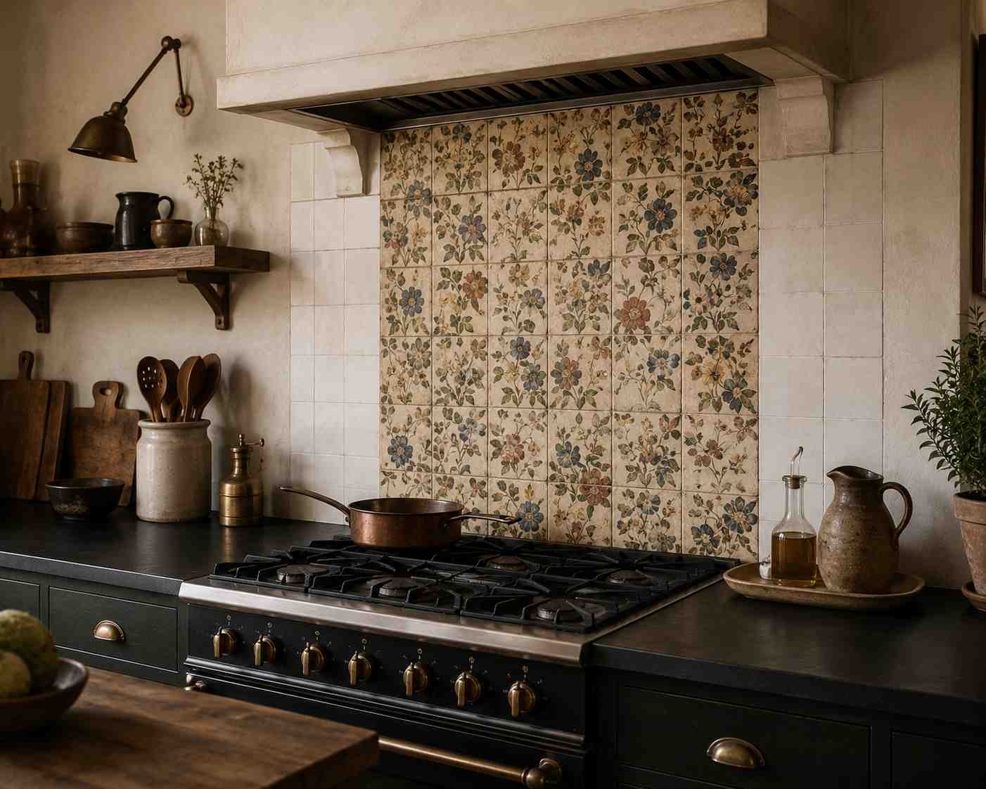
For kitchens that want personality over polish, a vintage floral tile — the kind you might find in an old European kitchen — brings warmth and history into a space that could otherwise feel very new and very dark. This works especially well as a backsplash behind the stove, framed by simpler tile or plain painted wall on either side. It’s one of those choices that makes a kitchen feel collected over time rather than bought all at once.
18. Two-Tone Geometric Tile

Rather than picking one tile and one color, some of the most memorable kitchens I’ve worked on use a two-tone geometric pattern — think triangles, chevrons, or interlocking shapes in two complementary colors. Against black, this reads as confident and current without feeling like a passing trend, especially if you keep the two tones close in value rather than high-contrast. It’s a good option if you want the backsplash to be the room’s main character.
19. Natural Stone Slate Tile
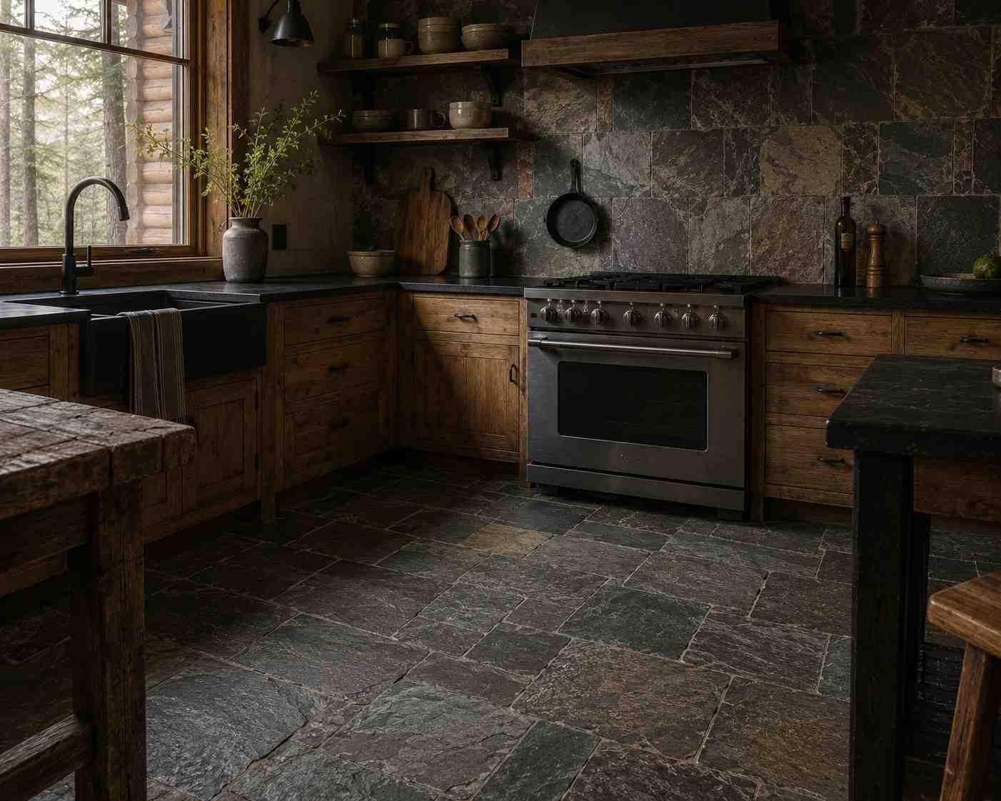
Slate has a rough, almost slightly uneven surface with subtle color variation running through grey, green, and even purple undertones. Next to a black countertop, slate tile creates a very grounded, almost cabin-like feel, especially when used on the floor as well as the backsplash. It’s a tile that ages well and hides wear naturally, which makes it a practical pick for a kitchen that’s going to see a lot of daily use rather than sit untouched for photos.
A Few Things I’d Think About Before You Choose
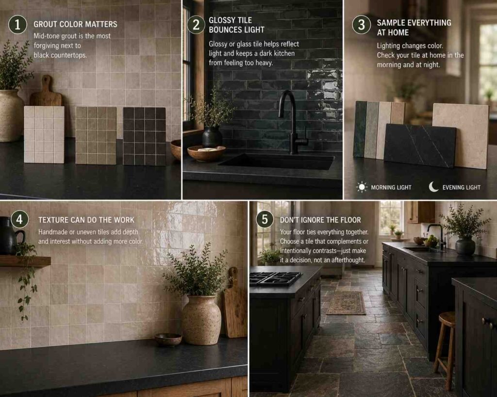
Grout color matters more than people expect. I’ve seen a beautiful tile choice get ruined by the wrong grout, and I’ve seen an average tile look expensive because the grout was picked with intention. Next to black countertops, mid-tone grout, not stark white, not jet black tends to be the most forgiving over time.
Glossy tile bounces light around a dark kitchen. If your kitchen doesn’t get much natural light, a black countertop can eat brightness fast. Glossy or glass tile on the walls helps push some of that light back into the room, which matters more than people realize until they’re standing in a kitchen that feels darker than they pictured.
Sample everything at home, not just in the store. Store lighting is almost always warmer and more flattering than home lighting. Bring a tile sample and a small piece of your countertop material or a photo if the counter’s already in, and look at them together under your actual kitchen lights, morning and evening both. Colors shift more than you’d think.
Texture can do the job color usually does. If you’re worried about too much going on, remember that texture alone through zellige, handmade tile, or a slightly uneven surface can add interest without adding a new color to balance.
Don’t ignore the floor. A lot of planning goes into the backsplash and almost none into the floor, but the floor tile is in the same room doing just as much visual work. Whatever you choose there should either match the calm of your walls or intentionally contrast with them just make sure it’s a decision, not an afterthought.
Living With a Black Countertop Day to Day
One thing worth mentioning, since it comes up in almost every kitchen project: black countertops hide grime and stains far better than white or light-colored stone, but they show water spots, dust, and fingerprints more obviously, especially in a matte finish under direct light.
A honed or matte black surface is more forgiving on this front than a high-gloss one. It’s a small detail, but it changes how the kitchen feels to actually live in, not just look at.
Tile choice can help balance this out too. Lighter, glossier tile on the walls tends to make small marks on the counter less noticeable, since the eye is drawn upward rather than down at counter level. It’s a small trick, but it works.
Wrapping This Up
There isn’t one correct tile for a black countertop kitchen there’s the one that fits the mood you’re actually going for and the way your family uses the space.
A young family with kids running through the kitchen probably wants something more forgiving and durable, like ceramic subway tile or slate.
A couple who cooks elaborate dinners and entertains often might lean into something more dramatic, like zellige or an encaustic pattern.
Whichever direction you go, take your time with samples, look at them in your own light, and don’t be afraid to mix textures instead of relying only on color to do the work.
Black countertops give you a strong, quiet base to build from the tile is where the personality of the kitchen actually shows up.
 Sumit Banerjee