
I’ve walked through more kitchen renovations than I can count at this point, and if there’s one thing that surprises homeowners every single time, it’s how much the floor changes the feel of a room. People obsess over cabinet color and countertop material, and then treat the floor like an afterthought — until it’s installed, and suddenly it’s the thing tying everything together or fighting against it.
Flooring is also the one surface in a kitchen that takes real physical abuse. Dropped cast-iron pans, spilled olive oil, a dog running through with wet paws, five years of foot traffic in the exact same path between the fridge and the stove. So when someone asks me for kitchen flooring ideas, I don’t just think about what looks good in a photo. I think about what looks good after eighteen months of actual cooking.
Here are 23 ideas I keep coming back to, organized not as a random scroll of pretty pictures, but by the actual decisions you’ll need to make: pattern, material, color, and the practical stuff nobody mentions until it’s too late.
Pattern-Driven Ideas (Where Herringbone Comes In)
1. Classic herringbone in a neutral porcelain
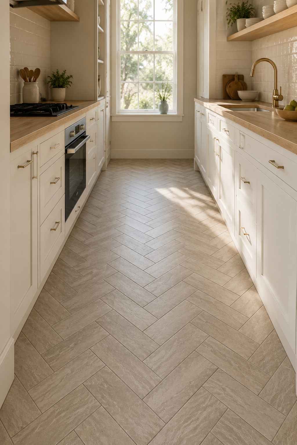
This is the one everyone asks about first, and for good reason. Herringbone creates a zigzag rhythm that pulls the eye forward, which is exactly what a long, narrow kitchen needs. I’ve seen it make galley kitchens feel almost twice as deep. The trick is scale — go too small with the plank size and the whole floor turns busy and hard to look at; go slightly larger (around 3×12 or 4×16 inch pieces) and the pattern reads as elegant rather than chaotic.
2. Herringbone laid on the diagonal
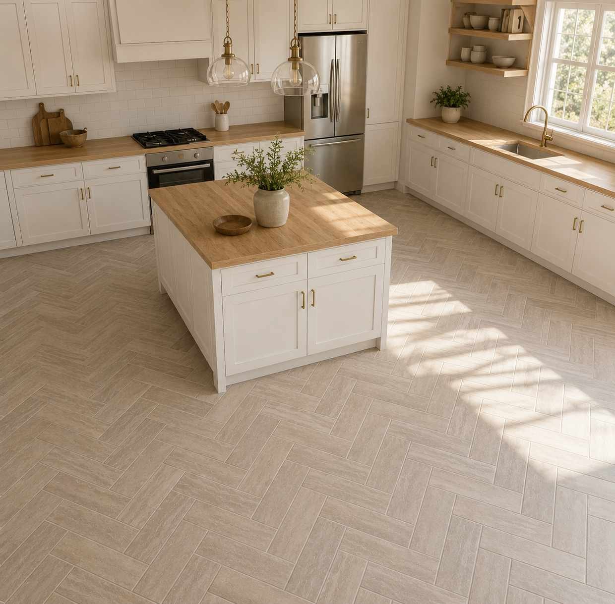
Most herringbone runs parallel to the walls. Rotate the entire layout 45 degrees and you get something a lot less expected. It’s a small change that has a big effect — it makes a square kitchen feel less boxy because your eye can’t immediately find the “grid” of the room anymore.
3. Double herringbone (basket-weave hybrid)
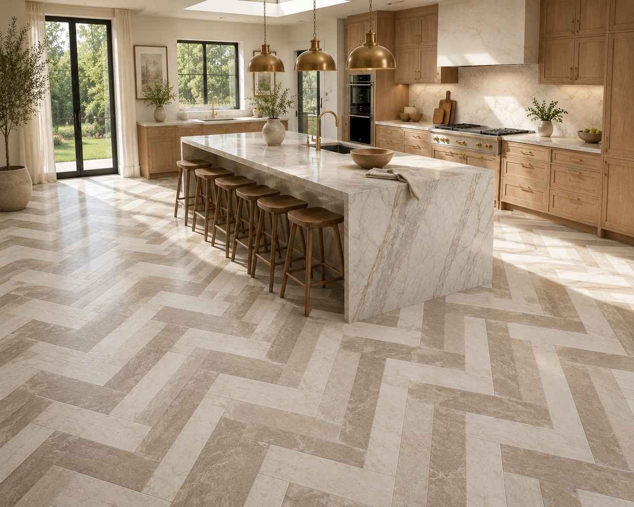
Instead of single planks zigzagging, pairs of planks are grouped together before the direction flips. It reads more like a woven basket than a traditional herringbone. This one works particularly well in kitchens with a lot of open floor space, like an island kitchen, where a bold pattern has room to breathe instead of getting chopped up by cabinetry.
4. Chevron instead of herringbone
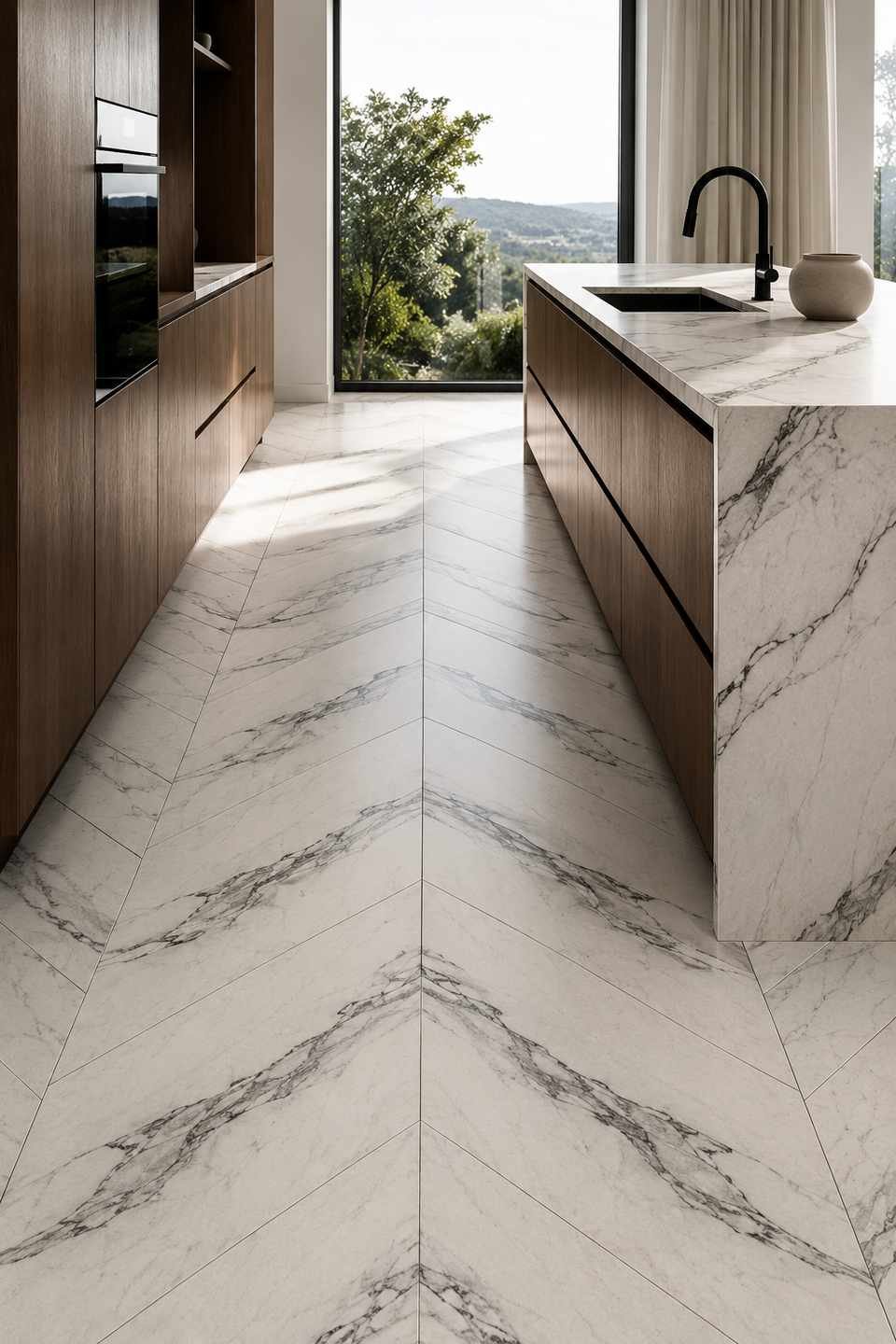
People use these terms interchangeably, but they’re not the same thing. Herringbone pieces meet at a 90-degree offset, so the seams zigzag. Chevron pieces are pre-cut at an angle so the ends meet in a clean point, forming a continuous V. Chevron feels sharper and more formal; herringbone feels a little more relaxed and traditional. If your cabinetry is very modern and minimal, chevron often matches that energy better.
5. Herringbone as a floor “rug”
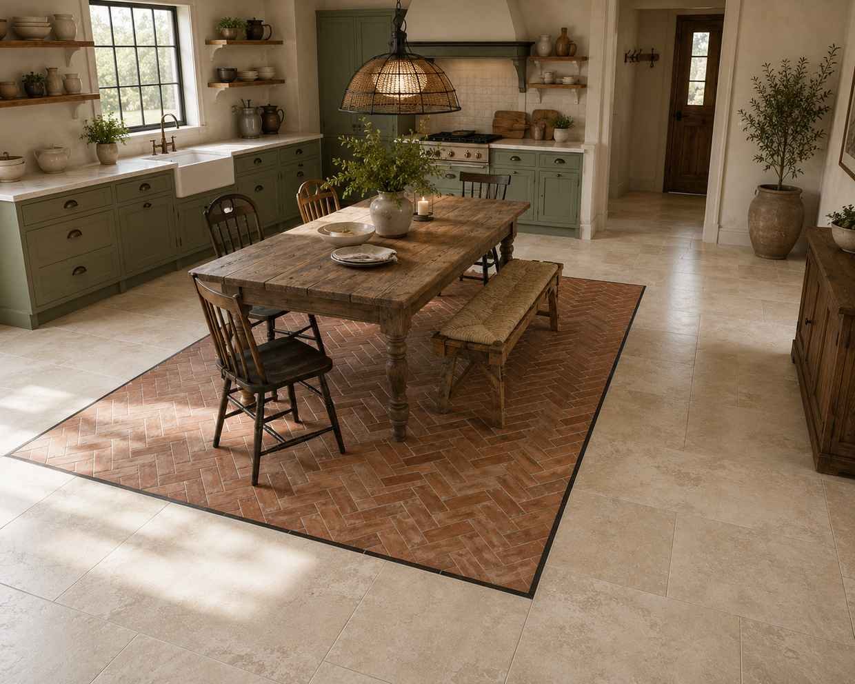
Rather than covering the whole kitchen in herringbone, some of the best-looking floors I’ve come across use it as a defined zone — say, under a farmhouse table or in front of a range — bordered by a straight-laid field tile everywhere else. It gives you the drama of the pattern without the cost of tiling an entire kitchen in a labor-intensive layout (herringbone typically costs more in labor because of all the cuts).
6. Basketweave with contrasting grout
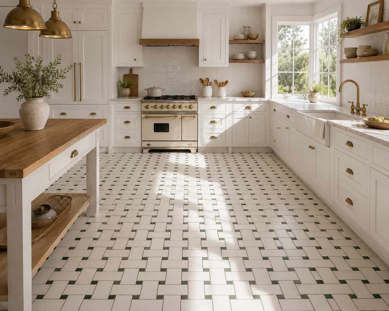
This isn’t herringbone, but it belongs in the pattern conversation. Small square and rectangular tiles are arranged to look like woven fabric, and when you pick a grout color that contrasts instead of matches, the geometry becomes the star of the room rather than a quiet background texture.
Also Check – Pair Quartz Countertops with Wood Kitchen Cabinets
Material-First Ideas
7. Wood-look porcelain tile
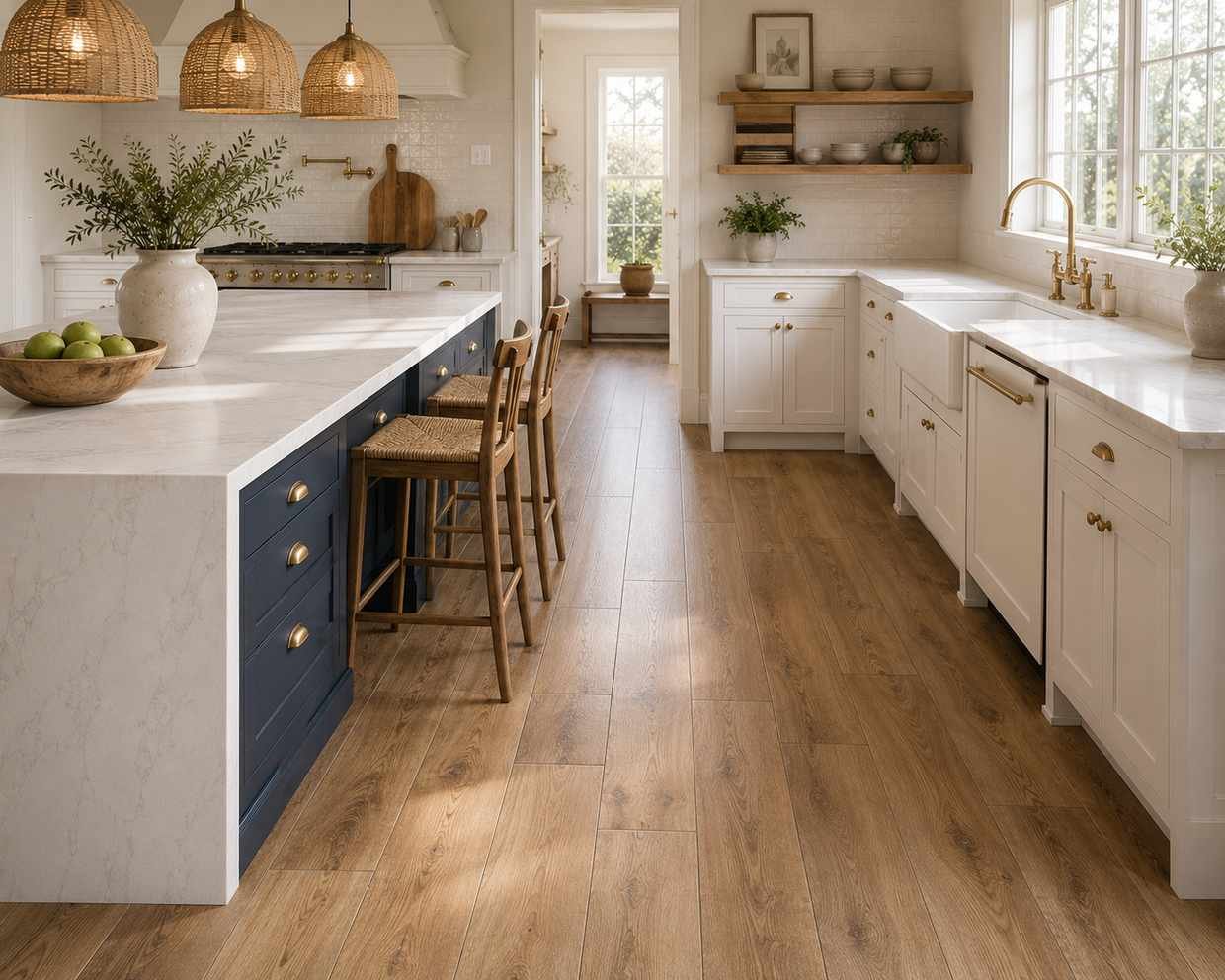
This is probably the single most requested material combination I run into now. People want the warmth of hardwood in a room that regularly floods with water, grease, and dropped ice cubes. Modern printing technology on porcelain has gotten good enough that from three feet away, most people can’t tell it isn’t real wood — but it won’t warp, cup, or stain the way actual hardwood can near a sink or dishwasher.
8. Large-format tile with minimal grout lines
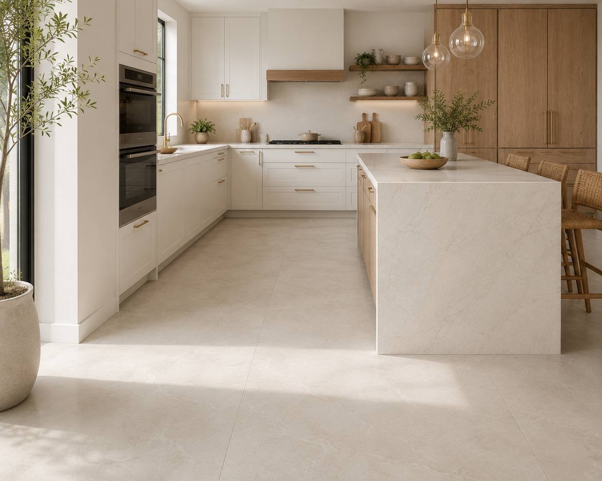
Bigger tiles, fewer grout lines, less visual clutter. A 24×24 inch or even 24×48 inch tile can make a small kitchen feel considerably larger because the eye isn’t tripping over a grid of seams every twelve inches. It also means less grout to clean, which matters more than people expect once they’re living with the floor day to day.
9. Natural stone, sealed properly

Travertine, slate, and limestone bring a texture that manufactured tile struggles to fully copy. The catch is maintenance — natural stone is porous and needs to be sealed on a schedule, usually once a year in a kitchen, or it will stain from wine, tomato sauce, and turmeric faster than you’d think. If you love the look but don’t want the upkeep, this is where the wood-look and stone-look porcelains earn their keep.
10. Terrazzo, old and new

Terrazzo went from “grandma’s building lobby” to a genuine design trend over the last several years, and I understand why. The flecked, speckled surface hides crumbs and small stains extremely well, which is a real advantage in a room where flour dust is a daily occurrence. Newer terrazzo tiles come in softer, custom color combinations rather than just the old gray-and-white municipal look.
11. Encaustic-style patterned cement tile (or the porcelain version)

Bold, Mediterranean-inspired patterns in blues, terracottas, and blacks have made a strong comeback, usually as an accent under an island or near a breakfast nook rather than across an entire floor. True cement encaustic tile needs sealing and is soft compared to porcelain, so I usually point people toward the porcelain versions that mimic the pattern — same visual punch, much easier to live with.
12. Polished or stained concrete
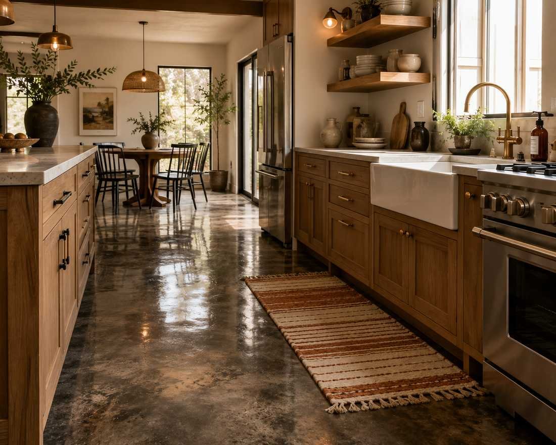
If the kitchen sits on a slab foundation, staining and polishing the existing concrete is one of the more overlooked options. It’s seamless, industrial without feeling cold if you warm it up with the right cabinetry, and there’s no tile to crack or grout to stain. The downside is that concrete is hard and cold underfoot, so a lot of people pair it with a strategically placed washable runner near the sink.
13. Reclaimed or engineered hardwood, sealed for kitchen use

Solid hardwood in a kitchen used to be a firm no from most flooring people, but engineered wood with a strong factory finish has changed that conversation. It’s more dimensionally stable than solid wood and handles minor humidity swings better. It’s still not ideal directly in front of a sink with no rug, but for an open kitchen flowing into a dining or living room, matching the wood throughout the whole floor plan creates a continuity that tile just can’t replicate.
Color and Finish Ideas
14. Warm greige and taupe tones
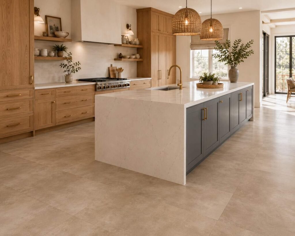
Stark white kitchens have started to soften. What I’m seeing far more of now is a warmer, greige-toned floor that reads as neutral without feeling clinical. It plays well with both warm wood cabinetry and cooler painted cabinets, which makes it a safer long-term choice if you think you’ll repaint cabinets before you replace the floor.
15. Deep charcoal or near-black tile
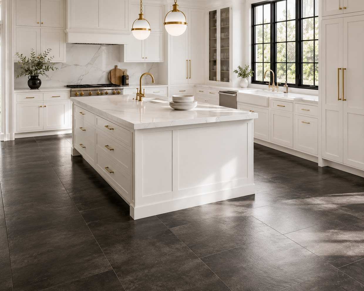
A dark floor grounds a kitchen and hides scuffs shockingly well — better, honestly, than a pure white floor does. The trade-off is that dust and dry footprints show up more on matte dark tile than people expect, so a slight sheen or texture helps mask that day-to-day reality.
16. Two-tone floors that mark a “zone”
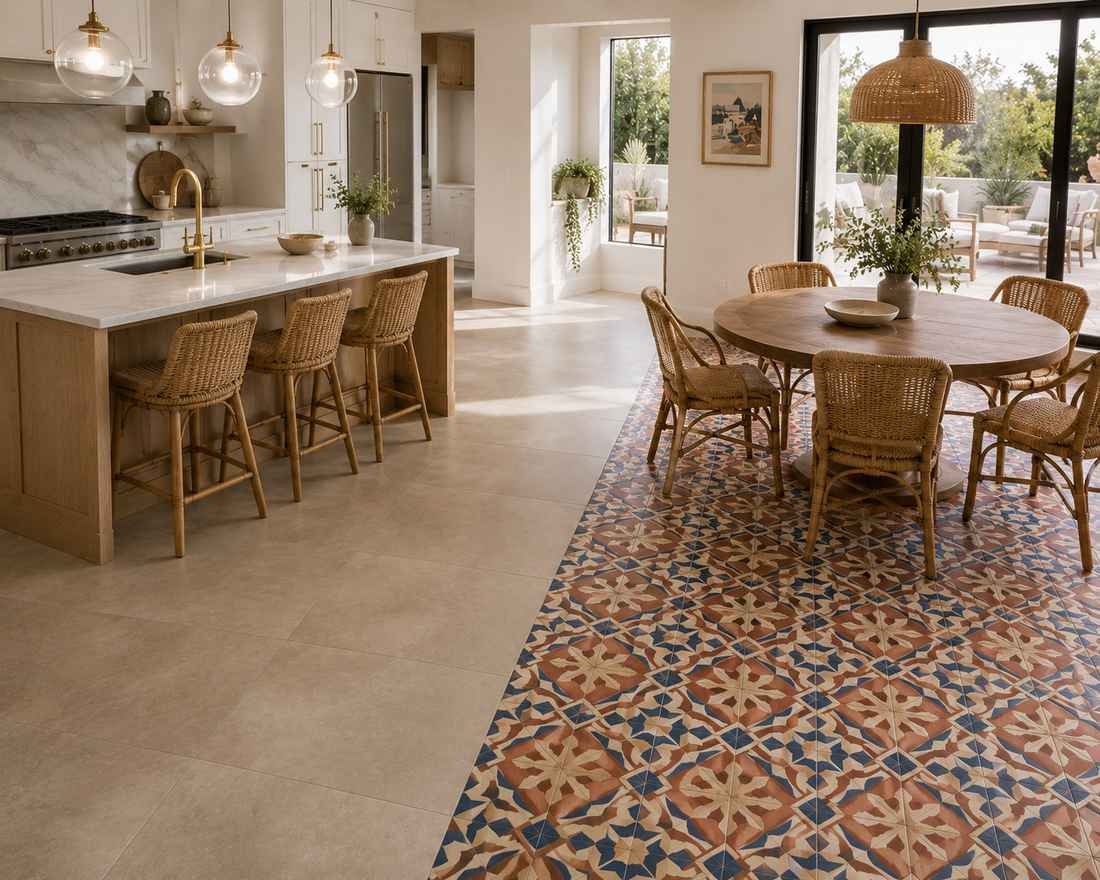
Rather than a single continuous floor, some kitchens now use one tile in the cooking and prep zone and a slightly different tone or material where the dining table sits. It’s a subtle way of zoning an open floor plan without putting up a wall, and it lets you be a little more adventurous with a bold pattern in a smaller area.
17. Matte finish over high-gloss
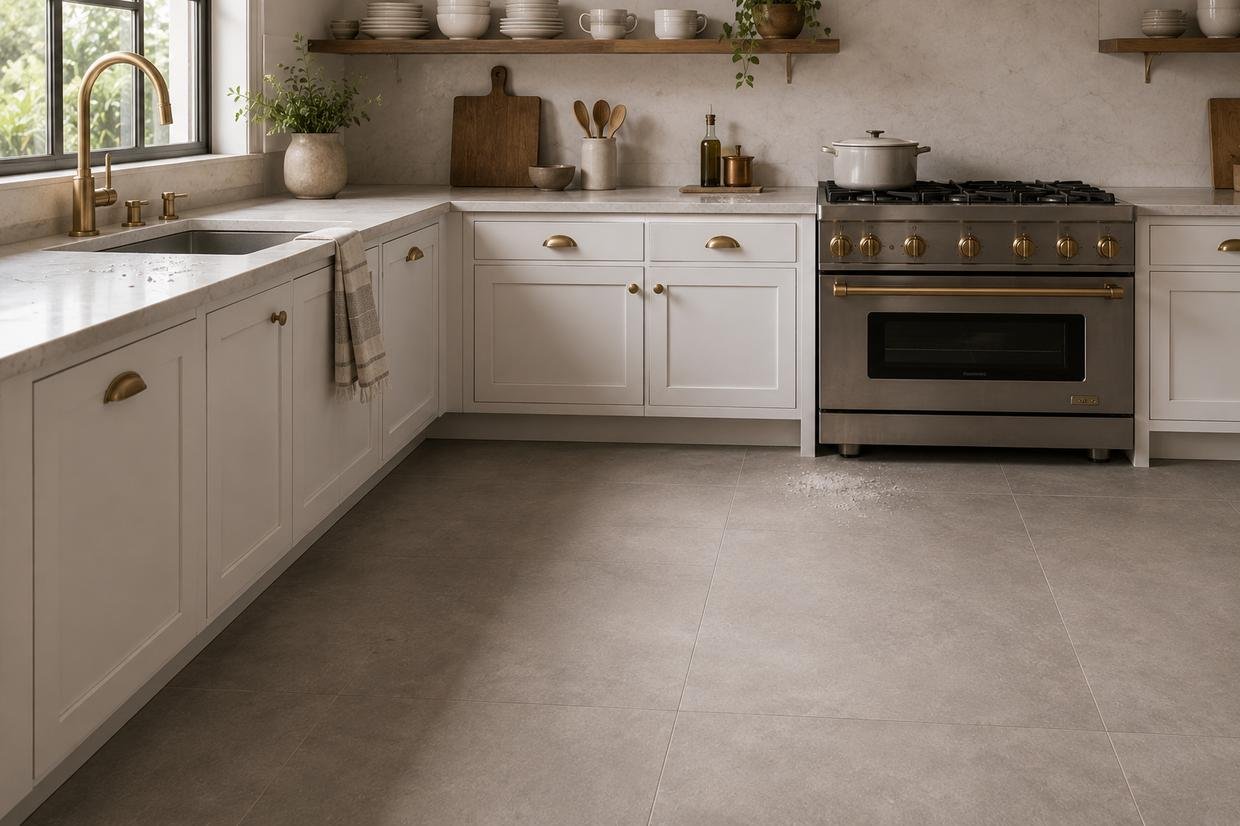
Glossy tile photographs beautifully but shows every water spot, footprint, and streak within an hour of mopping. Matte and honed finishes have become the practical default in working kitchens, especially near the sink and stove, because they simply hide daily life better while still looking intentional and current.
18. Grout color as a design decision, not an afterthought
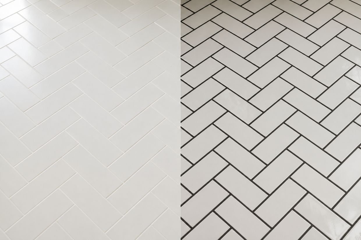
This is one of the most underrated levers in the whole project. The same tile can look completely different depending on whether the grout matches it closely (quiet, seamless) or contrasts sharply (graphic, pattern-forward). If you’re doing herringbone or basketweave, grout color is arguably as important as the tile choice itself, because it’s what actually draws the pattern your eye follows.
Also Check – Blue and Grey Kitchen Design Ideas
Layout and Space-Planning Ideas
19. Diagonal field tile for small kitchens
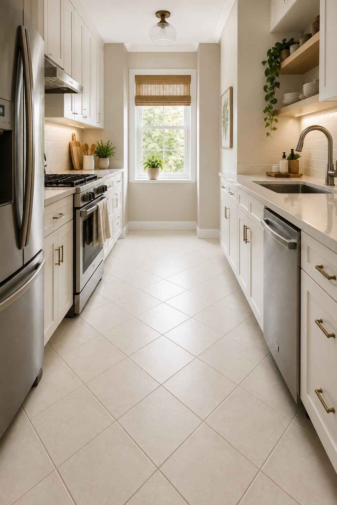
Even without a herringbone or chevron pattern, simply laying a standard square tile on a 45-degree diagonal instead of straight against the walls can make a small kitchen feel bigger. It’s a trick I’ve used in more than one narrow apartment kitchen where a straight grid made the walls feel closer together than they actually were.
20. Consistent flooring through an open-concept layout
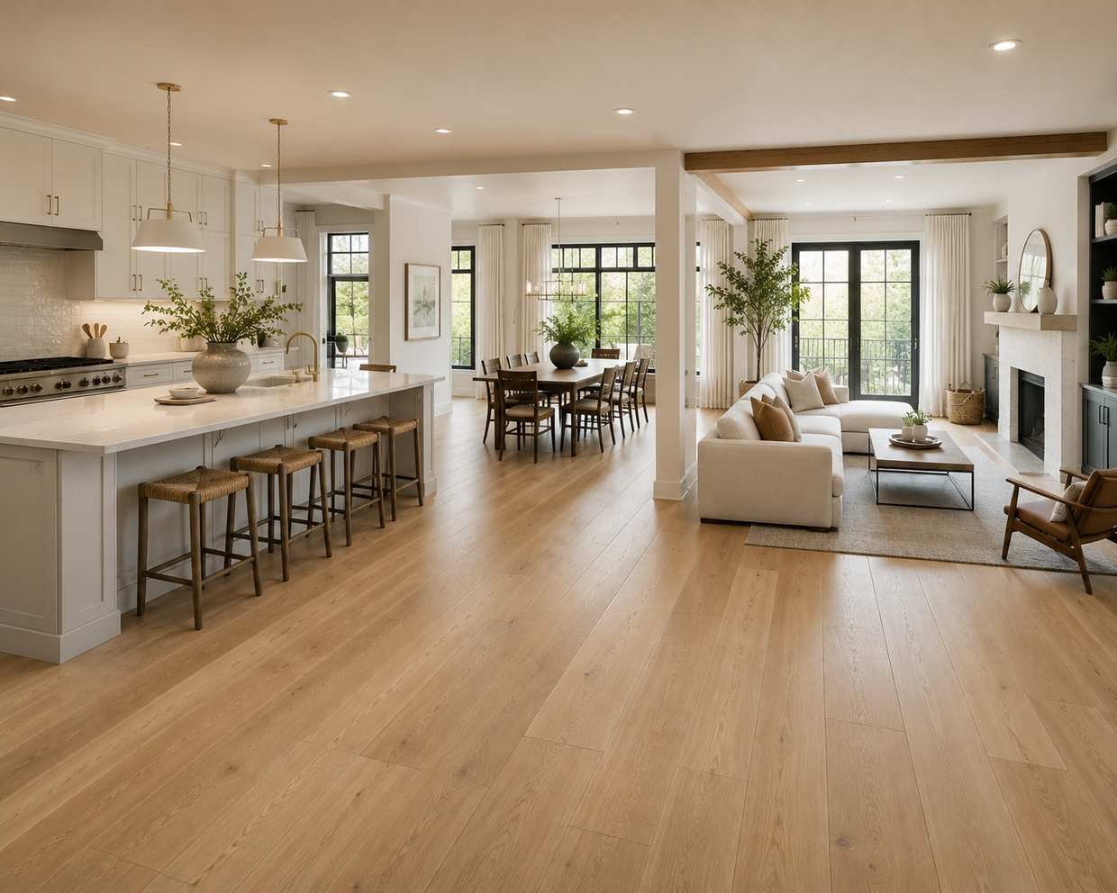
If your kitchen opens into the living or dining area, running the same floor material through all of it — rather than switching materials at an arbitrary threshold — makes the whole footprint feel larger and more considered. Transition strips at odd spots are one of the fastest ways to make an open floor plan feel chopped up and unplanned.
21. A durable “hero” material paired with radiant heat
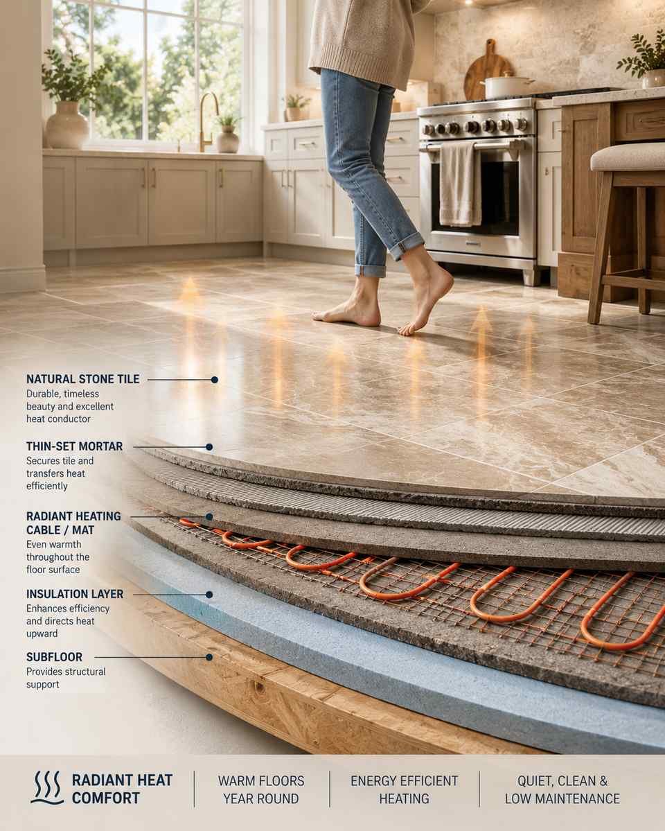
Tile and stone are excellent conductors, which means they’re also cold underfoot, especially first thing in the morning. Radiant floor heating under tile has become far more common in kitchen remodels, and it solves the one real complaint people have about hard flooring without giving up any of the durability.
Practical and Long-Term Ideas
22. Rectified tile edges for a nearly grout-free look
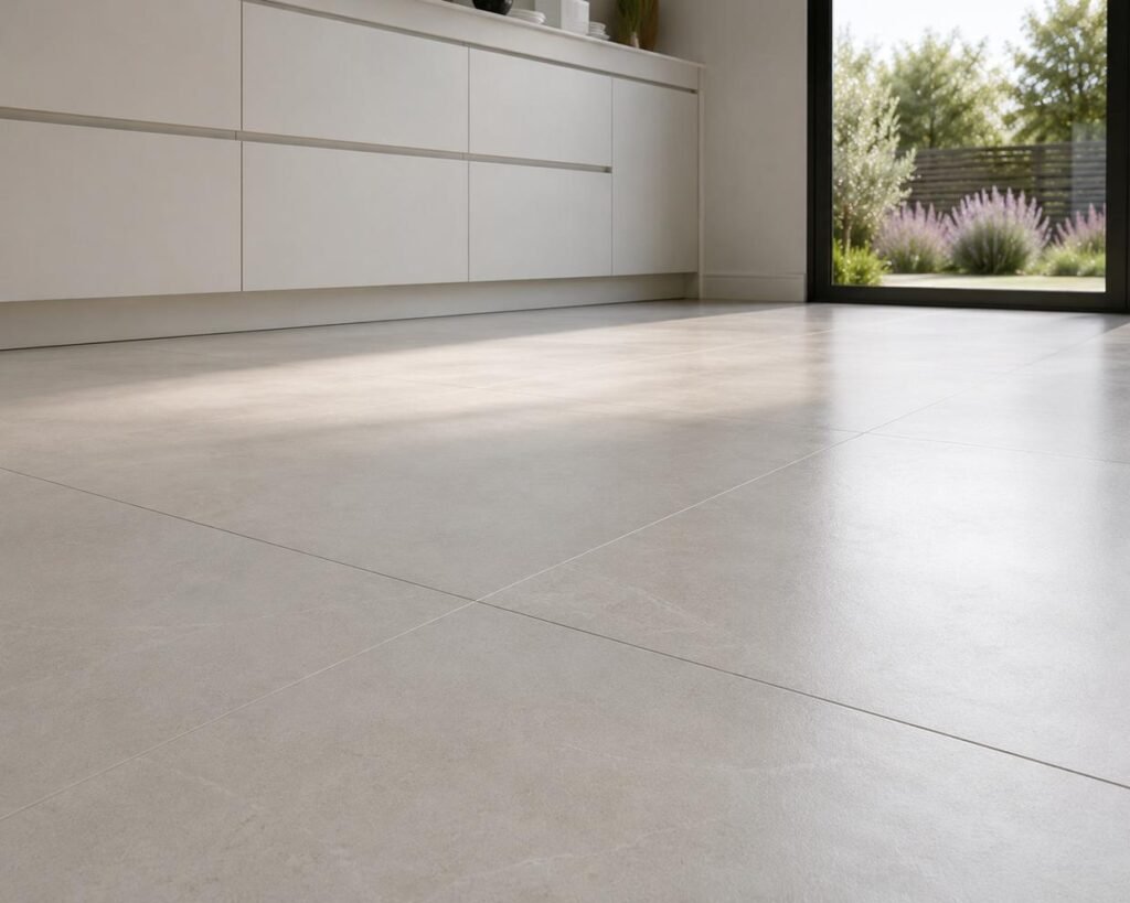
Rectified tiles are precision-cut so the edges are perfectly straight, which allows for much thinner grout lines than older tile manufacturing allowed. The result is a floor that looks closer to a single continuous surface, which pairs especially well with the large-format and minimalist trends mentioned earlier.
23. Slip-resistant textured tile near work zones
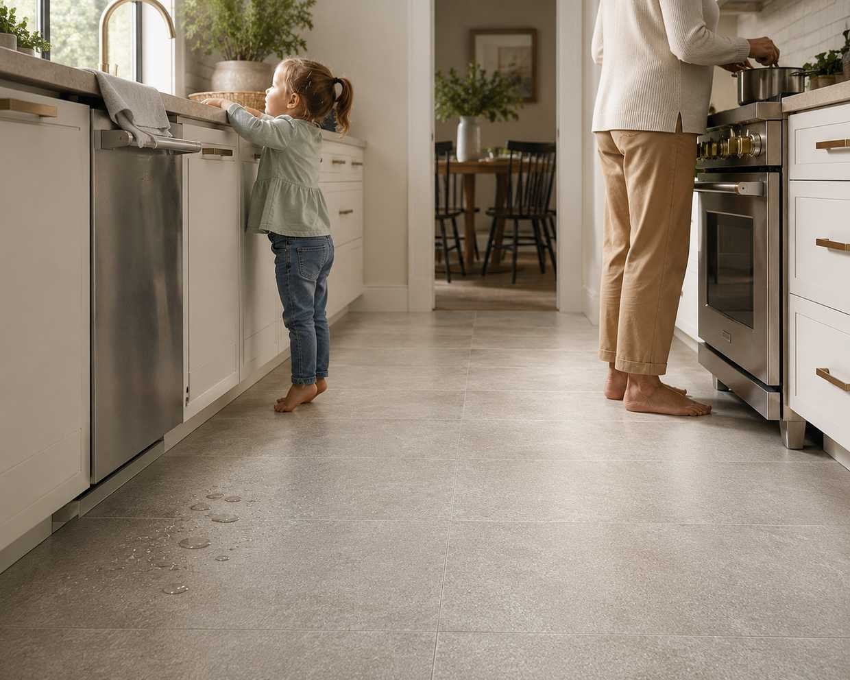
This one rarely makes it into design mood boards, but it should. Kitchens are wet, greasy, and full of moving people, and a textured or slightly matte tile with a higher slip-resistance rating near the sink and stove is a genuinely smart, safety-first choice — especially in households with kids or older family members. You can still get this in a refined, modern-looking finish; it just takes checking the tile’s slip rating before you fall in love with the glossy sample in the showroom.
A Few Honest Notes Before You Commit
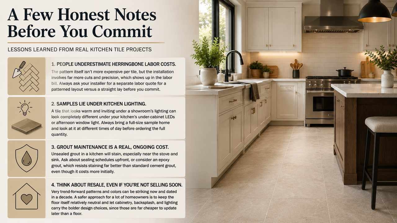
After being around enough of these projects, a few patterns show up again and again in what actually goes wrong:
People underestimate herringbone labor costs. The pattern itself isn’t more expensive per tile, but the installation involves far more cuts and precision, which shows up in the labor bill. Always ask your installer for a separate labor quote for a patterned layout versus a straight lay before you commit.
Samples lie under kitchen lighting. A tile that looks warm and inviting under a showroom’s lighting can look completely different under your kitchen’s under-cabinet LEDs or afternoon window light. Always bring a full-size sample home and look at it at different times of day before ordering the full quantity.
Grout maintenance is a real, ongoing cost. Unsealed grout in a kitchen will stain, especially near the stove and sink. Ask about sealing schedules upfront, or consider an epoxy grout, which resists staining far better than standard cement grout, even though it costs more initially.
Think about resale, even if you’re not selling soon. Very trend-forward patterns and colors can be striking now and dated in a decade. A safer approach for a lot of homeowners is to keep the floor itself relatively neutral and let cabinetry, backsplash, and lighting carry the bolder design choices, since those are far cheaper to update later than a floor.
Flooring is one of those decisions you live with under your feet every single day, in a room where you’ll spend a genuinely large share of your time at home. It’s worth slowing down on this choice, getting real samples into your actual kitchen, and thinking past the first photo you fall in love with online — toward the floor you’ll still be glad you picked five years from now.
 Sumit Banerjee
[…] Also Check – Modern Kitchen Flooring Ideas […]