
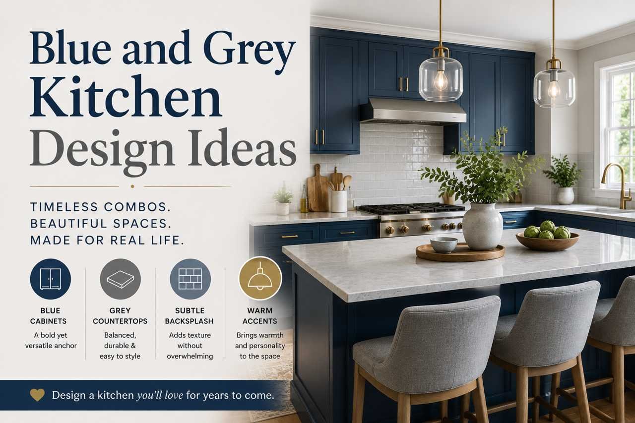
I’m not an interior designer. I don’t have a design degree, and I didn’t hire a professional to plan my kitchen. What I have is a kitchen I redid myself over the course of about four months, a stack of paint samples I probably didn’t need, and enough trial and error to know exactly what works with blue and grey — and what doesn’t. This guide is everything I wish someone had told me before I started.
If you’re staring at a plain white or beige kitchen and thinking about switching to a blue and grey scheme, this article will walk you through the real decisions you’ll need to make: which shades actually pair well, what materials hold up over time, where to spend money and where to save it, and the mistakes that are easy to avoid once you know about them.
21 Blue and Grey Kitchen Design Ideas You Can Actually Use
Here are 21 ideas I’ve either tried myself, borrowed from friends’ kitchens, or seen work well in real homes — not showroom fantasies. Skim through, pick two or three that catch your eye, and then use the rest of this guide to actually plan and execute them.
1. Navy Lower Cabinets With Light Grey Uppers
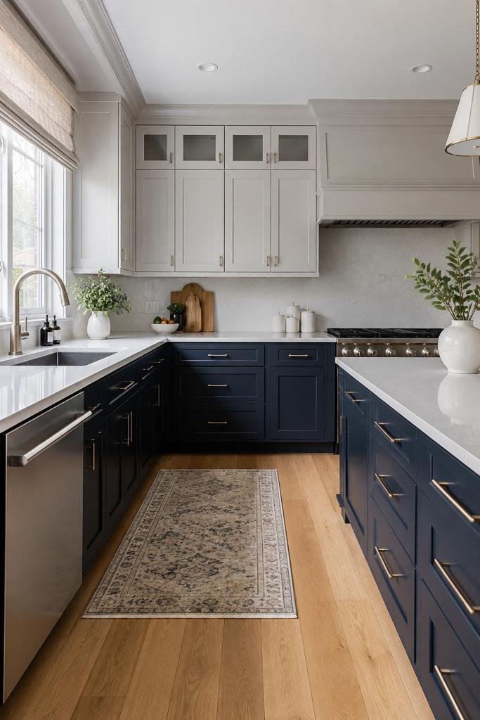
Grounds the room without making it feel closed in. Works especially well in kitchens with 8-foot or taller ceilings, where the visual weight of the dark lowers balances the height of the room instead of overwhelming it.
2. All-Grey Cabinets With a Bold Blue Island
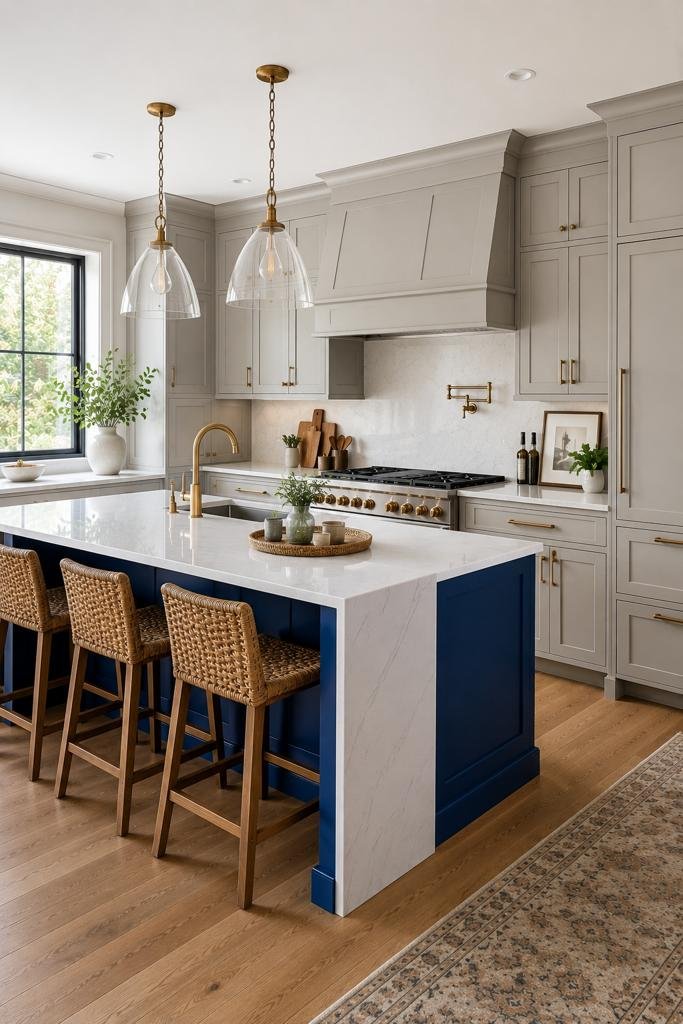
The lowest-commitment way to test blue without repainting your whole kitchen. If you’re not sure blue is right for you long-term, start here.
3. Slate Blue Shaker Cabinets With a Honed Grey Stone Counter
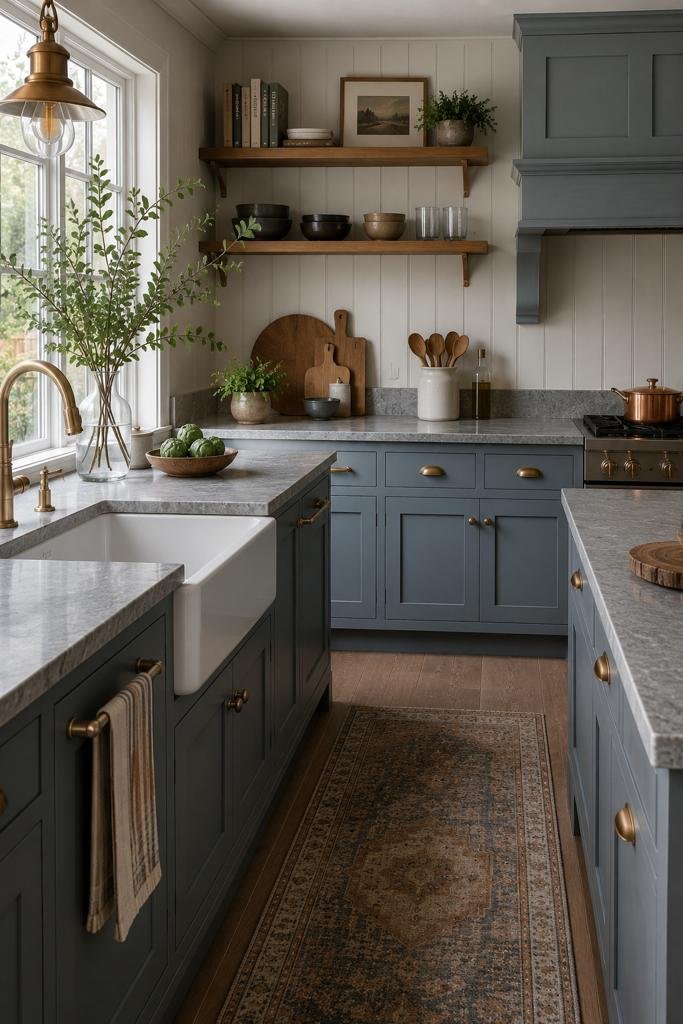
A softer, more matte look that photographs beautifully and hides fingerprints better than glossy finishes — good for busy households.
4. Grey Walls With a Blue Mosaic Tile Backsplash
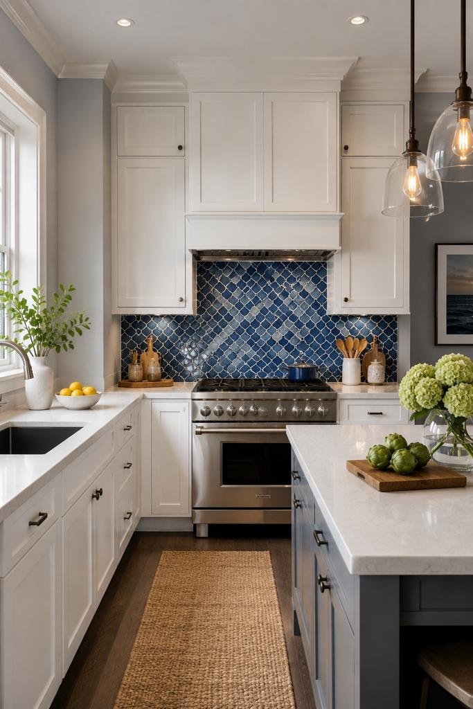
The cheapest way to get the look — no cabinet work required. A great starting point if you’re renting or on a tight budget.
5. Two-Tone Grey Cabinetry With Blue Accessories Only
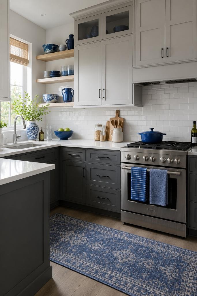
Barstools, a runner rug, or open-shelf dishware carry the blue instead of paint, so you can change your mind easily later.
6. Charcoal Grey Island in an Otherwise White-and-Blue Kitchen
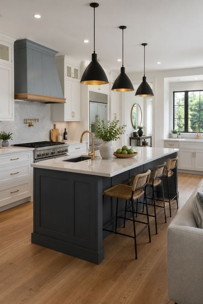
Adds contrast and an anchor point without overwhelming the room, especially in larger, open-concept kitchens.
7. Powder Blue Upper Cabinets With Warm Grey Lowers
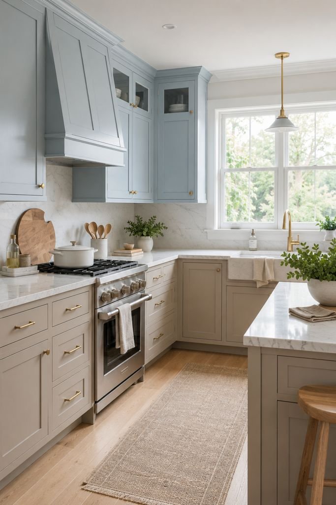
A lighter, airier combination that works well in small or dim kitchens where a fully dark palette would feel heavy.
8. Denim Blue Cabinets With Brushed Brass Hardware
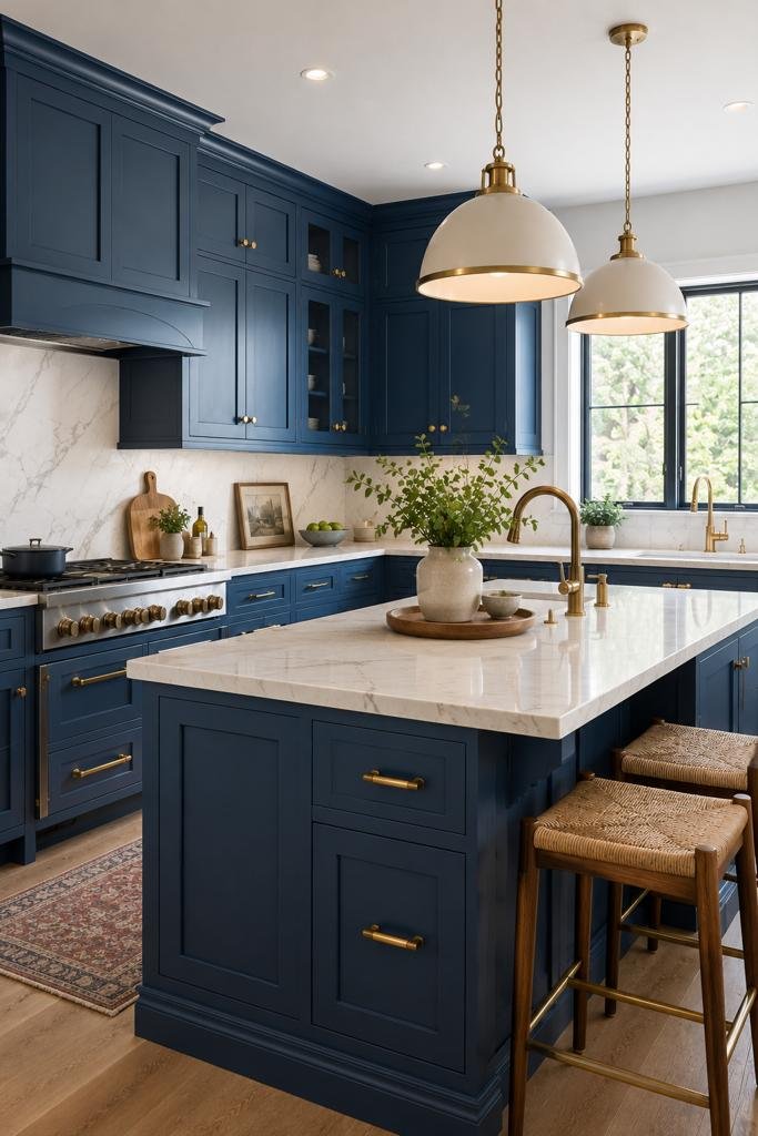
The warm metal tone keeps the blue from feeling cold or clinical, and it’s currently a popular, timeless pairing.
9. Grey Herringbone Tile Floor With Navy Cabinetry
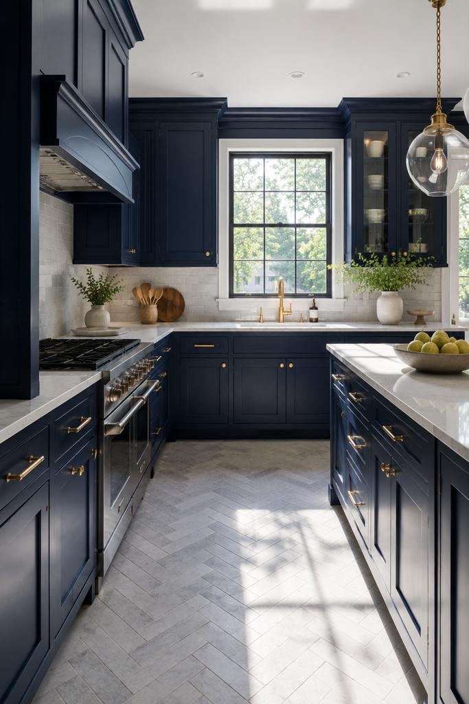
The pattern adds texture so the room doesn’t feel flat, and it draws the eye without competing with your cabinet color.
10. Blue-Grey (“Greige-Blue”) Cabinets Throughout, Single Tone
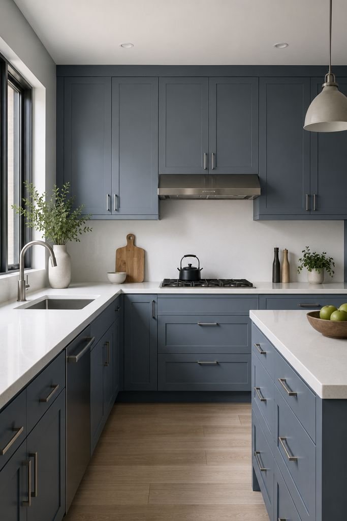
The safest, most resale-friendly option if you’re not ready to commit to strong contrast between two distinct colors.
11. Open Wood Shelving Against a Blue-Grey Wall
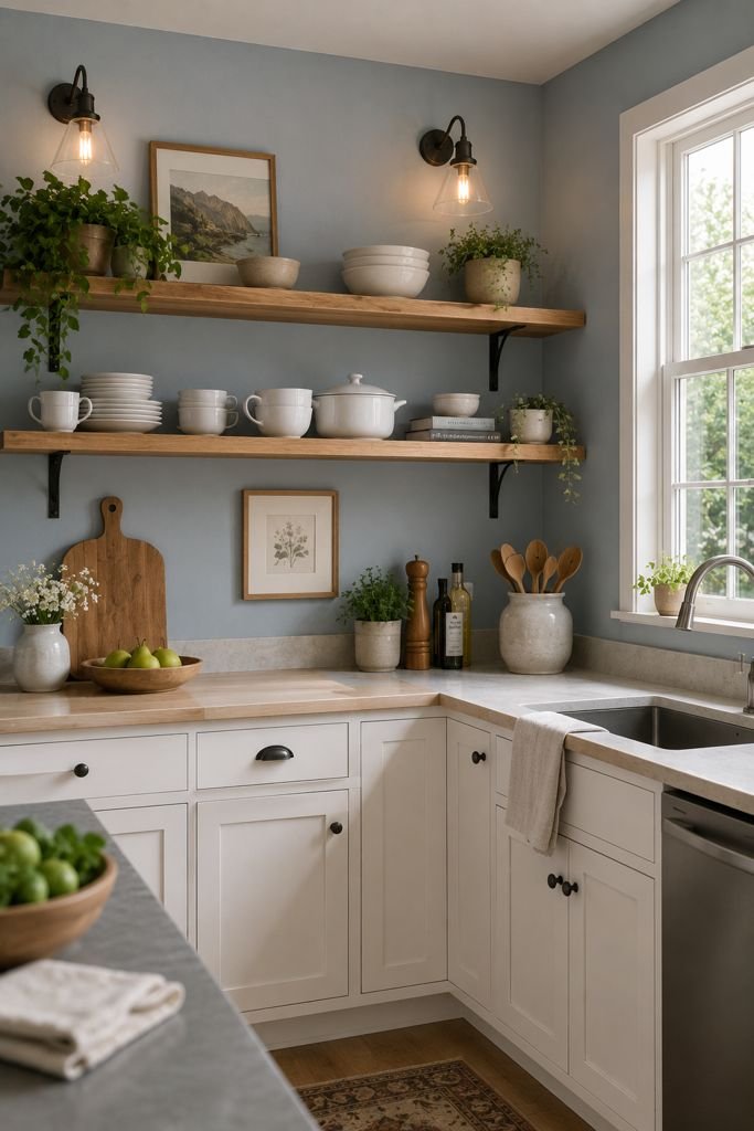
Breaks up the coolness with natural warmth, and it’s cheaper to install than a full run of upper cabinets.
12. Matte Black Fixtures With Cool Grey Cabinets and a Navy Island
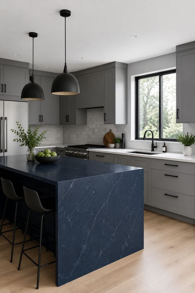
A modern, high-contrast look that reads more sophisticated than trendy, especially in kitchens with clean, minimal lines.
13. Grey Quartz Waterfall Countertop With Navy Base Cabinets

A higher-end look that’s still achievable with quartz rather than natural stone, keeping the cost more manageable.
14. Blue Beadboard Backsplash With Grey Shaker Cabinets
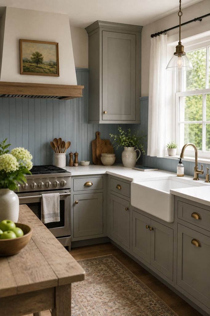
A farmhouse-leaning option that adds texture without the cost or labor of tile installation.
15. Two-Tone Kitchen Island: Blue Base, Butcher Block Top
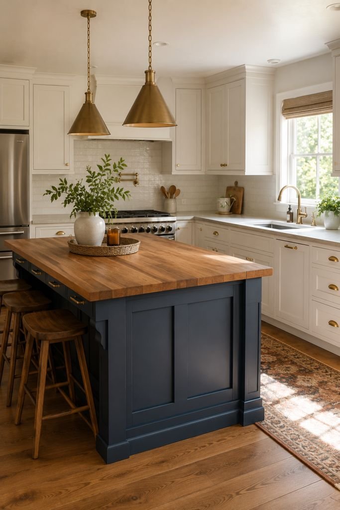
Softens the blue and adds a warm, functional prep surface right in the middle of the room.
16. Soft Dove Grey Cabinets With a Cobalt Blue Accent Wall
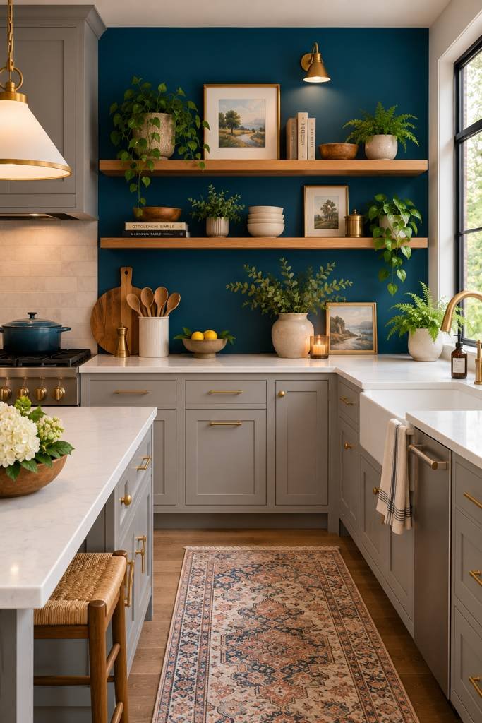
Good for kitchens that are open to a dining or living area, since the wall reads as a design feature rather than “just paint.”
17. Blue Glass-Front Upper Cabinets With Grey Lowers
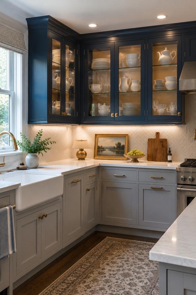
Adds visual interest and a place to display dishware, without the full commitment of open shelving.
18. Grey Subway Tile Backsplash With Navy Grout
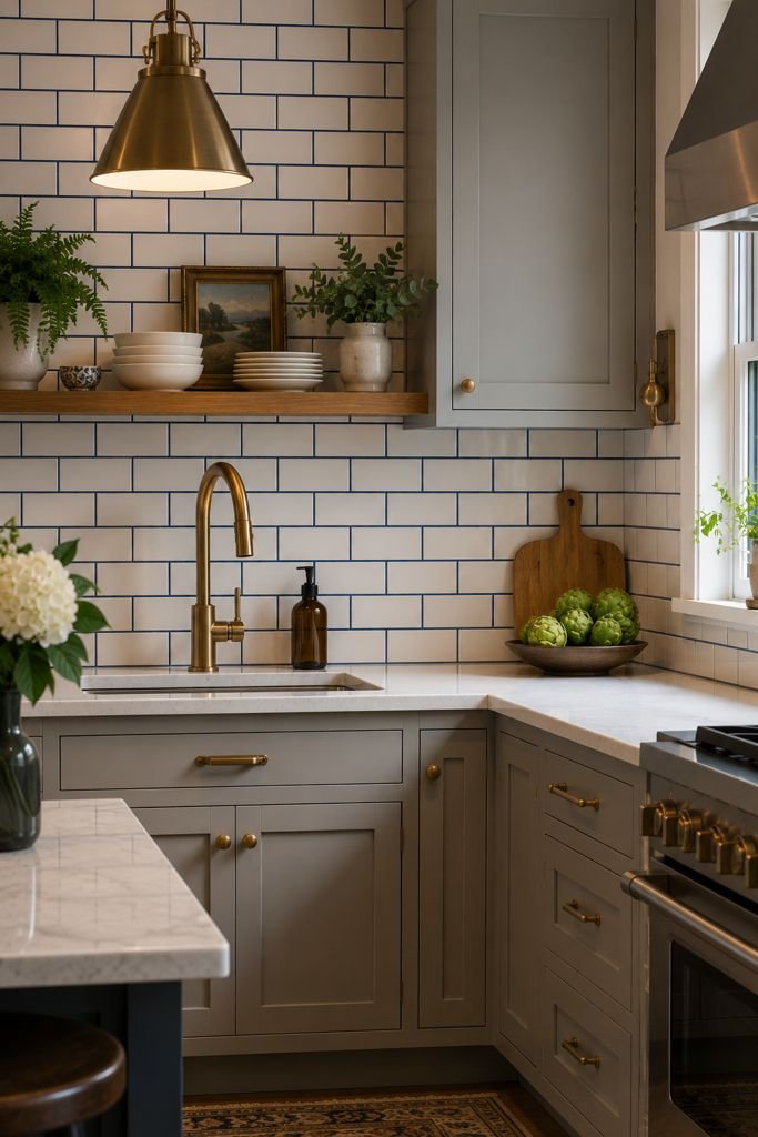
A subtle way to bring blue in through a detail most people wouldn’t think to color, without changing the tile itself.
19. French Blue Cabinets With Warm Brass Pendant Lighting Over the Island
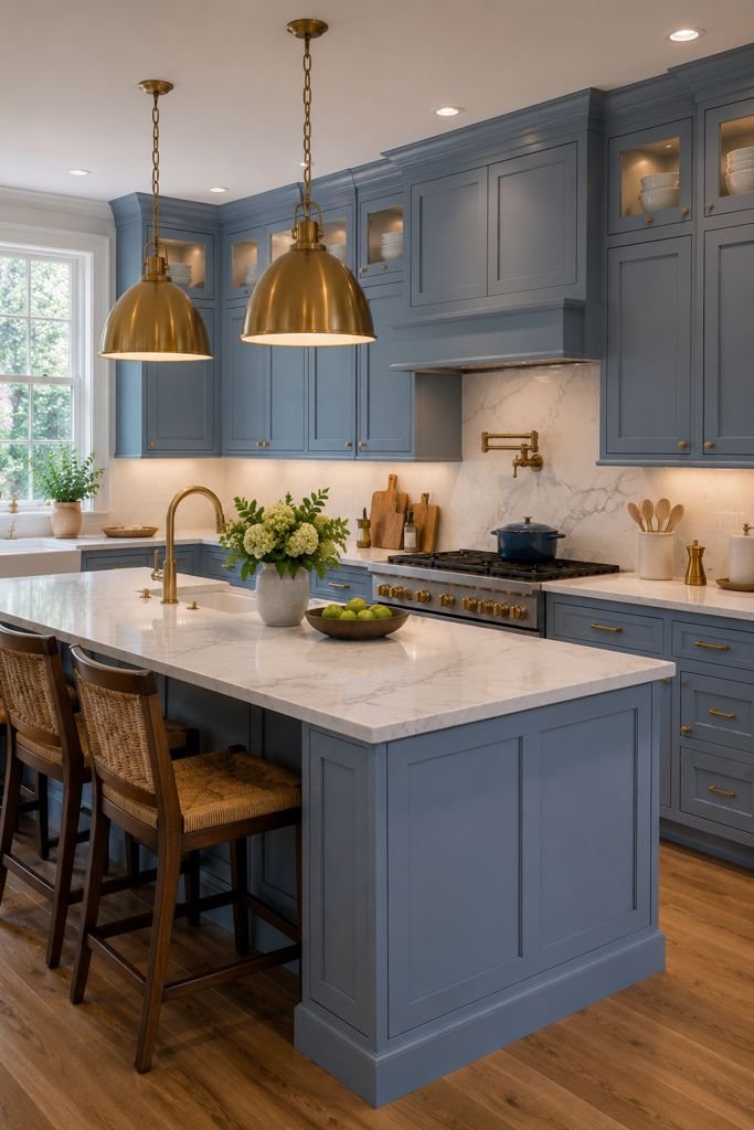
Balances a slightly deeper blue with a warm light source, keeping the space from feeling too cool overall.
20. Grey Painted Brick or Shiplap Accent Wall Behind Open Blue Shelving
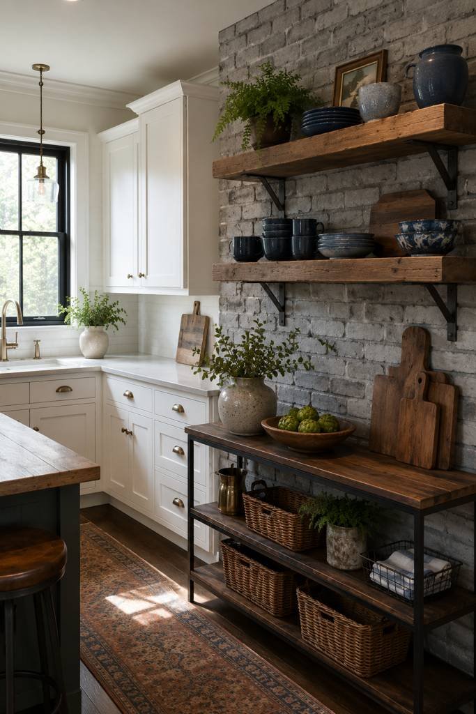
Great for kitchens with some architectural character already, like an older home with exposed brick or existing shiplap.
21. Monochrome Blue-Grey Kitchen With Varied Textures
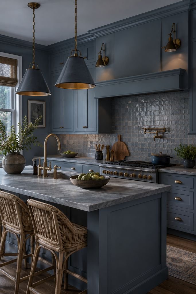
Combine matte cabinets, honed stone, woven bar stools, and a textured tile backsplash. Sticking to one tight color family but varying the finishes keeps a single-color kitchen from looking flat or boring.
A Few Suggestions Before You Pick One
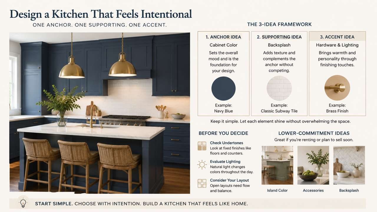
- Don’t combine more than two or three ideas at once. That’s usually how kitchens end up feeling busy instead of intentional.
- Pick one anchor idea (usually your cabinet color), one supporting idea (countertop or backsplash), and one accent idea (hardware, lighting, or an accessory), then build outward from there.
- If you’re renting or plan to sell soon, lean toward the lower-commitment ideas on this list (island color, accessories, backsplash) rather than full cabinet repaints.
- If you’re not sure which one fits your kitchen, use the sections below to check your undertones, lighting, and layout before you commit to paint or materials.
Why Blue and Grey Actually Works (Not Just Because It’s Trendy)
Blue and grey get paired together in kitchens for a reason that goes beyond trends: they’re both “cool” tones on the color wheel, which means they sit next to each other comfortably without fighting for attention. Grey is essentially a neutral, so it lets blue do the talking, while blue keeps grey from feeling flat or cold on its own.
But here’s what nobody told me when I started: not all blues and greys go together automatically. A warm grey (one with beige or brown undertones) can clash badly with a cool, icy blue. I learned this the hard way when I painted a sample patch of “greige” next to a navy cabinet door and it looked muddy, not sophisticated. The fix was simple once I understood it — match undertones, not just the color names.
How to Check Undertones Before You Buy Anything
Before you buy a single gallon of paint or a cabinet sample, do this: hold your grey paint chip and your blue paint chip together in natural daylight, not under indoor lighting. Look at the grey chip specifically — does it lean slightly purple/blue (cool), or slightly brown/green (warm)? Most paint brands will tell you this in the product description or you can ask an associate at the hardware store to check the undertone for you. Cool greys pair beautifully with almost any blue. Warm greys need a warmer, dustier blue (like a slate or denim blue) to avoid looking off.
Building Your Palette: Where to Start
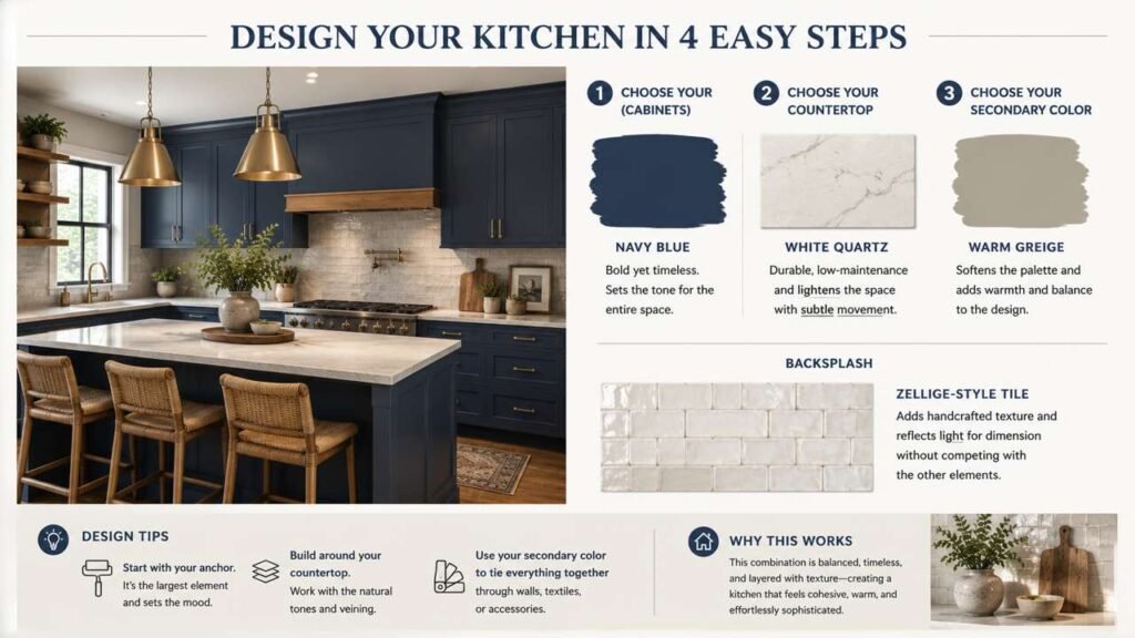
I made the mistake of picking my cabinet color first and then scrambling to find a matching countertop, backsplash, and wall color. It’s much easier — and cheaper, because you won’t end up returning things — if you build your palette in this order:
- Pick your “anchor” color first. This is usually the biggest surface area in the room, which for most kitchens is either the cabinets or the walls. Decide now: do you want blue cabinets with grey walls, or grey cabinets with a blue accent wall or island?
- Choose your countertop next, since natural stone and quartz come in fixed patterns you can’t tint to match anything — you have to work around what’s available.
- Then pick your secondary color (the one that isn’t your anchor).
- Backsplash and hardware come last, because these are the easiest and cheapest elements to change later if something isn’t working.
This order matters because countertops and cabinets are the most expensive and hardest to change. Everything else should adapt to them, not the other way around.
Choosing Countertops That Actually Work With Blue and Grey
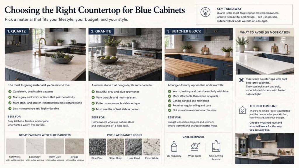
This is where a lot of people overspend or under-plan. Here’s what I learned:
- Quartz is the most forgiving material if you’re new to this. It comes in consistent, predictable patterns (unlike natural stone, where every slab is different), and most major manufacturers now carry grey and white options specifically designed to pair with blue cabinetry. It’s also more stain- and scratch-resistant than most natural stone, which matters if this is your only kitchen and you actually cook in it daily.
- Granite works well too, especially in grey and blue-grey tones, but you need to see the actual slab in person before committing — granite patterns vary a lot, and what looks good on a small sample chip can look completely different across a full countertop.
- Butcher block is the budget option, and it actually pairs surprisingly well with blue cabinets for a warmer, more lived-in look. The tradeoff is maintenance — you’ll need to oil it periodically and it’s not as forgiving of water damage near the sink.
- Avoid pure white countertops with cool blue-grey cabinets unless you’re going for a very stark, modern look. In my experience, it can read as cold and a little clinical in kitchens that don’t get a lot of natural light.
Flooring: The Detail Most People Get Wrong
I nearly ruined my whole kitchen by choosing a cool grey-toned floor to match my cabinets. It looked fine in the store, but under my kitchen’s warm-toned overhead lighting, the whole room looked flat and grey-on-grey-on-blue, with no warmth anywhere.
The fix: if your cabinets and countertops are already cool-toned (blue and grey), warm up your flooring instead. A medium warm-toned wood floor, or a wood-look tile with some brown or amber undertone, balances out the coolness of blue and grey and keeps the room from feeling sterile. This one change made a bigger visual difference in my kitchen than any single cabinet or paint decision.
Lighting Changes Everything (Literally)
Blue and grey are both tones that shift dramatically depending on your lighting temperature. This is the single most overlooked factor in kitchen design, and it’s also one of the cheapest things to fix.
- Warm white bulbs (around 2700K–3000K) will soften blue and grey, making them feel cozier but sometimes slightly muddier.
- Cool white or daylight bulbs (4000K–5000K) will make blue and grey pop and feel crisper, but can also feel harsh or clinical, especially at night.
- My honest recommendation: go with a bulb in the 3000K–3500K range for most blue-and-grey kitchens. It’s warm enough to feel comfortable but won’t wash out or muddy your blue tones the way a true warm bulb can.
Before you finalize any paint or cabinet color, buy a sample can or a cabinet door sample and look at it under your actual kitchen lighting, at different times of day. Colors that look perfect on a paint chip under store lighting can look completely different at 7am versus 7pm in your own kitchen.
Hardware and Fixtures: Small Choices, Big Impact
Once your cabinets, countertops, and backsplash are settled, hardware is where you can really refine the look without much cost:
- Brushed brass or gold hardware against navy or slate blue cabinets creates a warm, higher-end look, and it’s currently a popular pairing for a reason — the warmth of the metal balances the coolness of the blue.
- Matte black hardware works well for a more modern, high-contrast look, especially against lighter greys.
- Brushed nickel or chrome is the safest, most neutral option if you’re not sure and want something that won’t look dated in five years.
Budget tip: you don’t need to replace your faucet, sink, and hardware all at once. Cabinet hardware alone (knobs and pulls) is one of the cheapest upgrades in a kitchen remodel and makes a noticeably bigger visual difference than its cost would suggest.
Common Mistakes I Made (So You Don’t Have To)
- Painting the whole kitchen before testing a sample in my actual space. I cannot say this enough — buy a sample, paint a two-foot square, and live with it for at least three full days before committing.
- Ignoring undertones. A grey with warm undertones next to a cool blue looked murky, not sophisticated, in my kitchen.
- Going too dark in a small or dim kitchen. Deep navy cabinets look stunning in kitchens with big windows and natural light. In a smaller, darker kitchen, they can make the room feel cramped. If your kitchen doesn’t get much natural light, lean toward a mid-tone blue or grey rather than the darkest shade you like.
- Forgetting about maintenance. Matte cabinet finishes look beautiful in photos but show fingerprints and water spots more than satin or semi-gloss finishes, especially around handles and the sink area. I switched from a matte to a satin finish on my lower cabinets specifically because of this.
- Not thinking about resale. If you might sell your home in the next few years, a bold navy-and-charcoal kitchen might not appeal to every buyer. A softer grey-blue with easily changeable accents (like my two-tone grey option above) is a safer long-term investment.
A Simple Step-by-Step Plan If You’re Starting From Scratch
- Set a budget first, and separate it into categories: paint/cabinets, countertops, backsplash, flooring, hardware, lighting. This keeps you from overspending on one area and running out of money for another.
- Collect 3–5 paint and material samples in your preferred blue and grey combination and bring them home.
- Test everything in your actual kitchen lighting for at least three days, checking morning, afternoon, and evening.
- Decide your anchor color (cabinets or walls) and commit to that first.
- Choose countertops in person, not just from a small sample chip.
- Warm up your flooring if your cabinets and countertops are both cool-toned.
- Save hardware and backsplash decisions for last — they’re the cheapest to change and easiest to get right once everything else is settled.
- Do one section at a time if you’re on a budget or doing the work yourself. I painted my cabinets in two phases, upper and lower, a few weeks apart, and it was much more manageable than trying to do the whole kitchen at once.
Final Thoughts
Blue and grey kitchens work because the two colors complement each other without competing, but the actual success of the look comes down to details most people don’t think about until they’re deep into the project: matching undertones, testing colors under your real lighting, and balancing cool tones with at least one warm element somewhere in the room, whether that’s your flooring, your hardware, or your countertop veining.
You don’t need a professional designer or a massive budget to get this right. What you need is patience to test things properly before committing, and a willingness to make one change at a time rather than everything all at once. That’s genuinely how I got my kitchen from “looks fine on paper” to a room I actually enjoy cooking in every day.
 Sumit Banerjee