
I’ve lost count of how many kitchens I’ve walked through, planned, or helped friends renovate, and there’s one combination that keeps coming back no matter how many design trends come and go: white cabinets with a subway tile backsplash.
It’s the little black dress of kitchen design. It works in a farmhouse, a mid-century bungalow, a glassy new-build condo, and a hundred-year-old brownstone, and it never feels like it’s trying too hard.
But here’s the thing I want to save you from: “subway tile” is not one look.
I made the mistake early on of thinking a plain white 3×6 tile was the safe, boring choice, and it is a great choice, but it’s also just the entry point into a huge range of colors, layouts, grout choices, and finishes that can make your kitchen feel custom instead of copy-pasted from a hundred other renovations you’ve seen on Pinterest.
Below are 19 real, usable ideas, from the classic to the unexpected, along with the practical details I’d want to know before picking up a tile sample.
I’m writing this the way I’d talk to a friend standing in my kitchen, not the way a showroom brochure would.
1. Classic White 3×6 Subway Tile in a Running Bond Pattern
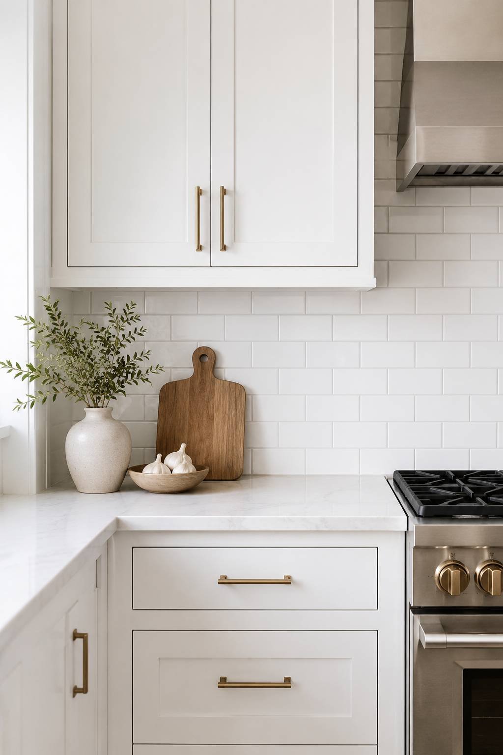
This is the one everyone pictures when they hear “subway tile,” and honestly, there’s a reason it’s stood the test of time. White 3×6 tiles laid in a brick-like running bond (each row offset by half a tile) against white cabinets creates a soft, tonal look that never competes with the rest of your kitchen. If your countertops are white or light quartz too, this backsplash almost disappears into the wall in the best possible way, letting your hardware, lighting, and bar stools carry the personality. I’d recommend this if you’re not 100% sure what your “forever style” is yet, because it will outlast every trend cycle you go through.
2. Glossy White Subway Tile for Extra Light Bounce
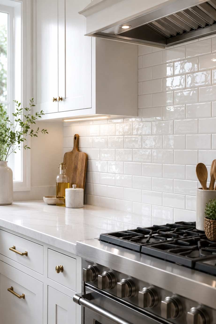
Not all white tile is created equal. A high-gloss finish reflects light in a way that matte tile just can’t, which matters a lot if your kitchen doesn’t get much natural sunlight. I’ve used glossy subway tile in a north-facing kitchen that felt genuinely dim before, and the difference after installation was noticeable, especially at night under the under-cabinet lighting. The glossy surface also tends to be easier to wipe grease off of, which is a nice bonus behind a stove.
3. Matte White Subway Tile for a Softer, Modern Look
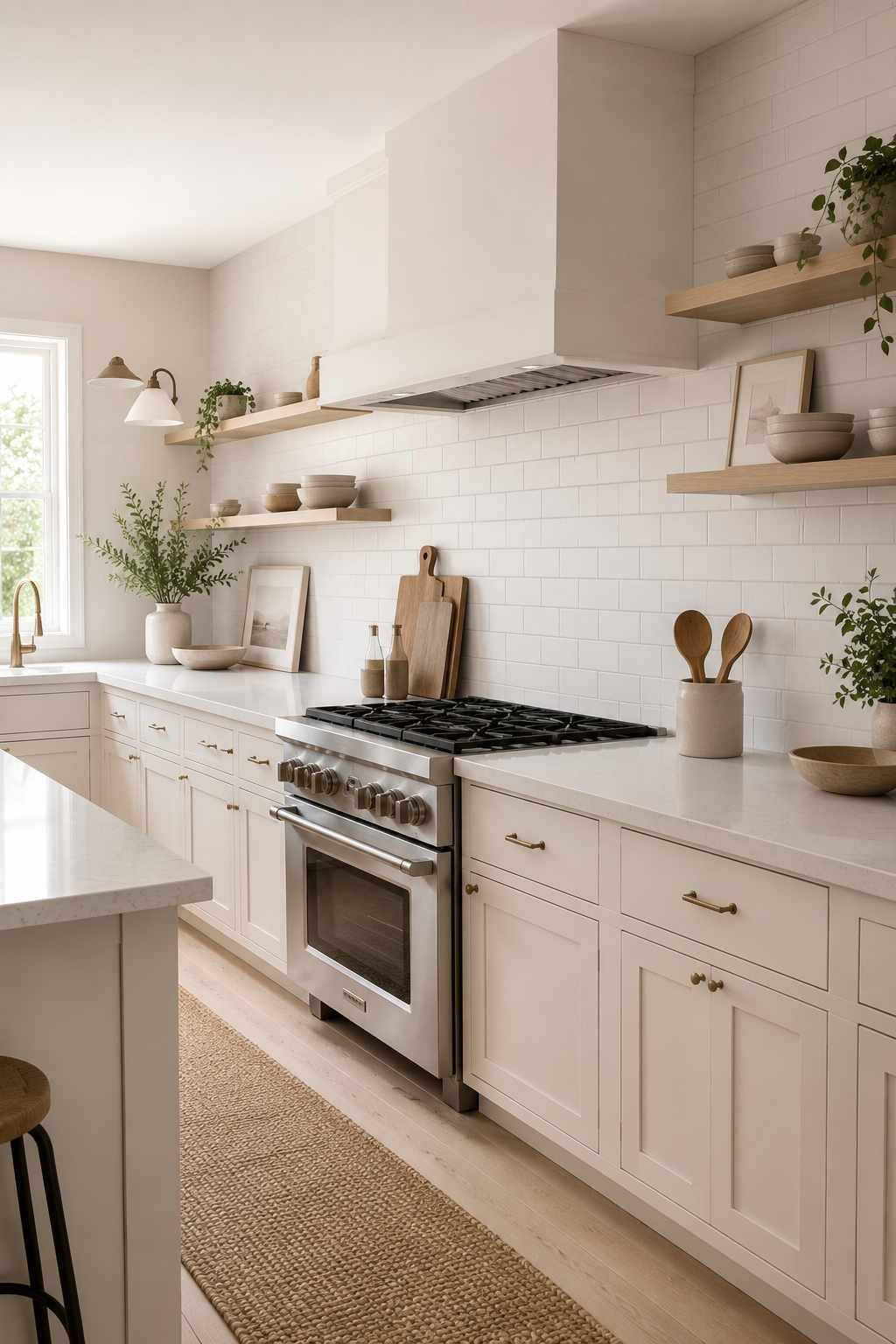
On the flip side, if your kitchen already gets plenty of light, or if your style leans more modern farmhouse or Scandinavian, a matte finish subway tile is worth considering. It has a chalky, quiet quality that pairs beautifully with white cabinets that have a slightly warmer, off-white undertone. Matte tile shows water spots less than gloss, but it can be a little trickier to keep totally grease-free, so keep that in mind if you’re a heavy cook.
4. Herringbone Subway Tile Layout
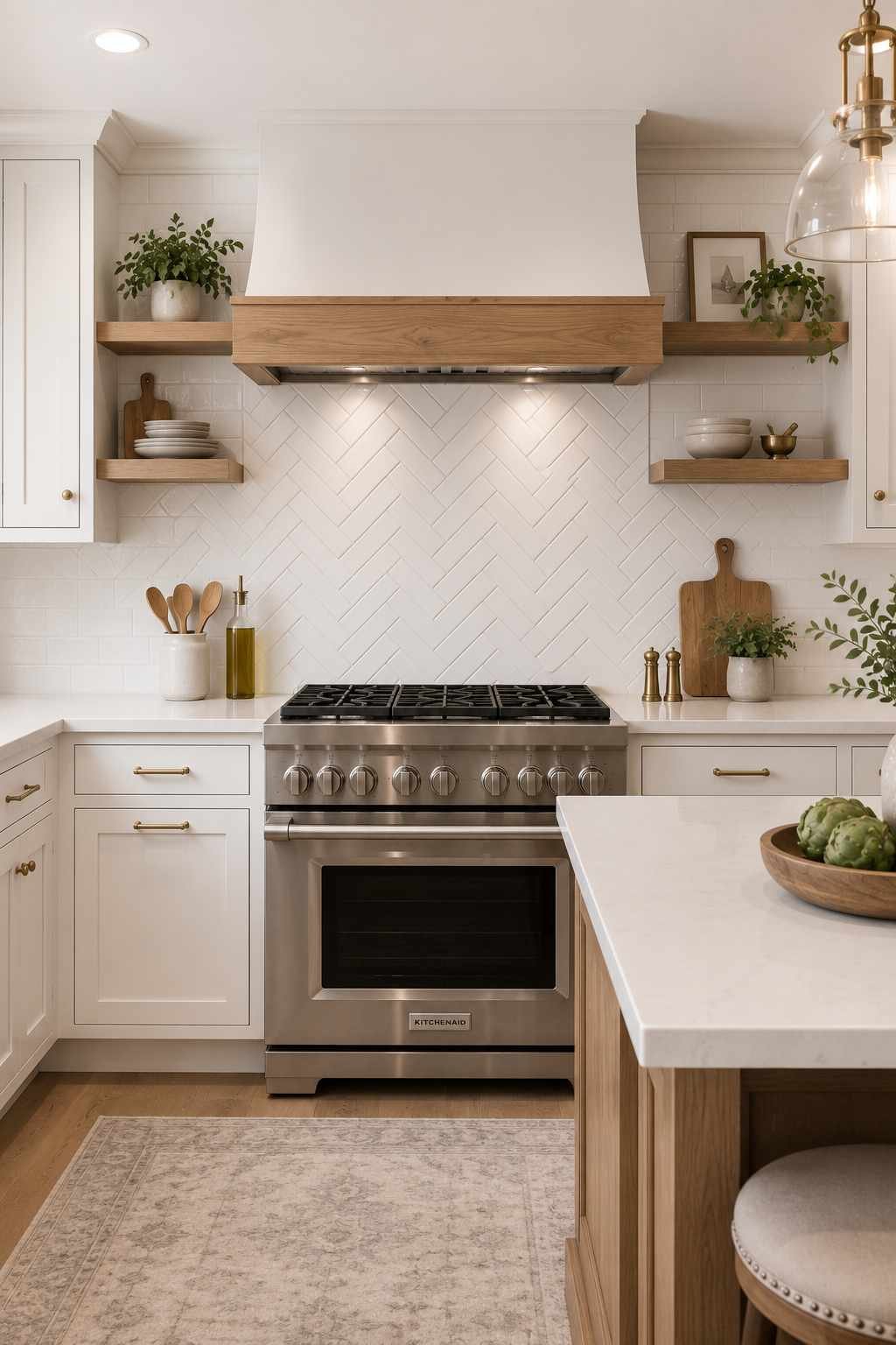
If you like the idea of white subway tile but want something with more visual movement, herringbone is the layout to look at. Instead of stacking tiles in straight rows, they’re arranged in a zigzag “V” pattern that catches the eye immediately when you walk into the room. It reads as more tailored and a little more expensive-looking than a standard running bond, even when you use the exact same tile. I’d suggest this for a focal wall behind a range or a small feature area rather than wrapping the whole kitchen in it, since herringbone takes noticeably longer to install and the cost per square foot goes up because of labor.
Also Check – Kitchen Design Ideas With Dark Wood Floor
5. Vertical Stack Subway Tile
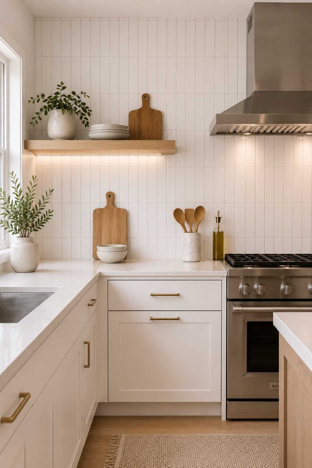
Turning the same rectangular tile on its end and stacking it vertically, rather than laying it horizontally, is such a simple change but it completely shifts the feel of a kitchen. Vertical stacking draws the eye upward, which can make a kitchen with lower ceilings feel a bit taller. It also has a cleaner, more architectural look than the traditional offset brick pattern, which I’ve noticed tends to suit sleeker, more contemporary white cabinet styles (think flat-panel or Shaker-lite doors) better than very traditional raised-panel cabinetry.
6. Stacked Horizontal (Grid) Subway Tile
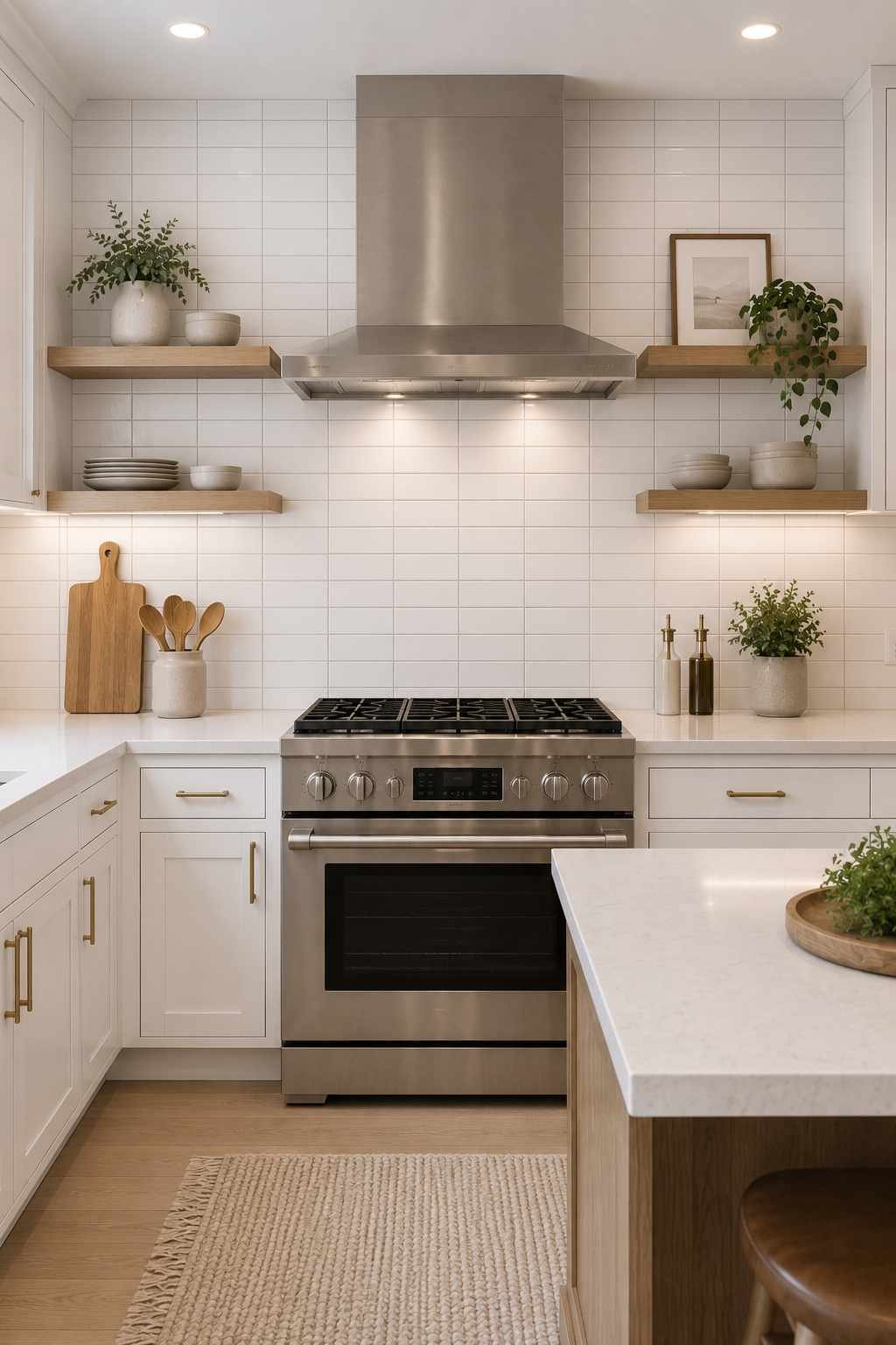
This is the layout where each tile lines up directly above the one below it, creating a clean grid instead of an offset brick pattern. It’s a more modern, minimalist take on subway tile, and I think it looks especially sharp with white cabinets that have simple, unfussy hardware. Because the grout lines all line up, this pattern does show any unevenness in your tile-setter’s work more than a running bond would, so it’s worth hiring someone with real experience in grid layouts specifically.
7. Black Grout with White Subway Tile
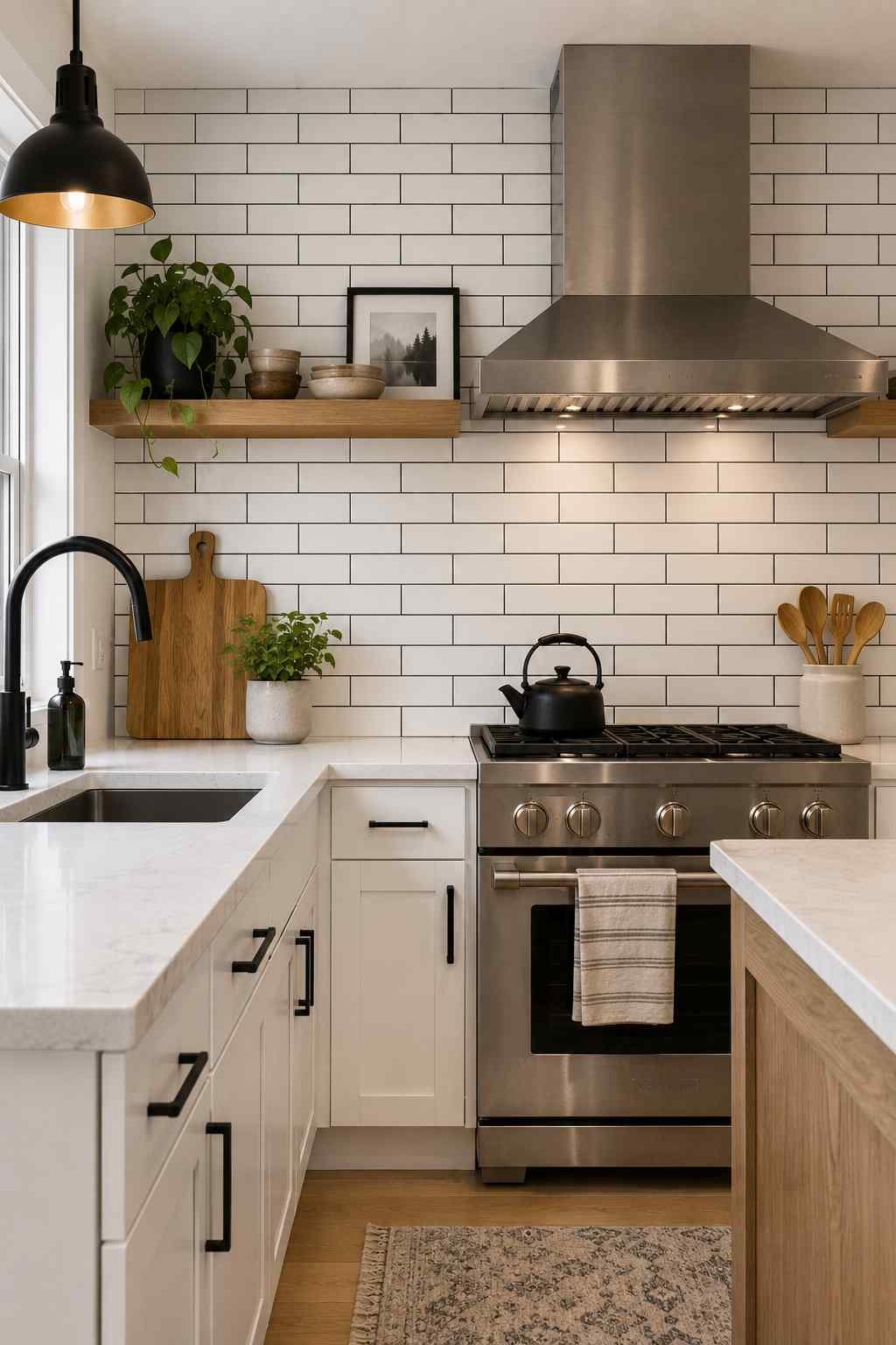
This is probably the single easiest way to take a “safe” white subway tile backsplash and make it feel intentional and modern. Swapping white or gray grout for black outlines every single tile, which turns a subtle backsplash into a graphic, almost architectural pattern. It’s a striking pairing against white cabinets, especially if you’ve got black hardware, a black faucet, or black light fixtures elsewhere in the kitchen, because it ties the whole room together. One practical note: dark grout does show flour dust and light-colored splatters more than white grout does, so it’s a slightly higher-maintenance choice depending on how you cook.
8. Colored Subway Tile for a Pop of Personality
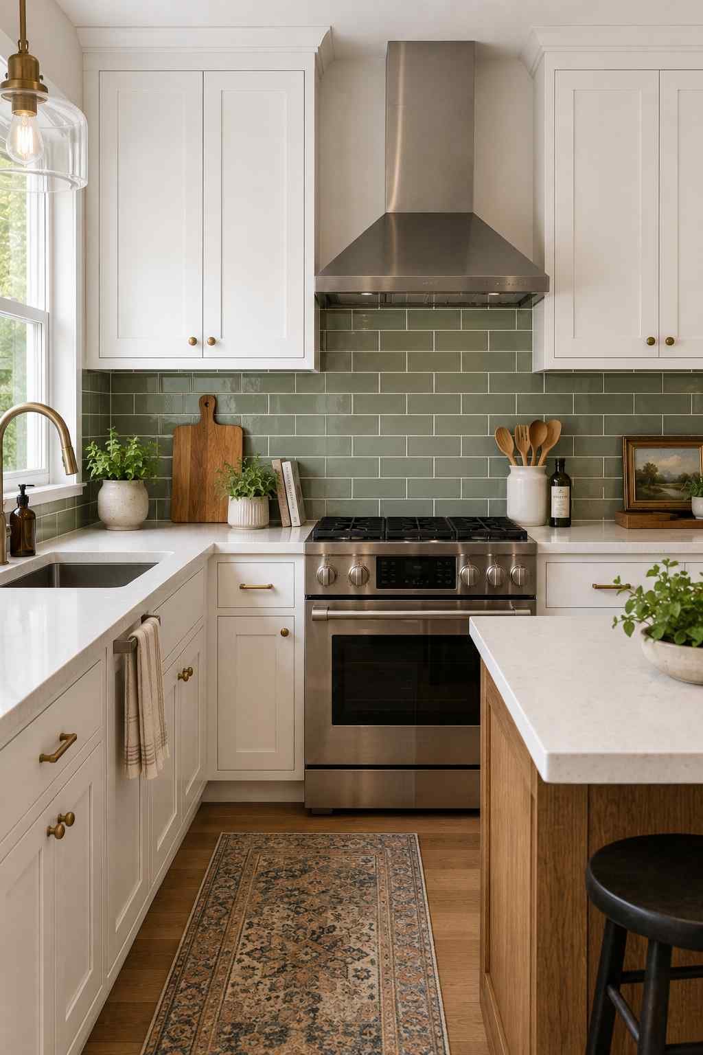
White cabinets are such a neutral, flexible backdrop that they’re actually the easiest place to introduce a bold backsplash color without it feeling overwhelming. Soft sage green, dusty blue, warm terracotta, or even a deep navy subway tile against crisp white cabinetry gives you all the personality of a colorful kitchen with an easy exit ramp if you ever want to repaint or sell — the cabinets stay neutral and timeless while the backsplash does the talking. If you’re nervous about committing to color, I’d suggest ordering a handful of sample tiles and taping them to the wall for a few days before deciding, since tile color can look very different under your kitchen’s actual lighting versus a showroom.
9. Two-Tone Subway Tile (Different Colors on Different Walls)

I really like this one for open kitchens where the backsplash wraps around a corner or continues behind a separate prep area. Using a lighter neutral subway tile on the main wall and a slightly bolder color on a secondary wall, like behind an open shelf or a coffee station, creates definition between zones without adding a single extra material. It’s a subtle way to zone a kitchen visually, especially in newer open-concept layouts where the kitchen flows directly into the living or dining space.
10. Subway Tile All the Way to the Ceiling
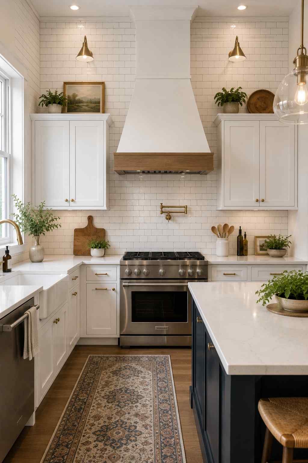
Most kitchens stop the backsplash at the bottom of the upper cabinets, but running white subway tile all the way up to the ceiling, especially behind open shelving or in the gap above cabinets, makes a real visual statement. It draws the eye upward and can make a kitchen with tall ceilings feel even grander, and it also solves the awkward “what do I do with this weird gap above my cabinets” problem a lot of people run into. This works particularly well if you’ve gone with a hood vent as a focal point, since the tile becomes a dramatic backdrop for it.
11. Subway Tile Behind a Statement Range Hood
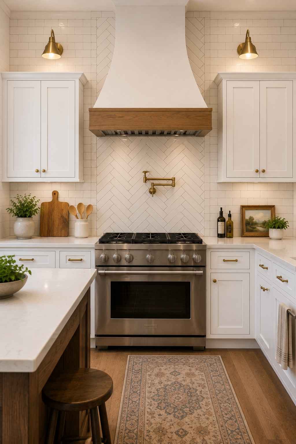
Speaking of range hoods, this is one of my favorite “small effort, big payoff” ideas. Tiling the entire wall behind your range in a slightly different pattern than the rest of the kitchen (herringbone in an otherwise running-bond kitchen, for example, or extending the tile higher just in that one spot) turns your stove into the visual centerpiece of the room. Combined with white cabinets on either side, it’s a classic magazine-kitchen move that doesn’t require touching a single cabinet.
Also Check – Rustic Modern Black And White Kitchen Design Ideas
12. Extra-Long Subway Tile (4×12 or Larger)

If you like the proportions of subway tile but want fewer grout lines to clean, look at longer formats like 4×12-inch tiles instead of the traditional 3×6. The elongated shape still reads as “subway tile” but feels more current and a bit more upscale, and because there’s less grout overall, maintenance is genuinely easier. This is a great compromise if you love the classic look but are dreading the idea of scrubbing grout lines every few months.
13. Beveled Subway Tile for Texture and Shadow
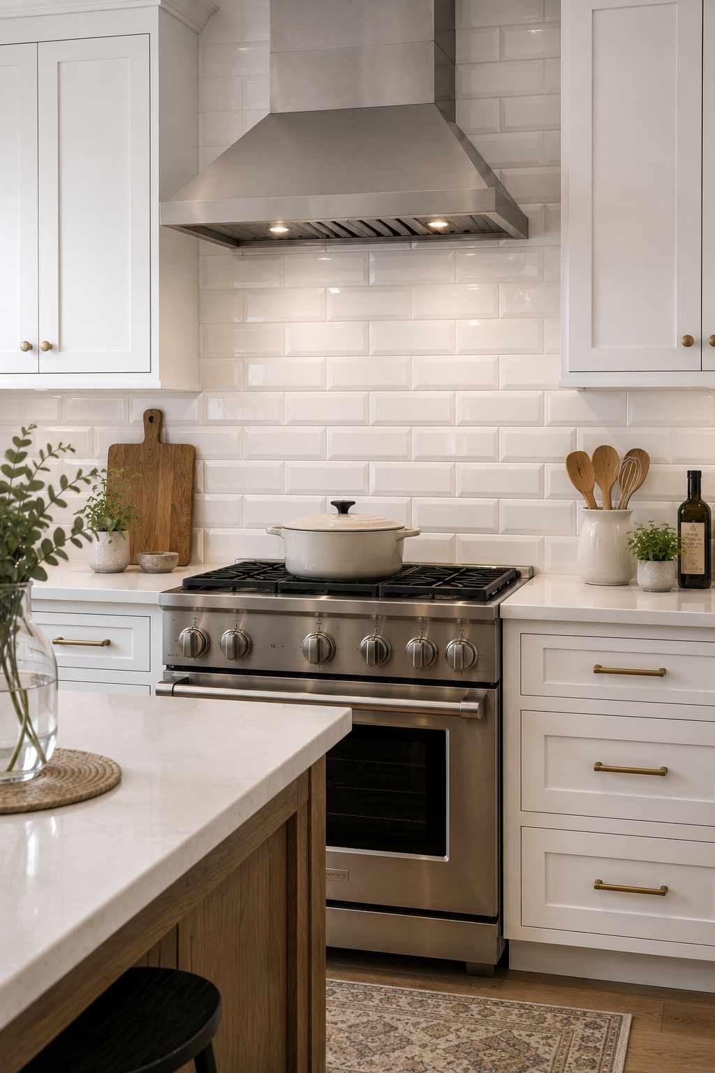
A beveled edge subway tile has a slight angle cut around the border of each piece, so when light hits the wall, it creates tiny shadow lines between each tile. Against plain white cabinets, this adds a subtle handmade, dimensional texture that flat tile just doesn’t have, without introducing any new color or pattern. It photographs beautifully because of how it catches light, which is worth thinking about if resale photos are on your mind at all.
14. Handmade or Artisan-Look Subway Tile
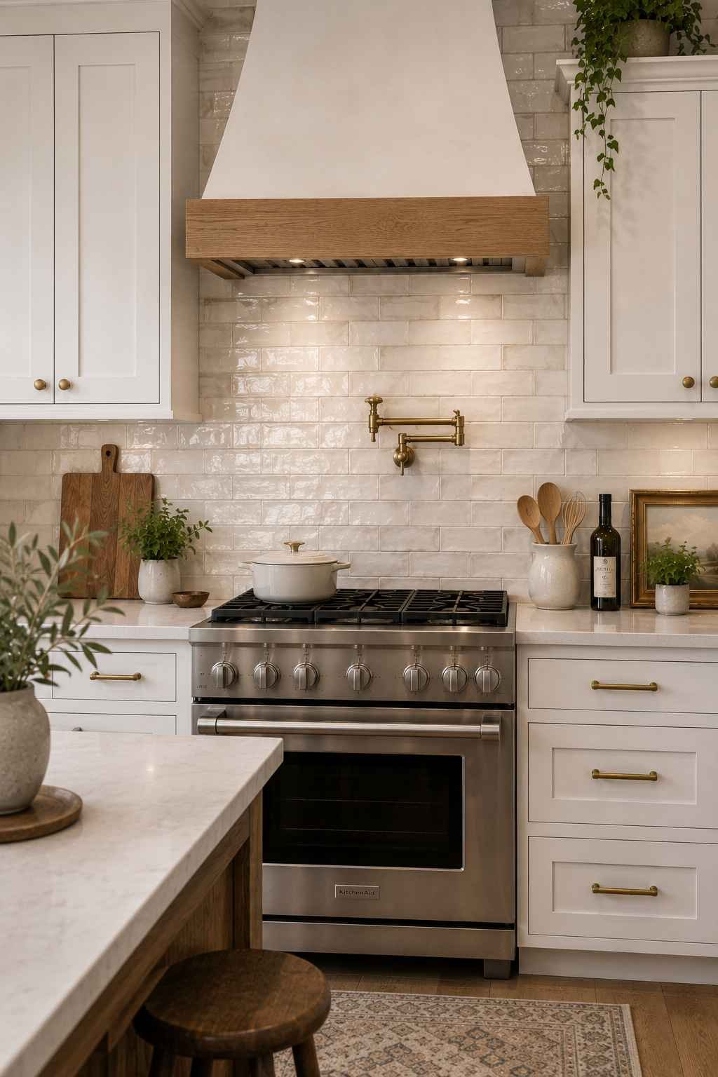
Perfectly uniform tile is beautiful, but slightly irregular, handmade-look subway tile (often called “zellige-inspired” even when it’s not true zellige) has gentle variations in surface and edge that give a backsplash real depth and warmth. Against white cabinets, this softens the whole kitchen and moves it away from a builder-grade feel toward something that looks custom and collected over time. Just know that irregular tile usually costs more and needs a more careful installer, since the grout lines won’t be perfectly even by design.
15. Subway Tile with a Contrasting Colored Grout (Not Black)
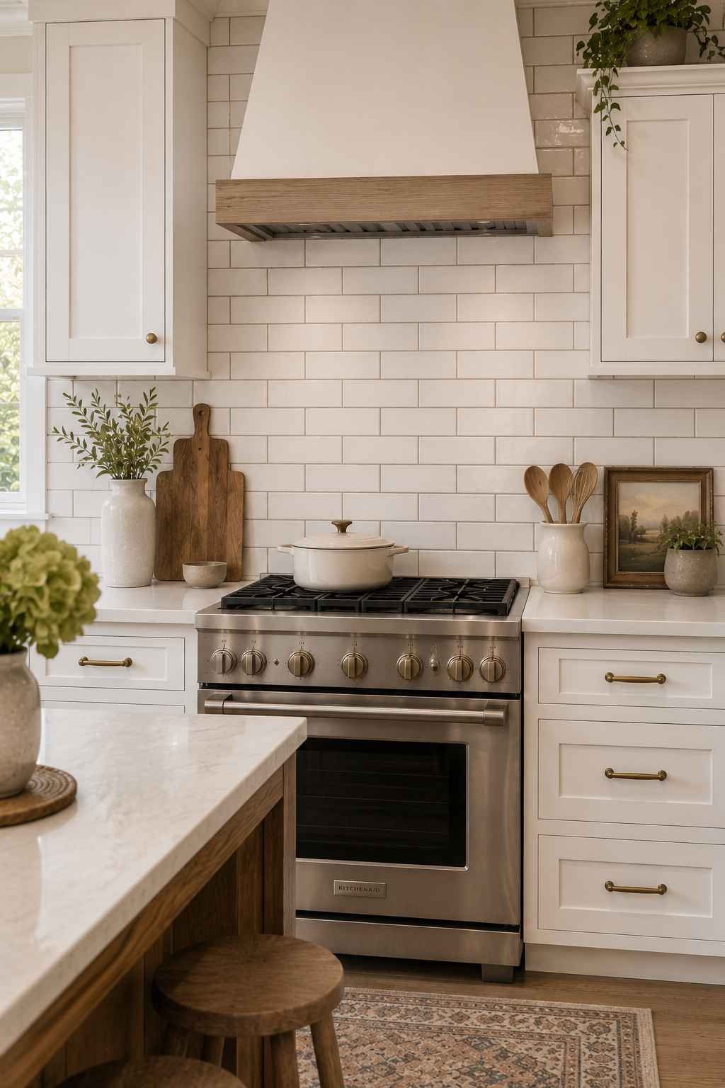
Black grout gets most of the attention, but a warm gray, soft taupe, or even a dusty blue grout against white subway tile is a gentler way to add definition without the high contrast of black. It’s a good middle ground if you love the idea of grid definition but find black grout too stark for your taste, and it tends to age a little more gracefully with less visible staining over the years.
16. Marble-Look Subway Tile (Porcelain, Not Real Marble)
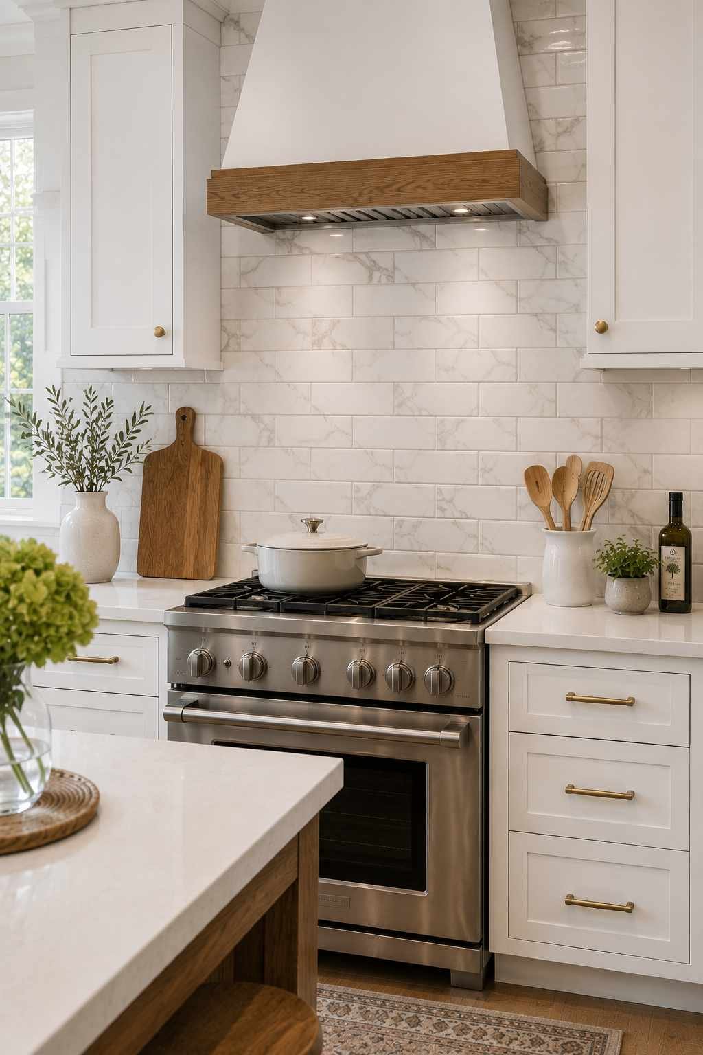
If you love the veined, high-end look of marble but not the maintenance (real marble stains and etches easily, especially near a stove), porcelain subway tile printed with a marble-look pattern is worth a serious look. Modern printing technology has gotten remarkably good, and against white cabinets, a marble-look subway tile brings a soft luxury feel while staying practical and budget-friendlier than actual stone slab.
17. Mixed-Material Subway Tile Accent Strip
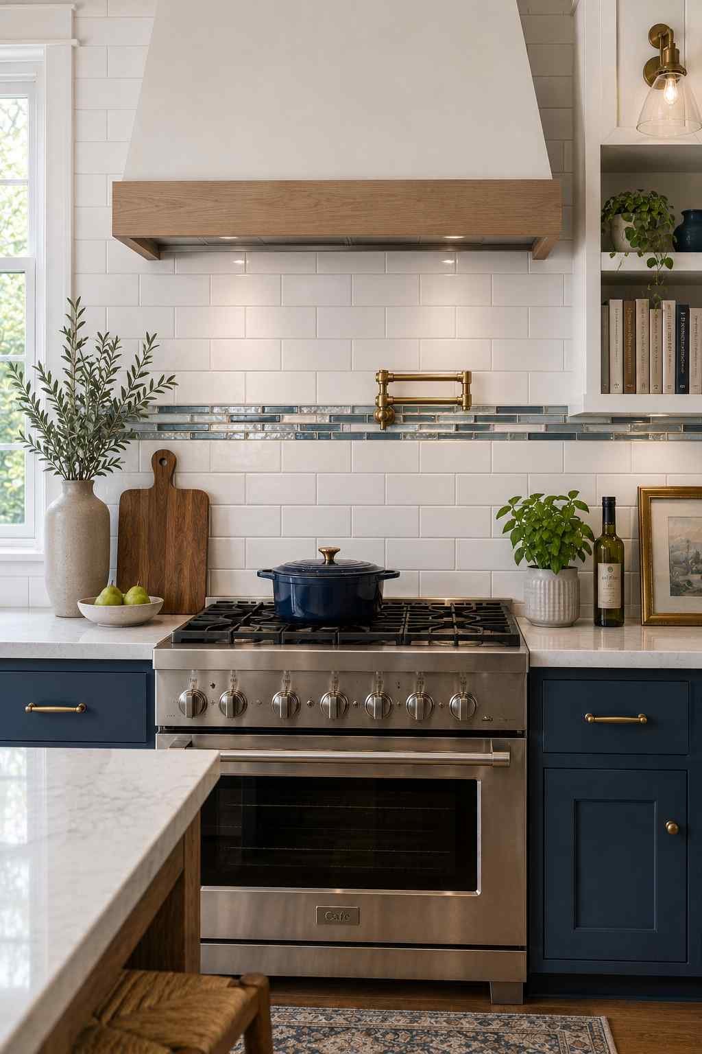
You don’t have to tile the entire backsplash in one material. A thin accent strip of glass, mirrored, or metallic subway tile inserted as a single row within a field of white ceramic subway tile adds sparkle and a custom, boutique feel without a huge investment. This works especially well behind a stove or sink where the light catches it throughout the day.
18. Subway Tile Paired with Open Shelving
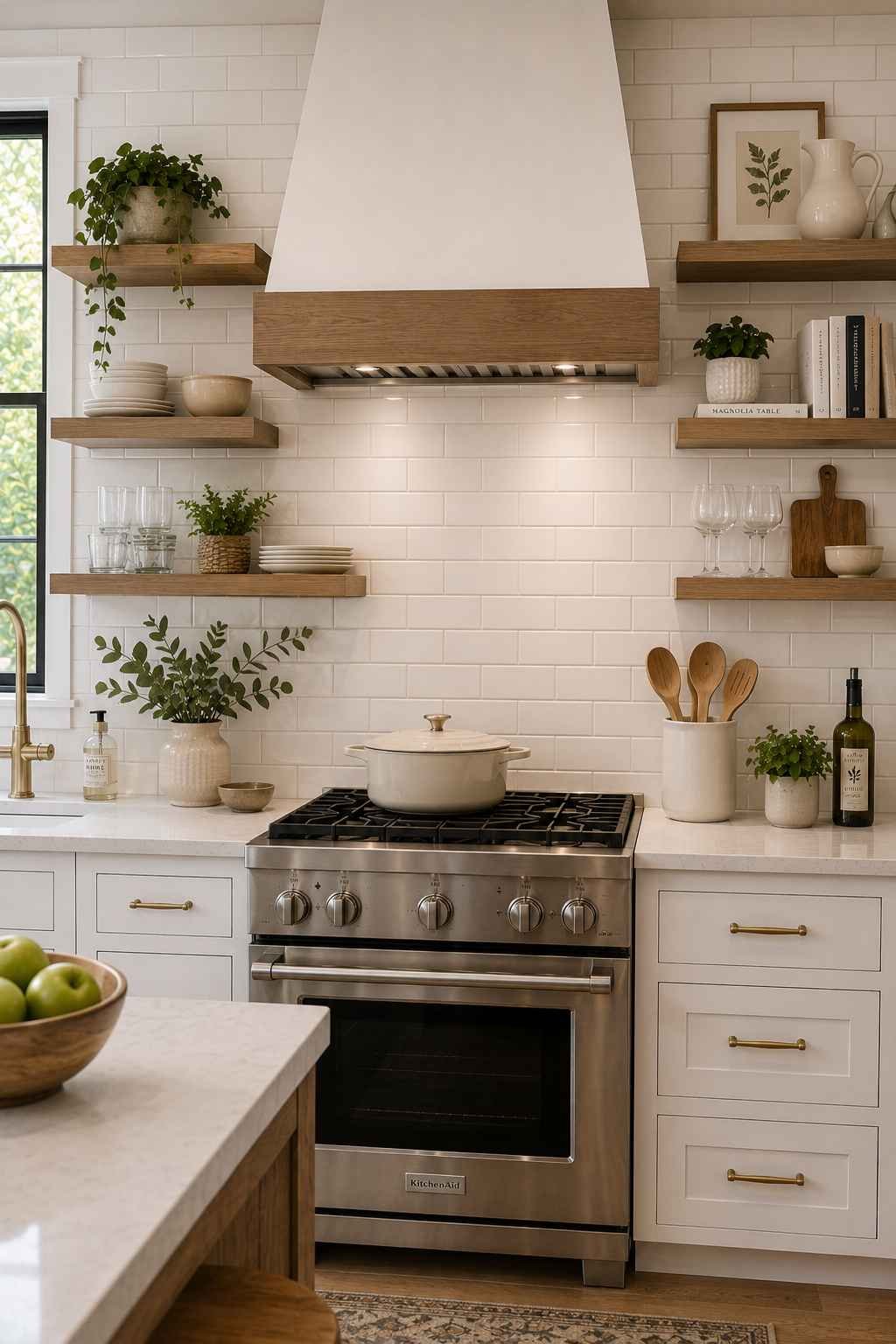
White subway tile is the perfect backdrop for open wood or white shelving because it lets whatever you display, plates, glassware, plants, actually stand out instead of competing with a busy pattern. I think this combination is particularly good for smaller kitchens, since the tile keeps the wall feeling light and airy even when the shelves themselves get visually busy with everyday items.
19. Full-Height Subway Tile Instead of Upper Cabinets

If you’re doing a bigger renovation and considering removing your upper cabinets on one wall (a popular move for kitchens that want more of an open, café-style feel), a full wall of white subway tile from countertop to ceiling is a stunning way to fill that space. It keeps the room feeling bright and connected to adjacent rooms, and it gives you a big, uninterrupted canvas to play with pattern, like herringbone or a mixed grout color, since there won’t be any cabinets breaking it up.
A Few Practical Things I’d Think About Before You Buy
Picking the pattern is honestly the fun part. Here are a few things I always tell people to nail down before ordering tile, because they’ll save you money and headaches later.
Order more tile than you think you need. Most tile setters recommend 10-15% extra to account for cuts, breaks, and future repairs. Dye lots can vary between batches, so if you run short later, the replacement box might not match perfectly.
Think about grout color before you fall in love with a tile. As you can see from the ideas above, the grout is doing almost as much design work as the tile itself. Ask your tile store for grout samples, not just tile samples, and look at both together under your kitchen’s actual lighting.
Decide how far up the tile goes before installation day. Standard is 18 inches (the gap between countertop and upper cabinets), but going higher, to the ceiling, or behind a hood, changes your material quantity and your budget, so lock this in early.
Check the tile’s PEI rating and water absorption if you’re tiling near a sink or stove. Not every tile is rated the same for moisture and heat exposure, and a kitchen backsplash sees both regularly.
Get a sample on your actual wall, not just in the store. Lighting temperature (warm bulbs versus cool daylight bulbs) can shift how white a tile reads by a surprising amount. A tile that looked crisp and cool under store lighting can look yellow or dull at home, so always test in your own space for at least a day or two before committing.
Wrapping It Up
The beauty of pairing subway tile with white cabinets is that you genuinely cannot go wrong with the base combination, it’s the details, the layout, the grout color, the finish, that turn a good kitchen into a kitchen that actually feels like yours.
I’d encourage you to pick two or three ideas from this list that caught your eye, order samples, and hold them up in your actual kitchen before making a final call.
A backsplash is one of the more affordable ways to transform a kitchen, and it’s also one of the easier ones to get exactly right if you take a little time with the planning.
 Sumit Banerjee